

15 Paint Colors That Will Make Your Kitchen Look More Expensive
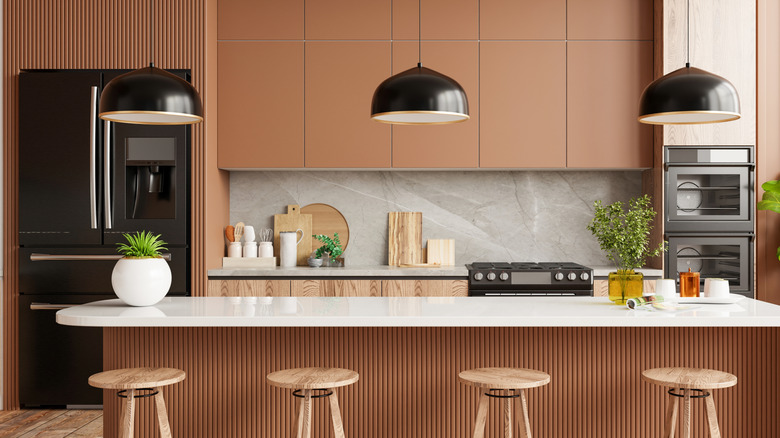
A fresh coat of paint can give a serious upgrade to a kitchen without requiring a hefty chunk out of your bank account. Choosing the right color, however, can mean the difference between a room with major impact and a space that misses the mark. Homeowners looking to sell should know that the right color of paint can increase offer prices. Whether you're setting out to create a richer-feeling space or to design a home with more intentionality, opting for the right shade can make your room look like a professionally-styled space and add value to your home.
The way in which color plays with countertops and the layout of the room is heightened by the light. Warm neutrals are paint shades that can turn your kitchen from basic to bougie, while deeper, moody tones bring the drama. For those looking to bring the outside in, earthy hues and natural greens convey comfort and taste. Of course, go-to classics like charcoal, navy, and creamy white never fail. As you're browsing endless options for DIY inspiration, Tasting Table put together a list of suggestions that can add value to your space.
White
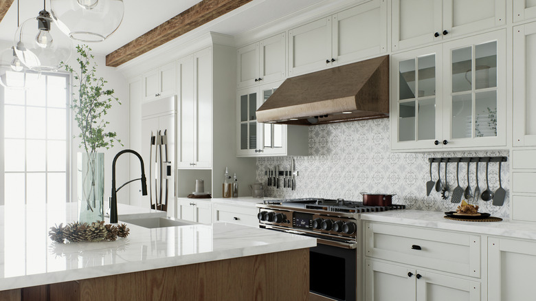
With a variety white paint colors to choose from, it's never boring. A crisp white coat can serve as a blank canvas for your kitchen accessories and reflect light. White won't compete for attention against brass pulls or an antique faucet. Paired with warm wood accents in oak or walnut, the sophisticated choice looks clean, not sterile.
Beige
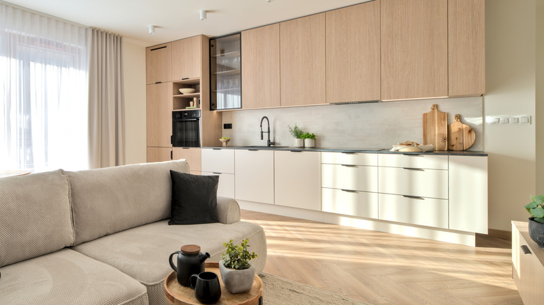
Beige can upgrade your kitchen with a smooth, refined touch. Designers often reach for this choice to add elegance to spaces and warm up kitchen areas. The practical color is friendly for every day use, as surfaces won't easily show smudges. Outfitting a beige kitchen can read as an intentional design direction, particularly when paired with marble countertops and rich walnut cabinetry.
Burgundy
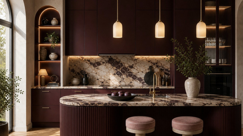
If you're wanting your kitchen to feel like an exclusive club or wine cellar, burgundy is a regal color that can upgrade a space of utility to an area in which dinner party guests want to linger. Designers agree that burgundy is a trending kitchen paint color and can be the paint choice that showcases a designer's touch without having to fork over a pricey consultant fee.
Butter-yellow
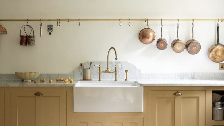
Instead of turning a kitchen into a dated space, butter-yellow kitchens can inspire serious design envy among house guests. Buttery yellow offers a warm shade that complements black steel and natural wood, or when paired with brass detailing can offer an upbeat feel that ages well and complements quartz surfaces. "Our house has so much butter yellow from like 20 years ago when the previous owner did it and I love it," wrote a user on Instagram.
Navy blue
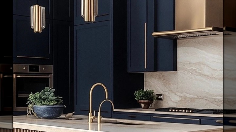
Blue paint is and will always be a classic, and navy blue brings an impressive aesthetic without a jarring shock. Navy blue can be used strategically in kitchen design to ground design elements and establish visual anchors in a room that prioritizes neutral, natural accents. Matched with brushed gold hardware or white marble counters, the color conveys regal, intentional curation.
Midnight blue
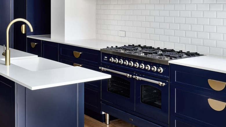
If you're looking for a darker, moodier impression than navy, midnight blue leans toward the deeper end of the spectrum to create stunning blue kitchen designs that offer both depth and warmth. The jewel tone is often associated with luxury spaces, and when used on islands in which butcher blocks and soapstone counters are placed, adds substance with minimal investment.
Clotted cream
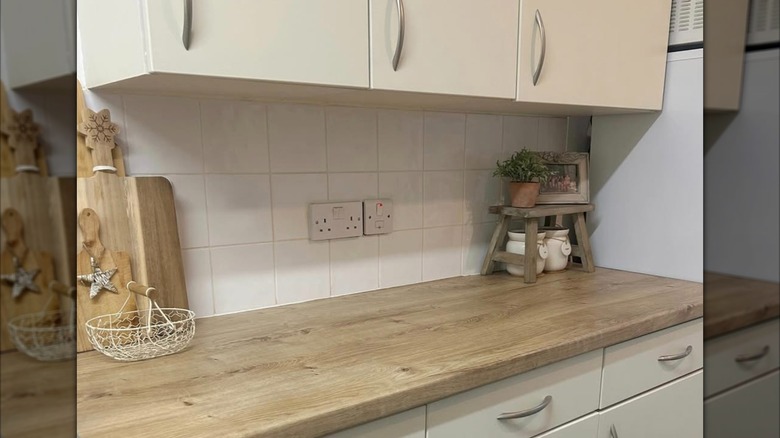
Borrowing inspiration from the color of homemade clotted cream, this yellowy white evades the sterility of pure white while still contributing to a clean, airy environment. Often found in Scandinavian and English design palettes, a clotted cream coat of paint helps establish softness where materials like rattan, stone, and unfinished oak can settle in comfortably.
Olive green
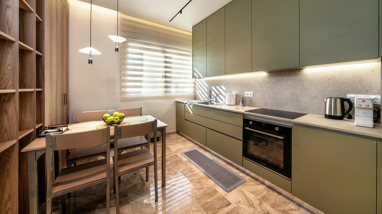
Some color choices are timeless and bring the outside indoors. This is part of the reason why olive green is a kitchen paint color known to add value to homes. The muted green looks considered and can contribute to earth-driven design boards to create rustic countryside and Mediterranean-inspired spaces. Wood cutting boards and cast iron pieces look stunning set against this shade.
Warm stone
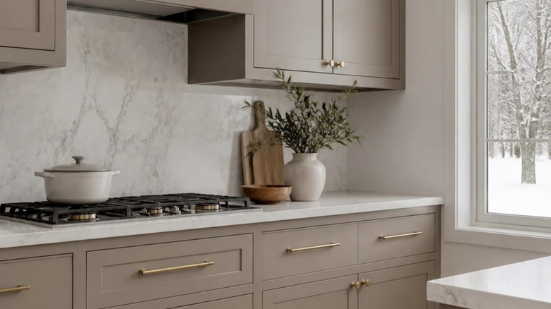
Warm stone is a softer, more nuanced hue that can effortlessly complement a range of kitchen countertop materials. The shade mimics the aesthetic of natural stone, turning modern spaces into rooms that offer whispers of antiquity and elegance. If you're looking for a color that isn't beige or gray and lands comfortably at a temperature that is neither too warm nor too cold, warm stone can match with brushed nickel fixtures and limestone.
Hidden Sapphire
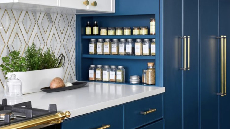
Benjamin Moore's Hidden Sapphire offers a blue-green option that brightens kitchens with a jewel-like quality. Kitchen islands and cabinets painted in this shade can be the pop of color that brings a point of interest to a space. The opulent choice looks pretty alongside colorful Le Creuset cast iron collections, and homeowners can add quirky personality with patterned tile backsplashes.
Plum
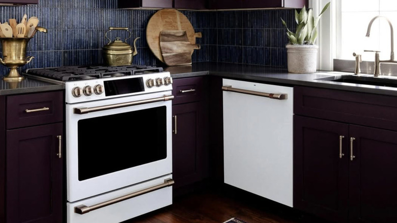
Plum is the cozy kitchen color that invites warmth and personality into a space. The color looks equally stunning when cast by warm brass scones or lit by natural light. Brass fixtures paired against a plum island can create a luxurious looking area that signifies deliberate, bold design. Shades of plum can lean more purple or dark, offering options for DIY homeowners looking for an impressive upgrade.
Down Pipe
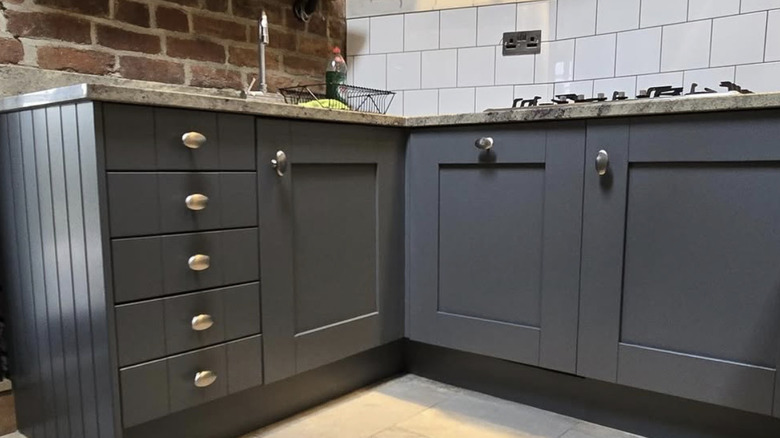
Even Martha Stewart is partial to grey paint, but Farrow & Ball's Down Pipe has designers clambering for paint swatches. The deep charcoal-gray offers a modern take that can anchor rooms and provide a moody, elegant contrast for unlacquered brass details to shine. For this reason, Down Pipe is an editorial choice often favored in upscale renovations. This timeless shade won't soon need updating.
Espresso
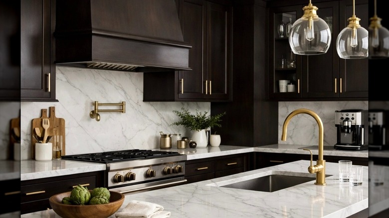
For designers, inspiration is everywhere, and a love of Italian espresso can be used to convert a kitchen into a space of sophisticated elegance. The rich tone echoes palettes commonly found in high-end boutiques and restaurants and creates a substantive backdrop for brass fixtures and marble work spaces. This is a strong choice for those wanting warm, pointed design.
Sage
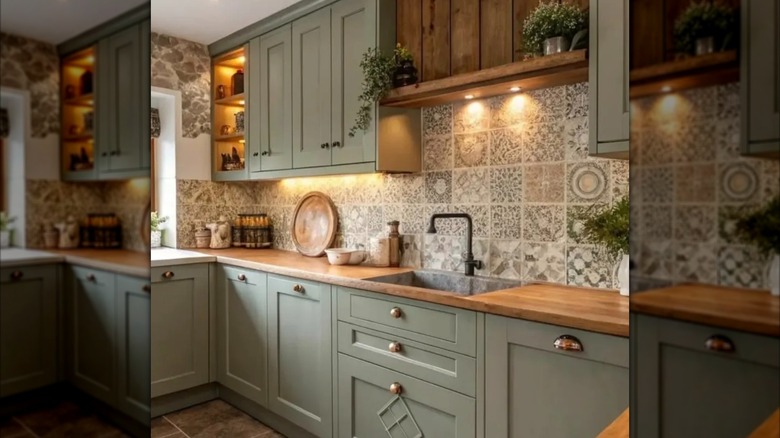
High-end interior design often draws from nature, and this muted green offers a calming choice that still conveys personality. Sage green is timeless yet on-trend that can elevate a space without tipping into an over-styled aesthetic. This fresh color can be easily paired with copper pot racks, cream limestone, and wood shelving for a quietly impressive effect.
Rich honey
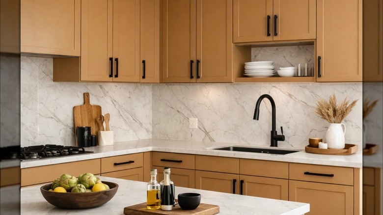
Whether you're looking to embrace create a minimalist kitchen or deck out your kitchen with patterns and textures, rich honey is an amber-toned option that can emphasize wood grains and draw attention to carefully-chosen details. Paired with matte black or brass hardware, the warm shade offers an intentional aesthetic instead of a flat cookie-cutter coat of paint.