12 Most Recognizable Fast Food Restaurant Designs You Likely Won't Ever Forget
Some logos are nothing short of iconic. You know the classics: McDonald's, Taco Bell, and KFC ... their designs are recognizable in a heartbeat. According to the CDC, 32% of adults in the U.S. consumed fast food on any given day. That's a considerable amount of brand exposure; it's no wonder we've grown to memorize their marketing.
Ever wondered what makes a design so memorable? Well, the psychology behind logos is incredible. Designers utilize symbols, shapes, fonts, and colors (similar to how grocery stores use color psychology on you constantly). In a perfect storm, this careful concoction fuels brand recognition and shapes consumer behavior. The best logos become beacons on the horizon: signs of trustworthy grub and familiar menus. Think of it as the fast food "halls of fame."
Feeling ready to test your knowledge of famous fast food logos? Here are the 12 most recognizable designs; you won't forget these in a hurry.
1. McDonald's golden arches
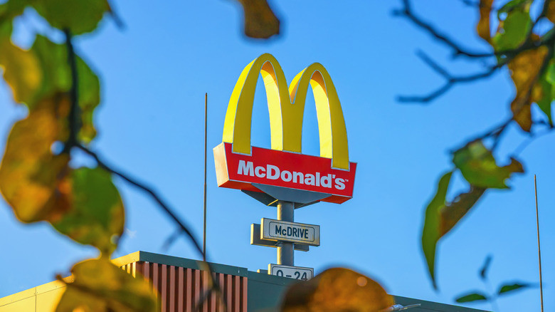
With brand recognition, McDonald's holds the crown, or should we say arch. Its logo development has had twists and turns, like when McDonald's logo had a line through it in the '60s, but the arched idea stems from the revamping of its rooftops in 1953.
Originally, the chain added a single arch to its rooftops and signposts (there's still one visible at the oldest operating McDonald's location in the U.S.). However, in 1968, McDonald's switched to its iconic doubles. The rest is history. The yellow-colored "M" has become synonymous with a quick Mickey-D's.
2. Pizza Hut's red roof
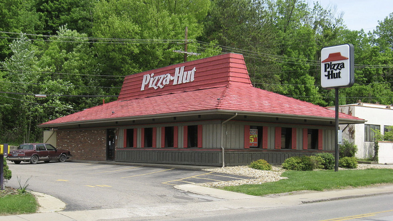
Pizza Hut has been on quite the journey, but there's one thing that's remained constant: its red roof. Originally, the actual roofs were red, but buildings modernized, and now, it's an instantly recognizable logo feature.
It did briefly share the stage. For those who don't know how Pizza Hut's logo changed forever in the 70s, the design once featured a cartoon chef. However, "Pizza Pete" sadly got the boot, and the logo's red roof has been the sole focus ever since.
3. KFC's bucket
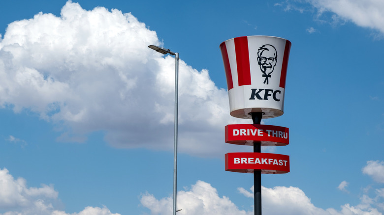
Imagine KFC, and images of a bucket quickly follow. These red-and-white striped containers are stamped with the face of Colonel Sanders, who called franchise owner Pete Harman in 1957 with an offer of 500 paper buckets. The unusual vessel was a smash hit. From festival doubles to single buckets for one, this symbol has become integral to the KFC menu and brand.
4. Chick-fil-A's chicken
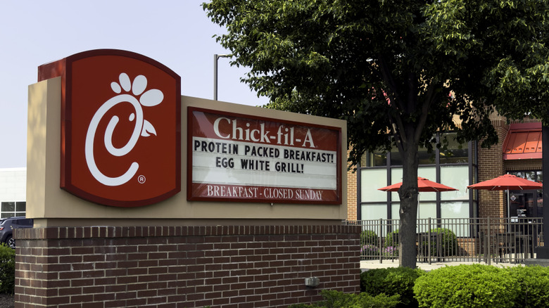
That stylized "C" is instantly recognizable. It's an artistic nod to Chick-fil-A's poultry-based dishes. But did you know that the chicken in the Chick-fil-A logo looked a lot different in the early 60s? After deciding it was time to introduce a logo, the brand originally had a rooster called Doodles.
5. The Taco Bell bell
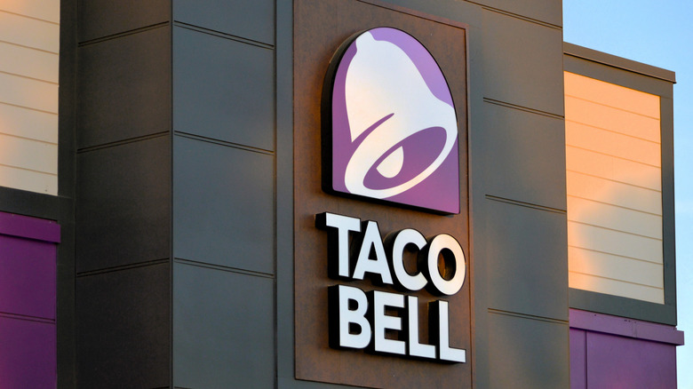
Fans can spot that bell from a mile off; with its white details and purple background, Taco Bell's logo is an iconic symbol. That said, do you remember its pre-2016 design? The chain underwent one of the biggest restaurant logo changes of all time – simplifying its color palette by removing the original hot-pink and yellow details. Taco Bell kept its purple, and the result was sleek minimalism.
6. Wendy's red-haired girl in pigtails
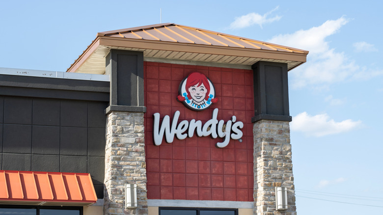
Mascots have dropped like flies, but not at Wendy's. That's because the girl in the Wendy's logo isn't just some random character; Melinda Lou "Wendy" Thomas is the daughter of the chain's founder, Dave Thomas. The decision to spotlight Melinda was a success: her red-haired pigtails and freckled smile are synonymous with the brand. Brand values have continued to champion children, too, through initiatives like the Wendy's Wonderful Kids Program, which supports adoptions in the care system.
7. Burger King's bread buns
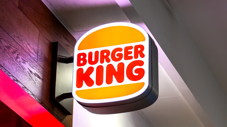
Burger King's creepy mascot might have entered temporary retirement, but its yellow buns are here to stay. Since the introduction of the burger buns in 1955, the bread has formed the backbone of the chain's logo. Small details have changed, but negligibly enough for critics to scoff that it looks the same (think subtle switches from mustard-yellow to orange, or the addition of a blue swirl). Clearly, Burger King is pretty dedicated to its "bread bun aesthetic."
8. Arby's hat
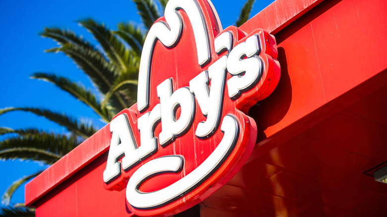
It doesn't get more iconic than a cowboy hat. Arby's name probably doesn't mean what you thought (it's actually an abbreviation of two names, not one), but its logo is crystal clear. The design suggests cowboy-esque dining, and with its protein-focused menus, Arby's certainly delivers. Changes have been minimal over the years; the hat itself has remained, but has been gradually modernized. Designers have particularly toyed with capitalization and coloring.
9. Five Guys' red and white checkers
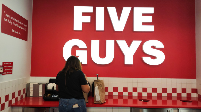
You might be surprised to hear that Five Guys opened in 1986, not earlier. The chain oozes vintage aesthetic, and for that, you can thank its checkers. Red-and-white checkered designs were a common feature in 1950s American diners. And while Five Guys demoted this pattern when redesigning its original logo, it remains an important part of its restaurant decor and branding. In 2023, the chain even launched a checkered fashion range to celebrate 10 years of U.K. expansion.
10. In-N-Out's yellow arrow
That yellow arrow? You'd follow it anywhere. In 1954, In-N-Out waved goodbye to its "No Delay" sign and invested in non-verbal marketing. Its iconic arrowed logo has been prompting pit stops ever since.
Interestingly, yellow shapes aren't the only signposts the chain invests in. Keep your eyes on the treeline; there's a hidden meaning behind In-N-Out's x-shaped palm trees.
11. Panda Express' panda
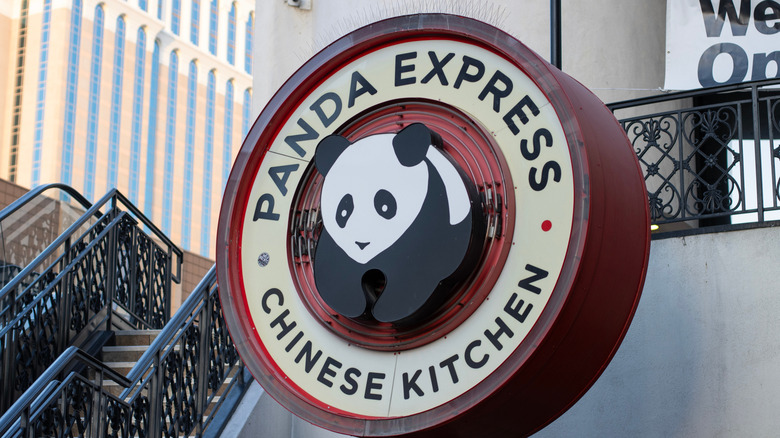
Panda Express takes a literal approach to its logo. Let's be honest, who could miss a giant image of a front-facing panda? Since its launch in 1983, the chain has made only slight changes to its design. A few switches between shades of red here and there, but nothing more. Why fix what isn't broken?
12. Shake Shack's green burger
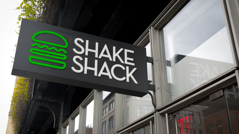
How quickly do you recognize Shake Shack from its burger? The use of green is noteworthy and creates clear connotations of modernity and freshness. It's exactly how a chain would want you to feel before buying hearty burgers. Add that to the list of secrets of Shake Shack you'll wish you knew sooner.