Before Today's Golden Arches, Old-School McDonald's Logos Looked Very Different
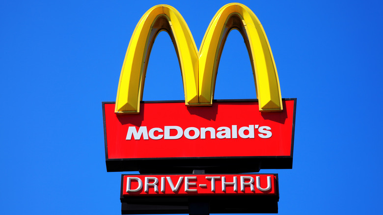
Along with its famous menu, McDonald's is equally recognizable (and memorable) by its iconic golden arches logo. Millions of kids, parents, and other weary travelers have long searched stretches of highway, looking for that legendary logo so that they could pull off the road and have a burger. Yet those famed arches have a history that is almost as topsy-turvy as the trials and tribulations of the McDonald's brothers themselves.
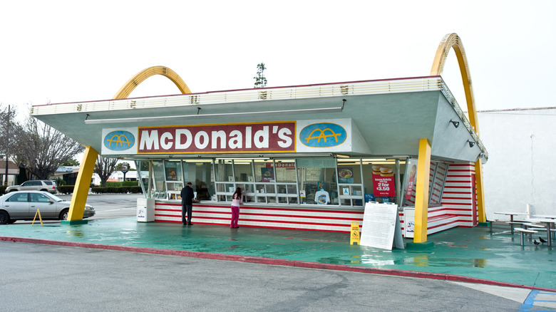
The original golden arch design, developed in 1968, was modeled after a unique architectural feature found on the earlier McDonald's restaurants. These locations featured swooping, neon-lit gold arches, one on each side of the building. Dick McDonald sketched out the initial vague idea in 1952, which was then perfected by architect Stanley Clark Meston and used on the first McDonald's franchise location in Phoenix, Arizona in 1953. Each golden arch was 25 feet tall, and when viewed from a particular angle from the road, came together to form a large "M."
But despite the huge swooping arches on certain McDonald's franchises, the restaurant's logo didn't always feature that design. From 1940 to 1968, it was very different. The old-school McDonald's logos were nowhere near as colorful or eye-catching as the one used today. In fact, if you saw some of them in use now, you might not even associate them with the fast food giant at all. Let's take a trip down memory lane and explore the logos McDonald's used leading up to the development of the restaurant's famed golden arches.
The first McDonald's logo was designed in 1940
McDonald's history was born out of humble beginnings. Two brothers, Richard and Maurice McDonald, moved to California from New England in the 1920s with their father Patrick. In 1937, Patrick opened a drive-up hot dog stand near the Monrovia Airport in Los Angeles called The Airdrome, and ran it with his sons. However, by 1940 the brothers, who had been hoping to make it in the movie business, ended up giving up that dream and moving to San Bernardino to start their own version of The Airdrome.
The small drive-in restaurant they opened in San Bernardino (which is now an unofficial McDonald's museum) was humble, and had one of the most bland, forgettable logos one could imagine. Featuring nothing but the text "McDonald's Famous Barbecue," it was absent of any color, graphics, or life. The restaurant's name didn't even convey the entirety of its menu or give any real hint as to what set it apart from the many other drive-in food stands in the area. Yet the brothers' dreams were far from humble, and they were already exploring ways to make their restaurant different from others they had visited. One such way was the assembly-line concept they were developing in order to streamline service so they could lower the cost of their burgers. The enduring success of this service model is still evident in California today, as it is the U.S. state with the highest number of McDonald's locations.
The logo changed in 1948 with the addition of 15-cent hamburgers to the menu
By 1948, the brothers perfected their unique fast food service model, which they called the Speedee Service System. At the same time, they started selling 15-cent hamburgers as well as shakes and fries. Their burgers were about half the cost of those sold by other drive-thru restaurants in California. The new McDonald's sign featured a logo conveying the novelty of their service model. Featuring the head and shoulders of a smiling man in a chef's hat and uniform, the "McDonald's Famous Hamburgers" name is now flanked on each side with "15 cents," letting customers know immediately that they can get a great deal on a quick meal. Underneath the restaurant's name is an even more novel concept: "Buy 'em by the bag." Because the burgers are so inexpensive, customers are urged to fill up a whole bag of them, either to eat on the road or take home to their families.
The incredible success of this venture, timed with the brothers' fated meeting with a businessman named Ray Kroc, led to the franchising of McDonald's restaurants. The 1952 McDonald's franchisee brochures featured a more modernized version of this logo. This version has a mock-up of a McDonald's logo on a drive-in hamburger stand. The yellow sign on the top of the restaurant says "McDonald's Self-Service System," and underneath is a winking chef holding a sign proclaiming "I'm Speedee." Below that, the word "Hamburgers" appears in red, along with a version of the restaurant's now-famous slogan, "We have sold over six million." Around this time, the brothers were meeting with architect Stanley Clark Meston to design the golden arches that would be used on future McDonald's locations.
The 1953 logo is a throwback to a simpler design
If a man named Ray Kroc hadn't visited the brothers in 1954, he may never have partnered with them as their franchise agent, and McDonald's may not have become the global success that it is today. Kroc was one of the distributors of a milkshake machine called the Multimixer. He went to the San Bernardino McDonald's in 1954 to meet with the brothers about using Multimixers in their restaurant. However, by the time he left, he was in talks with them about becoming their franchise agent.
The first McDonald's franchise was opened in Phoenix, Arizona in 1953 and featured a large, swooping metal arch on each side of the building. Though the McDonald brothers were happy to approach their expansion with caution, Kroc urged them to push forward quickly. In 1955, he himself opened the first McDonald's location east of the Mississippi, in Des Plaines, Illinois –- which the McDonald's corporation considers the true birthplace of McDonald's. The logo underwent another shake-up at this time as well. It was streamlined and featured bright red italicized lettering along the building that simply said "McDonald's," while a red sign on a single gold arch featured the logo in white. While this new logo was simple and eye-catching, it was still nowhere near as unique as the golden arches that were to come.
The famous golden arches are finally introduced in 1961
By 1961, Ray Kroc had brokered a deal with the McDonald's brothers to purchase the company for 2.7 million dollars. That's about 30 million dollars in 2026 money. He went on to turn the company into a global corporation. He also reneged on a verbal agreement to give the brothers royalties from each newly-opened restaurant. The brothers also didn't have rights to the McDonald's name, which significantly limited their ability to pursue any future marketing or business opportunities under their own name.
In 1967, as McDonald's expanded into Canada and Puerto Rico, Kroc spearheaded the redesign of most existing McDonald's restaurants, removing the golden arches from each building. The logo was also changed, incorporating the arches into its design. The new logo, now in its famous mustard yellow hue, featured the two arches converging in the center to form an "M," with an arrow running through the center to indicate the direction in which the arches were to be viewed. Underneath the arches was a bold red "McDonald's" in sans-serif font.
The simplified 1968 logo looks more like what we're familiar with today
Ray Kroc wasn't satisfied with stopping there. He hired a new architect to design future McDonald's restaurants in a more retro-style, rather than the futuristic one that the brothers had envisioned with architect Stanley Clark Meston. The new restaurants featured a mansard roof that harkened back to 16th and 17th century European architecture.
At the same time, he changed the restaurant's logo once again, turning it into the most recognizable version of the iconic golden arches we know today. This new logo simply features the mustard-yellow arches, now in a distinguishable, rounded "M" shape, with the name "McDonald's" across the lower half in bold black font. This logo would remain relatively untouched for 35 years, only undergoing minor tweaks to the size, weight, and background color behind the golden arches.
In 1975, the logo was placed on a red square background with the McDonald's lettering changing to white. In 1993, that background, along with the McDonald's name, was removed and the arches were given a black shadow, proving the arches alone were enough to identify the brand. In 2003, the shadow was gone and the arches were made smaller and put onto a square, brick red background. In 2003, the arches were given more weight and the background was removed. By 2018, the arches were thinned again and set into a bright, fire-engine red background, and it has remained that way since. Today, only a handful of McDonald's locations aren't crowned with the iconic golden arches.