10 Outdated Kitchen Design Rules You Can Completely Ignore, According To An Expert
There is no dearth of advice on how a kitchen should be designed. From the precise height of the cabinets to the colors that do and don't belong together, everyone has their opinion on what's best. While guidelines can help to an extent, you also need to ensure that your kitchen is evolving with your own needs.
Traditional rules of design have viewed the kitchen as a closed-off, industrial space devised to be hidden away from view. This one-size-fits-all mindset meant that everything was designed with cohesion and visual conformity in mind. However, these formulas don't match pace with the modern needs of homeowners. The modern kitchen has a heavy list of duties to service: It must be equipped to support multiple cooks at once, double up as an entertainment zone, and house a wide array of appliances.
Instead of blindly following conventional design diktats, it makes sense to design your kitchen around your everyday habits and rituals. To help you avoid any costly mistakes and regrets, Kerrie Kelly, CEO and creative director of Kerrie Kelly Studio, shares her best advice on the outdated kitchen design rules you can safely break free from.
1. The work triangle is the golden standard for kitchen organization
With its roots in the early 20th century, the work triangle has held sway as the default kitchen layout for the longest time — and with good reason. The theory was simple: By positioning the sink, stove, and the refrigerator in a triangular formation in the kitchen, you could optimize your workflow.
However, this theory was designed for houses with one primary cook. As more people join in the prep and clean-up, the work triangle doesn't make sense for all kitchens. The definition of what counts as a major appliance has also extended beyond the refrigerator to include microwaves and ovens. As social habits evolve, Kerrie Kelly has observed that modern kitchens need to double up as an entertaining zone as well. "So in today's kitchens, a rigid triangle often fights how people actually live and gather," she says.
Instead, the zoning method is emerging as a more viable alternative. It's simple, and adaptable to your kitchen and your needs. Just designate specific zones in your space for prep, cooking, clean-up, and storage. More stations for specific needs could be added, such as for beverages and baking. "Zones make modern kitchens intuitive, efficient, and easier to grow with," she says. To make this approach work, Kelly recommends adding a landing zone alongside major appliances to minimize wasted steps. Your kitchen can be truly customized to your needs, with the potential for upgrades, like installing task lighting and power circuits in each station.
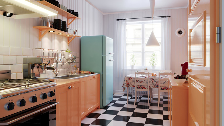
2. You cannot use dark colors in a small kitchen
There was a time when light colors and small kitchens went together like basil and tomatoes. The logic was straightforward: lighter hues, such as ivory and cream, could reflect light better and make a cramped space feel open and spacious. On the other hand, darker hues were thought to absorb light and make a small kitchen feel more boxed-in.
However, that doesn't hold true anymore. Lighting, finishes, and layouts have all advanced and changed the way that colors are perceived in a space. "Dark palettes used to be labeled 'shrinkers', but with better lighting, reflective surfaces, and satin-sheen paints, deep hues can create a cocooning, gallery-like calm, even in compact spaces," Kerrie Kelly iterates.
The key to leveraging darker colors in a small kitchen lies in the contrast. "Think inky blue-black, espresso brown, charcoal, or forest green on lower cabinets with soft white stone and warm metal accents," she recommends. Glossy surfaces are counted among the kitchen trends on the way out in 2026, so Kelly advises opting for semi-matte finishes instead. Satin paint, for instance, can help bounce light around a room while also hiding minor imperfections better than glossy surfaces. For finishing touches, you could add under-cabinet LED strips to distribute light uniformly and negate any dark spots.
3. All design elements should be perfectly symmetrical
Symmetry in kitchen design has always been considered a marker for visual discipline. How could you expect to feel a sense of control and calm if your cabinet heights weren't aligned with military-style precision? While symmetry can feel visually pleasing to the eyes, Kerrie Kelly has found that it can dampen your sense of personality in the space. Modern homeowners are instead throwing the rulebook out of the window by using asymmetry to infuse individuality into their kitchens.
So, how can you break free from the rules of symmetry without turning your space into a jumble of shapes and silhouettes? "Think 'visual rhythm' instead of 'perfect pairs'. Repeat lines, materials, and proportions so the eye moves comfortably, even when elements don't match 1:1," she advises. You can start by intentionally placing a range off the center of the kitchen. She recommends flanking this with a pull-out pantry on one side and a vertical spice or appliance garage on the other. Round out your work with an oversized art piece or a sculptural pendant to further play with proportions.
Adding a mix of vertical doors and horizontal drawers at regular intervals can also break the sense of overtly-matchy symmetry. "Mix door styles, like slab for tall units, shaker for base cabinets, while keeping finish and hardware cohesive," she adds.
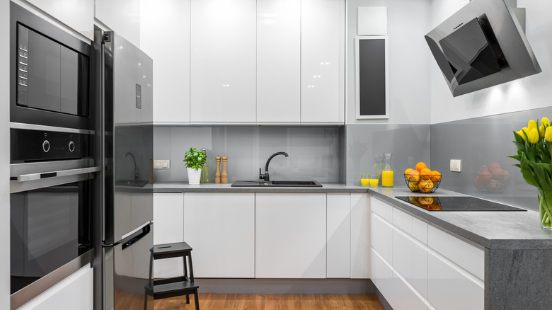
4. Appliances and fixtures should match
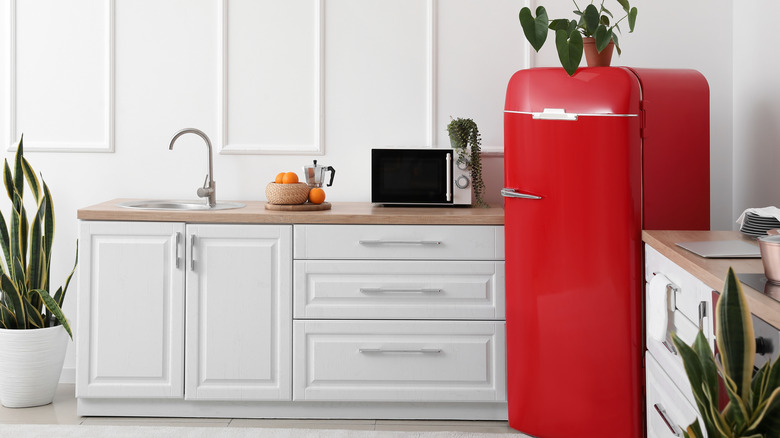
If the popularity of the all-white kitchen trend of the 20th century tells us anything, it's that cohesion invites a sense of calm. Appliances and fixtures have long been coordinated for practical reasons as well. After all, buying a complete suite of coordinated appliances eases the decision-making process. But ensuring that everything matches each other is the common kitchen design faux pas that actually doesn't matter at all. "Matchy-matchy appliances can read like a showroom. A curated mix feels collected and intentional," Kerrie Kelly declares.
Stainless appliances make for a timeless choice in her book, although panel-ready appliances may soon be coming for the crown. Once you have chosen your appliances, Kelly wants you to get creative with your choice of metals for the hardware: think warm hues, such as brushed brass or champagne bronze. "Matte black fixtures also play beautifully with stainless and darker cabinet tones, especially when echoed in window frames or lighting canopies," she says.
However, it is possible to have too much of a good thing. To keep your kitchen design from tumbling into visual chaos, she recommends steering clear of three or more unrelated metal colors with different sheens placed within the same sightline. The 60-30-10 rule holds true here: opt for 60% of a dominant color, 30% of a supporting hue, and 10% of an accent shade. "The result is layered, not loud — and easier to update later," she says.
5. The sink should only be placed under a window
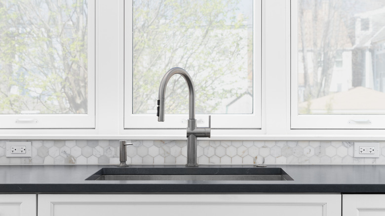
Before plumbing moved indoors, the sink was traditionally placed next to the window. This placement was ideal for fetching and draining water from external sources outside the house. Eventually, kitchens evolved, but the window was still favored for its natural illumination — after all, no need to turn on the lights when doing dishes during daytime. "Historically, the sink lived under the window for light, ventilation, and a nicer view during handwashing," Kerrie Kelly confirms. However, with the advent of dishwashers, the need for the sink to be tied to the primary light source in the kitchen declined.
So, where can you place the sink instead if your options aren't restricted by proximity to the window? Kelly recommends taking cues from your kitchen layout. "In an island-centric plan, a prep sink belongs near the main cutting surface with compost and knife storage close by; the cleanup sink can live along a wall with dish storage flanking the dishwasher," she says.
If you plan to entertain often, the sink should ideally be facing your guests so you aren't isolated from the conversation. For galley kitchens, the sink can nestle opposite the range. Compact spaces can position a workstation sink along any uninterrupted stretch of countertop space.
6. You cannot add an island to a small kitchen
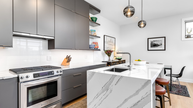
Bulky, space-consuming design elements are the arch nemesis of any small kitchen. It comes as little surprise then that kitchen islands were vetoed for compact spaces for the longest time. Considered an inefficient usage of floor space, islands were criticized for hampering circulation within a cramped kitchen.
While homeowners with small kitchens needn't give up on their dreams for an island, Kerrie Kelly advises being efficient with design choices. "Waterfall tops aren't mandatory; a slim stone or composite with eased edges lightens the look," she says. As a rule of thumb, she recommends leaving a minimum of 36 to 42 inches of clearance on each side. Adding drawers and an overhang for seating a couple of stools will further justify the floor space being devoted to the island. "In extra-tight rooms, a peninsula often beats an island by preserving a single clear aisle," she observes.
It is equally important to know what not to opt for when adding an island to a small kitchen. If the countertop slab is oversized, circulation in the room will be hampered, and you'll be facing a costly do-over. Kelly also finds that chunky legs unnecessarily steal legroom. "Materials matter: durable, low-maintenance counters and integrated charging make a petite island feel like a smart workstation, not a traffic cone," she says.
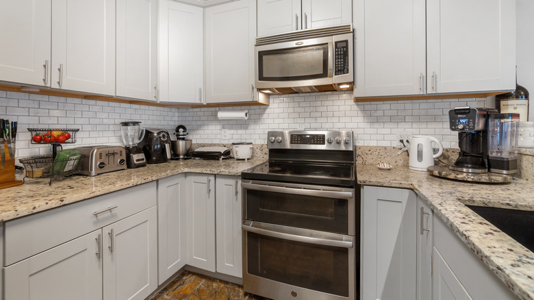
7. Upper cabinets are mandatory
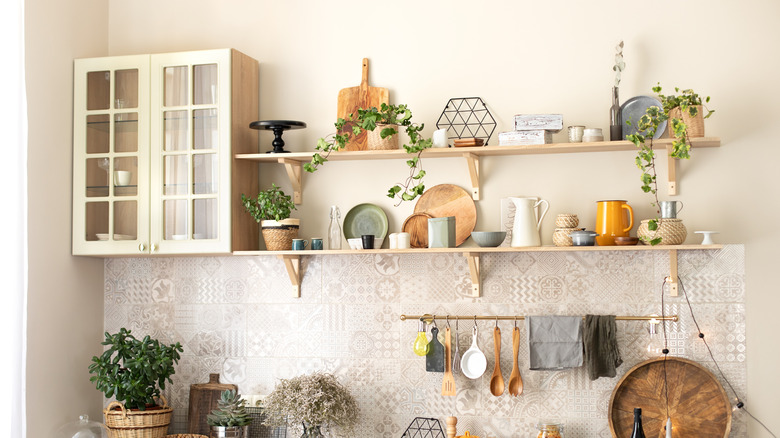
Having to regularly clean dust and grease is never on anyone's wishlist, so upper cabinets have served as a popular kitchen design candidate. Apart from providing hidden storage, they also leverage vertical space to keep the floor space in small kitchens free.
However, the trend pendulum has swung in favor of open, airy spaces that aren't laden down by imposing silhouettes. "Upper cabinets add storage, but they also add visual weight," Kerrie Kelly explains. When bulky uppers are removed, natural light can freely flood the room and create a better illusion of space. As kitchen islands with integrated storage become the norm, the need for wall-mounted cabinetry is being reconsidered.
Kelly prefers utilizing open shelving for showcasing a homeowner's personality. The improved access to everyday items is a sweet bonus. "Try a symmetrical pair of thick floating shelves in wood that echoes the floor or island, set against a full-height backsplash for easy wipe-down," she says. If you are looking for a decorative flourish, gallery rails are the easy addition that can make open shelving pretty and practical. "Keep a closed pantry and tall storage elsewhere so the display stays curated instead of crammed," she says. All of the real estate freed from upper cabinets can also be put towards decorative flourishes, from displaying art gallery-style botanical prints to statement light fixtures.
8. Everything should be hidden inside cabinets
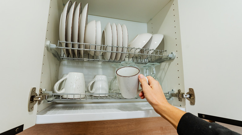
On paper, stowing kitchen items within cabinets can sound like an effective strategy for managing clutter. However, kitchens are shedding their utilitarian origins to now emerge as a social hub. By hiding everything out of sight, you could also be stripping the space of character and lived-in warmth. "Visible storage celebrates daily rituals — coffee, baking, beautiful cookware — and turns function into décor," Kerrie Kelly agrees.
According to her, the key to mastering visible storage lies in editing and strategic repetition. "Do group by material or color, such as all white dishes or all wood boards, decant pantry goods into airtight, uniform containers, and mix vertical [storage] using rails and hooks with horizontal shelves to create rhythm," she says. To avoid visual overwhelm, negative space is a powerful tool. By intentionally leaving breathing room in between items, you can prevent sensory overload.
On her list of no-nos are mismatched packaging, worn-out plastic items, and rarely used gadgets. It also helps to place larger items on higher shelves, while grouping together smaller items at eye level on the middle shelves. By rearranging the curation every quarter, you can keep things interesting. "Think 'merchandised market' rather than 'catch-all', making things purposeful, pretty, and easy to maintain," she says.
9. Kitchen islands should only be rectangular
Rectangular islands always seemed like the most efficient use of space for kitchens — the linear edges run parallel to the countertops and don't block clearance. But with changing social dynamics, homeowners are exploring options that support cooking as well as conversations. "As kitchens trade straight lines for softer silhouettes, islands are following suit. Curves improve flow, prevent hip bumps, and add a custom, furniture-like feel," Kerrie Kelly says.
There is a wide array of island shapes to explore, but Kelly recommends taking cues from the size of your kitchen before making any final decisions. "For small kitchens, consider a demi-oval or pill-shaped cart with a slim profile; it invites circulation and offers two-stool seating," she suggests. By adding shelves and cabinets, you can get more out of your kitchen island than just extra counterspace. Medium-sized spaces, meanwhile, can benefit from an asymmetric island that has seating options integrated into one end without hampering aisle space.
Unsurprisingly, larger kitchens have a blank canvas to play around with. From serpentine silhouettes to double islands, everything is fair game. You can set the dual islands at staggered heights to offer separate spaces for prep and entertaining. "Curved banquettes integrated into an island end are a beautiful way to blend dining and prep zones," she adds.
10. You shouldn't mix multiple design styles in one kitchen
Thanks to the rise of kitchen design fads, many people have just stuck with one design aesthetic or theme when it comes to remodeling and décor. The result? A sense of conformity and predictability. Kitchens are either kissed by the sleek touch of minimalism, or are brimming with the rustic charm and warmth of farmhouse-style — but nothing in between. If you're looking to design a kitchen brimming with character, it helps to seek inspiration from multiple styles.
According to Kerrie Kelly, some of the best kitchens thrive at the intersection of multiple influences. "The secret is a unifying palette and proportion, then layering contrast for character," she says. There are several ways to get creative with your mood board for the kitchen. If the modern farmhouse aesthetic has your heart, Kelly recommends peppering in some classic European touches by way of slab-paneled tall units, warm stone, unlacquered brass, and a classic range hood. Or you could throw a surprising twist to the coastal clean memo by inviting mid-century touches. The end result would host everything from white oak cabinets and slim-profile counters to matte black hardware and woven stools.
Balance is key, so you'll want to ensure that you aren't leaning too heavily in favor of one style. "Keep three constants — color, metal temperature, and countertop tone — and your mix will feel intentional, not chaotic," she concludes.