The 11 Biggest Restaurant Logo Changes Of All Time
Logos are more than just graphics — they're visual representations of how a brand sees itself (and how it wants to be perceived by its target audience). Yet in order to achieve its desired business objectives over time, nearly every major company or brand has undergone a visual refresh of some kind, and restaurants are no exception.
Since a company's logo tends to function as a visual and emotional anchor for its brand, there are plenty of reasons why a restaurant may opt for a change. It could be an attempt to stay relevant, perhaps by streamlining the look and feel for a younger, more modern audience, or by incorporating contemporary design trends and technologies. Other times, a logo revamp may be part and parcel of a strategic pivot in business positioning; for example, when Dunkin' dropped the "donuts" to focus on its other menu items, or Domino's deleting "pizza" to emphasize it's about more than just pizza pie.
Of course, a restaurant's logo can evoke positive feelings and favorable associations, as well — the type that make customers willing to spend their hard-earned dollars. Consequently, any shifts in identity and messaging may also trigger a backlash, with customers feeling a symbolic tie has been severed from the brand's roots. Let's take a closer look at the 11 biggest restaurant logo changes of all time, including the public reaction to these drastic brand re-designs.
Cracker Barrel
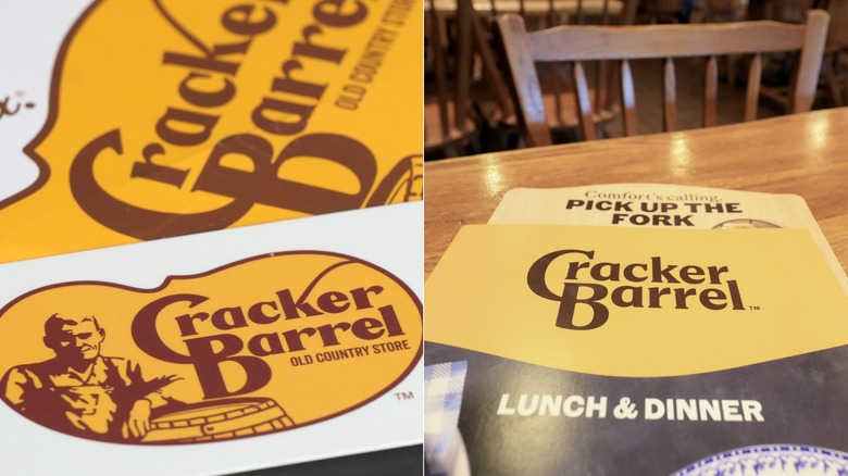
Perhaps the shortest lived logo change occurred in August 2025, when Cracker Barrel unveiled a minimalist rebrand attempting modernize and simplify the brand's image. The company teamed up with country singer Jordan Davis to announce the re-design, hoping to ensure customers its story and values weren't changing along with the logo. Unfortunately, the new logo — which removed everything but the words "Cracker Barrel" against a cheery yellow background — drew swift and intense backlash, largely because of the erasure of the Uncle Herschel character.
The decision to remove Uncle Herschel — an elderly Southern white man in overalls, who'd graced the logo since 1977 — along with the words "Old Country Store" was criticized as a departure from the brand's traditional values, particularly among conservative-leaning customers. President Donald Trump even urged the company to admit its mistake and restore the old logo, suggesting it could be a great public relations move.
Following a decline in stock value and further social media uproar, Cracker Barrel announced it would keep the old logo. Stating it had listened to public opinion, Cracker Barrel reaffirmed its commitment to classic American country-style hospitality by sticking with its old logo.
Dunkin'
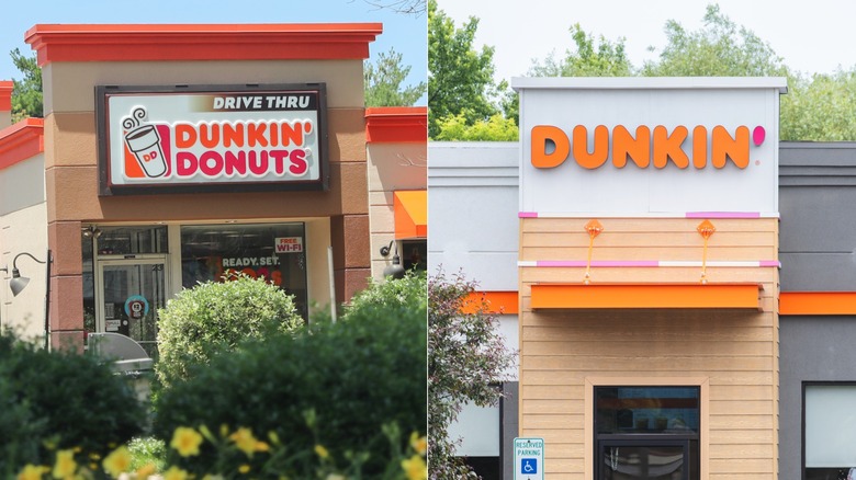
It took some time for Dunkin' Donuts to become a household name for donuts and coffee upon opening, but it eventually made its mark. While its logo has evolved throughout its history, the biggest change likely occurred in 2018 when the company announced it was dropping the "Donuts" from its name and logo.
Now, this change was less about visual design, and more about strategic rebranding. After all, the move signaled Dunkin' wasn't just a donut shop anymore: It was now a full-on beverage and snack destination. But the streamlined wordmark also leaned directly into the shorthand nickname many customers were already using in "Dunkin'." According to the company, this meant the rebrand felt intuitive and familiar, as if it was simply reinforcing a popular pet name. This was a slam dunk in brand alignment, modernizing and clarifying its identity while honoring an already well-known term.
Dunkin's shift wasn't just a matter of simplifying the look and feel of its logo — it was redefining how people saw the brand. By letting go of "Donuts," Dunkin' made room for the company to grow and evolve, and the calculated maneuver appears to have worked. Customers have embraced the change, after all, with the company's identity feeling sharper than ever. The new name suggests the brand is about successfully fueling your entire day, not just your sweet tooth.
IHOP
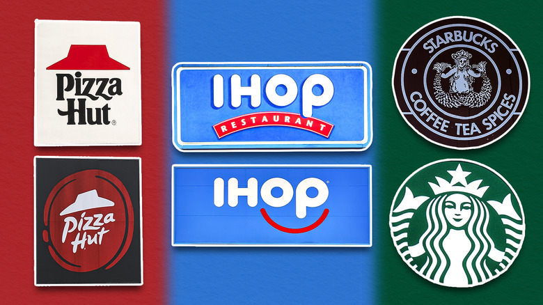
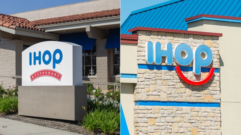
IHOP — originally known as the International House of Pancakes — first opened in 1958. By the 1970s, the brand had already shortened its name to the catchier and more dynamic "IHOP." This was done to help modernize its image, evoking associations with a fun activity while fitting better on signage. On that note, IHOP's logo previously featured a bold red banner with the word "restaurant" beneath the name, which many consumers noticed resembled a scowl. Since this contradicted the brand's intended cheerful, family-friendly image, it made the decision in 2015 to turn that frown upside down.
That year, IHOP unveiled a significant logo change in an effort to reshape how customers emotionally connected with the brand. The redesign cleverly transformed the "O" and "P" in IHOP into a pair of eyes, while literally turning the serious red restaurant banner on its head, creating a curved red line for a smiling mouth. This small but clever tweak turned the logo into something more human and approachable, reinforcing IHOP as a place of comfort and joy where families can create fond childhood memories (and you get free pancake breakfast on your birthday).
While reactions were mixed at first — with some critics dismissing the smile as gimmicky, clownish, or overly simplistic – customers have embraced the new design's friendliness over time. And a decade later, the cheerful logo has become a familiar part of IHOP's brand personality.
McDonald's
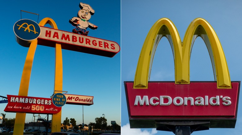
You may not realize McDonald's began as a hot dog stand, one that experimented with a menu of BBQ items in its early days. In fact, it wasn't until 1948 that the owners realized hamburgers were their most profitable and scalable product, leading them to focus solely on burgers and fries. This change soon affected the restaurant's sign and logo, as well, with a dramatic shift coming in 1953 — when McDonald's introduced restaurants with the now-iconic golden arches built directly into the architecture itself.
The bold design choice did more than just frame the buildings — it created a visual identity for the restaurant. It also represented a shift from its early signage, which reflected the busy, text-heavy aesthetic of mid-century roadside America (designed more to inform than to symbolize).
By 1961, the arches leapt from being just an architectural feature to the company's corporate identity and branding. They became part of the actual logo, eventually evolving into the minimalist french fry "M" recognized worldwide today. Interestingly, McDonald's has made other, quieter shifts during its existence, like altering its fry oil from beef tallow to vegetable blends with natural beef flavoring.
Pizza Hut
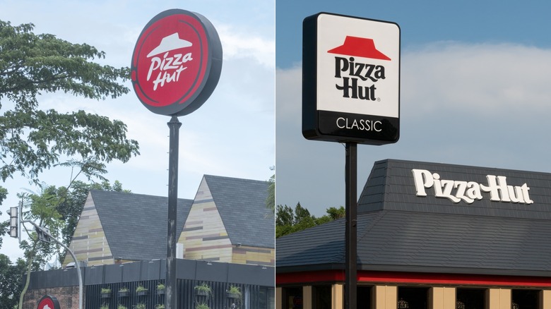
McDonald's isn't the only fast food chain to transform a piece of architecture into a lasting symbol. Just as the golden arches first appeared as an eye-catching design element making McDonald's instantly recognizable, Pizza Hut's red, trapezoid-shaped roof was similarly conceived as a visual beacon. Of course, it took until 1974 for the now-legendary roof to appear on the logo itself, which adopted a stylized representation of the restaurant's signature the red roof paired with bold typography.
Now, Pizza Hut's logo has evolved numerous times since its founding in 1958, swinging between bold, modernist designs and retro, nostalgic looks. For instance, the brand adopted a more dynamic, three-dimensional aesthetic in the 1990s and 2000s to reflect the design trends of the era. By 2019, however, Pizza Hut decided to return to a vintage-inspired red roof logo, signaling a conscious embrace of nostalgia and heritage.
The new logo design resonated with longtime customers while remaining fresh and recognizable across digital and physical platforms. The evolution of Pizza Hut's logo shows how brands use visual identity not just for recognition, but as emotional shorthand, balancing innovation and nostalgia to appeal to new audiences while continuing to court loyal patrons.
Taco Bell
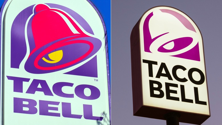
Although the first Taco Bell opened in 1962 (with these items on the menu), the company's famous mission bell logo wasn't introduced until 1985. The logo has mainly evolved since then by changing its colors, including the more grabby jewel tones of the 1990s (like bright purple and hot pink). These neon colors didn't just portray a youthful energy and excitement — they functioned as a differentiator, as well, helping the restaurant's signage stand out. In 2016, however, Taco Bell said goodbye to the rather cartoonish, multi-colored bell, and hello to a sleeker, flatter version.
The chain's new logo was minimalist, modern, and endlessly adaptable. Gone were the purple gradients, pink shadows, and playful outlines; instead, the brand introduced a more muted, monochrome purple logo — the type that can live anywhere from phone screens to brightly lit up neon signs on building facades. Taco Bell's latest logo redesign wasn't just about style, however — it was a signal that the company is tech-savvy, a digitally native brand ready to meet today's scrolling, snapping, app-ordering, Instagramming generation of consumers.
Some fans mourned the old bell, of course, missing its quirky charm and color-saturated energy. Then again, the new logo flexes like a pro. It's still recognizable as the Taco Bell mission bell, yet versatile and unafraid to evolve. It proves that even a simple dinner bell has to find its edge in the world of fast food, or risk being left behind in a sea of logos competing for our attention and dollars.
Kentucky Fried Chicken / KFC
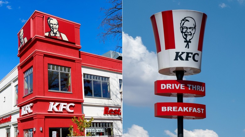
The original KFC logo consisted of a simple black-and-white wordmark that spelled out "Kentucky Fried Chicken," along with illustrations of newly hatched baby chicks placed below the capital letters K, F, and C. Of course, the brand replaced the chicks with a new centerpiece in 1959: The smiling face of founder Colonel Harland Sanders.
From then on, Sanders's likeness became the heart of KFC's corporate identity. It's been redrawn and modernized through many iterations, of course, including a 2018 refresh that stylized his portrait by flanking it with the brand's signature red stripes — echoing its iconic chicken bucket. The Colonel's southern string tie even inspired a viral moment in 2020, when a tweet suggested the tie resembled a tiny stick-figure body. The internet ran with the joke, sparking surprise, amusement, and countless memes.
Perhaps the most significant overall change to the company happened in 1991, though, when the company officially shortened its name to KFC. The move aimed to downplay the word "fried" (which was increasingly viewed as unhealthy), while sidestepping potential licensing fees tied to the trademarked name of the state of Kentucky. Although that issue has since been resolved, the abbreviation stuck, and KFC has been better known by its initials ever since. And if you're curious about what items you can still order from the original KFC menu, or if you want to recreate KFC recipes at home with 11 herbs and spices, we got you covered.
Burger King
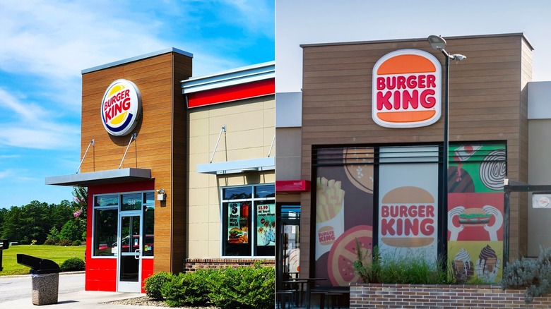
Like KFC, Burger King also started out with a simple black-and-white wordmark, with a stylized sunrise "crown" as the main part of its logo in the 1950s. It wasn't until 1969 that it created its first bun logo, which stayed in usage until 1999. That year, another logo refresh introduced a round, more dynamic logo inside a blue, C-shaped arc. For the next two decades, the fast food chain leaned into this three-dimensional look. However, the company revisited its own history in 2021 by unveiling a retro-style logo reminiscent of its previous 20th century design.
Emulating Pizza Hut, the brand chose to intentionally strip away the gradients and glossy shine, opting instead for a flat, bold design that echoed its earlier (and more iconic) logo. The move was widely praised by both branding experts and the general public, who felt the retro-inspired redesign carried a sense of authenticity and familiarity.
More than just a stylistic update, it tapped into a broader cultural wave of nostalgia, where consumers find comfort and trust in visuals tied to a supposed golden age of fast food and Americana diners. By embracing its roots, Burger King reminded people that some classics — like a really big hamburger known as the Whopper — don't need reinvention, only reaffirmation.
Domino's
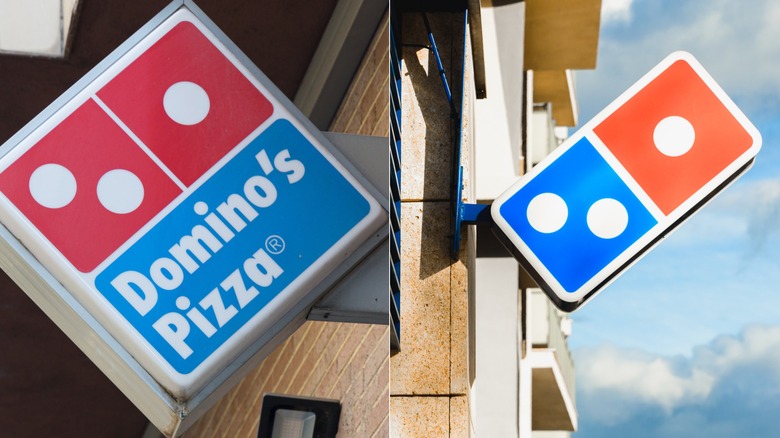
Founded in 1960 under the name DomiNick's in Ypsilanti, Michigan, the company rebranded as Domino's Pizza just five years later — complete with the now-iconic domino tile logo. The original design featured a red domino with three dots, meant to symbolize the first three stores. The plan had been to add a new dot for every new location, but the company's explosive growth quickly made that impossible.
Over the decades, Domino's has gradually refined its identity. Its kept the familiar domino while shifting from text-heavy logos to cleaner, bolder marks. The most significant logo change likely came in 2012, when the company shortened its name to Domino's, dropping the word "pizza" to emphasize its menu had grown beyond the signature product. The logo itself retained the familiar red-and-blue domino icon, though, maintaining brand recognition during the shift.
Of course, this move mirrors a similar strategy used by Dunkin' (when it dropped "donuts"): Using a name simplification to signal its offerings had expanded beyond the original category. For Domino's, the move was a nod towards sandwiches, pasta, and other menu items, hoping to capture more sales in those areas. The redesign helped reinforce the brand's versatility and appeal to a broader audience, making it clear the chain was no longer just a pizza delivery service (even if part of the restaurant's claim to fame is inventing the pizza box). It was a strategic evolution aimed at balancing tradition with innovation, and it paid off.
Wendy's
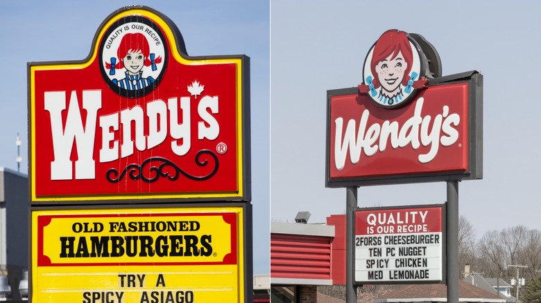
Wendy's original 1969 logo featured founder Dave Thomas's daughter as a cheerful, pigtailed redhead inside an old-timey oval sign. The logo text had an ornate, Western-style typeface, evoking a nostalgic, family-oriented, "Little House on the Prairie" vibe. Although the company has kept its redheaded mascot since its inception, in 2013, the chain gave its logo a major refresh.
The new design shifted away from the old-fashioned, woodcut-style portrait inside a decorative frame, replacing it with a cleaner, hand-drawn illustration with a more contemporary looking wordmark. All the text (except the name "Wendy's" itself) and the frame were dropped as well. This rebrand was more than cosmetic, however, as it reflected Wendy's strategic choice to continue competing with its fast food and fast casual rivals by modernizing and improving its brand image among consumers.
While some longtime fans missed the almost antique feel of the original logo, the more modern look helped Wendy's project freshness, friendliness, and a more contemporary personality — one that better matched its evolving identity. A subtle detail in the updated logo also sparked conversation, as the word "MOM" seemingly appears in the collar's folds. Some interpreted this as a nod to comfort food (meaning the food at Wendy's is as good as home made), though the company says the hidden message was unintentional.
Starbucks
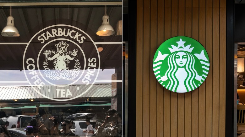
Starbucks began in 1971 as a single store at Pike Place Market in Seattle, selling whole beans, tea, and spices. Its first logo, designed by Terry Heckler, featured a detailed brown woodcut logo of a two-tailed mermaid — or siren — encircled by the words "Starbucks Coffee Tea Spices." The siren was meant to evoke seafaring tradition, as well as the exotic origins of coffee in far away lands. Of course, as Starbucks expanded through the 1980s and '90s, the logo evolved, too.
The siren was redrawn in green with cleaner lines, along with wavy long hair strategically covering her chest. The surrounding ring was simplified to "Starbucks Coffee," too, making the brand instantly recognizable. But the company made its boldest change yet for its 40th anniversary in 2011: Dropping the outer ring, removing all words entirely, and leaving only the stylized green siren.
This move reflected the company's evolution beyond coffee, though the change sparked some debate. Critics worried the new logo was too generic or lost its clarity without text. But the siren proved compelling enough to stand alone, luring in customers with her song. In fact, the Starbucks visual change is one of the more successful logo evolutions. By intentionally simplifying (rather than discarding) its imagery over the years, Starbucks has created a timeless symbol that signals a seemingly endless array of caffeinated beverages. Unlike Cracker Barrel's abruptly failed experiment with minimalism, the stand-alone green siren shows how a brand can gradually modernize while preserving its mythic core.
