

14 Farmhouse-Style Paint Colors That Give Your Kitchen That Cozy, Lived-In Look
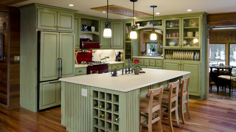
Kitchens keep getting cozier, and we're so here for this movement. Considering how much time we spend over a stove or at the table, it makes sense that we'd want the room to be warm, welcoming, comforting, and personalized. That's why farmhouse style is a popular (and timeless) approach. And if you want to know how to design your dream country kitchen, choosing a color scheme is one of the most important steps. The paint shade for your kitchen needs to fit that farmhouse-chic vibe, make you happy, and set you up well for coordinating counters, floors, appliances, and more.
The color possibilities are virtually endless for kitchen paint decisions, even with the farmhouse framework. There are many neutral paint colors that promise a classic kitchen, bold accent hues that make a statement, and everything in between. So, we're zeroing in on the pigment picks that most successfully deliver on that cozy concept. What shades really make you feel warm, happy, and at ease in your kitchen, even when you're juggling three different tasks on a chaotic day? Depending on whether you want to go light, medium, or dark, and for whatever direction you want to take for other surfaces and items in the kitchen, here are a range of options.
Warm white or cream
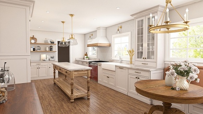
If you prefer a cleaner, more classic motif for your kitchen, you may be leaning toward white — a neutral blank canvas for your appliances, floors, and furniture. The key here, as with all farmhouse-esque color decisions, is to lean warm. Undertone is everything. The white you choose should not feel cold, clinical, or stark. It should look closer to off-white, with a cream feel. Look for shades like "oyster white," "alabaster," "creamy," or "pearl." This is a great choice if you want a more understated, versatile room that still offers that coziness.
Greige
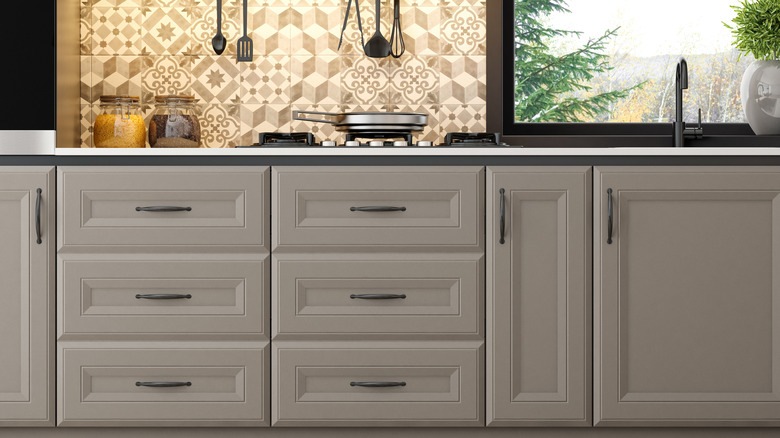
One step away from warm white is "greige." This color is still quite understated, neutral, and easy to match with other elements of your kitchen, but with a little bit more interest and depth. Just remember that here, too, you want a gray with warm (not cool) undertones. That's why "greige" is a better pick than simple gray, because that brown-ish beige warms the neutral hue up. Look for shades like "mushroom," "cashmere," or "dove."
Butter yellow
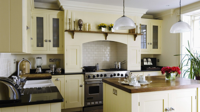
For even more warmth with a sunny feel — that happens to be very on-trend — venture into the land of yellow. Butter yellow kitchens are endlessly inspiring, simultaneously retro and country-chic. This warm pastel yellow is like a neutral with oomph. It works well with other shades like cream, sage, and cornflower, and looks especially farmhouse-esque with wood surfaces and lots of rich textures — try linen curtains, lace tablecloths, and woven placemats.
Sage
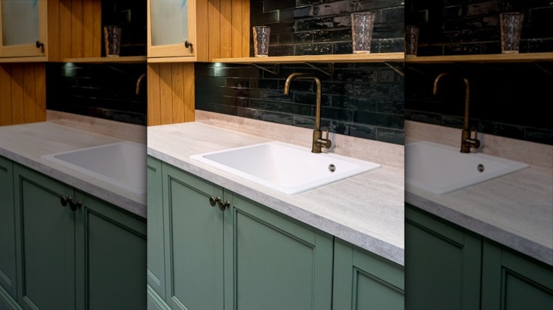
Sage green is an excellent choice for a farmhouse-style kitchen. It's muted enough to partner with wood surfaces and hues from cream and greige to cornflower and butter yellow but also feels fresh and intriguing at the same time. It makes a statement, but not one you'll be tired of in five years. It's not just warm; it's earthy, calming, and refreshing. In the kitchen, you can use sage for the walls, cabinets, or wood paneling, complementing it with tonal patterned tiles.
Cornflower blue
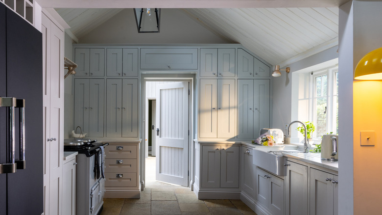
Another option in the "calming, refreshing, easy-to-match but subtly standout" category is cornflower blue. This brings an almost meditative blue-sky, blue-water vibe to your kitchen, working as an aesthetic anti-stress device. This pristine blue pairs beautifully with warm white or greige, and wood and marble pop against it with an elevated look. It also creates a foundation on which to build with different, deeper shades of blue as trims and accents.
Dusty rose
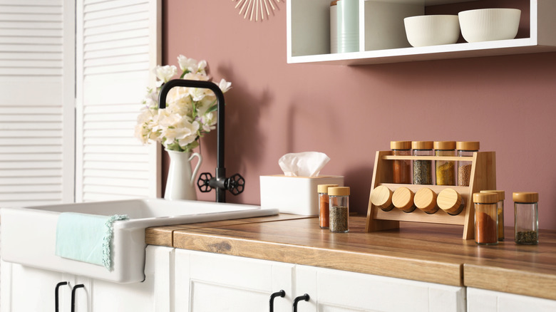
Dusty rose lives within the realm of sage and cornflower — quiet yet impactful. This shade was popular in the 1980s and is back in a big way. It embraces pink with a warmer tone that's a little purple-y, a little light brown. It makes a kitchen feel softer and introduces the feeling of fresh flowers with its rose petal look. Wood counters, furniture, or trims bring out dusty rose's warmth, and gold or brass hardware punch it up with some shine.
Terracotta
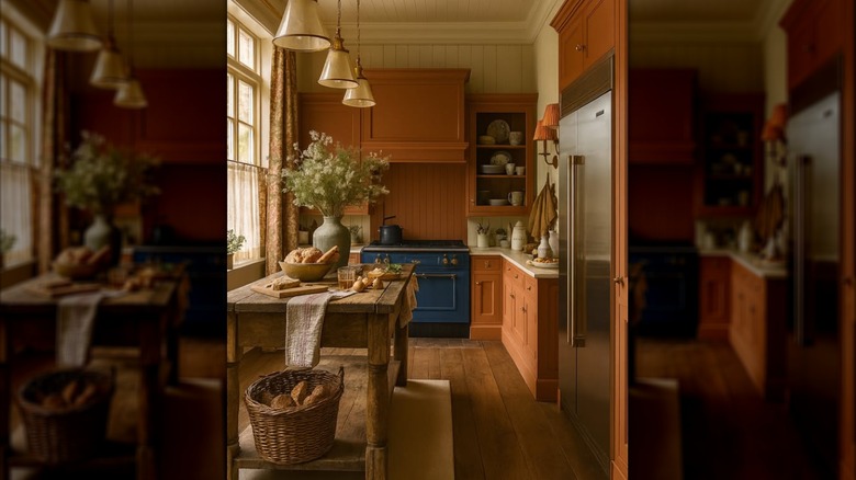
Moving deeper into the spectrum of warmth, we have terracotta. The color of sun-baked clay, this is maybe the first hue that comes to mind when you think "warm." It's a no-brainer for farmhouse kitchen because it's natural-looking and earthy. Terracotta matches so effortlessly with all beige-to-brown shades and wood surfaces. Plus, it plays well with pinker pigments and contrasts gorgeously with green and blue shades.
Caramel
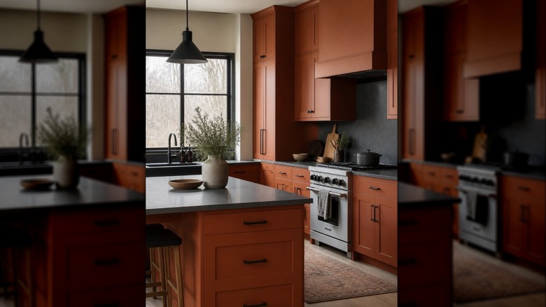
Maybe you want something more firmly in the brown color family, but don't want to go too dark. Caramel is an ideal compromise. It captures that earthy, woody mood perfect for farmhouse-style kitchens, but it's light enough that the space will still feel sunny and spacious. Team it with wood for a more country look, or even black trim for a modern twist.
Barn red
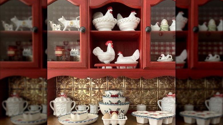
Barn red is more overtly "farmhouse" in the most country-chic way. Bold walls or cabinets are one of the biggest trends that work as antidotes to the bland all-white kitchen. Barn red is warm and classic, and stamps your kitchen with an artful, rustic flair. You can also opt for shades like rust, red ochre, or sienna. We love this color with brown wood, creamy neutrals, and all things gold.
Olive green
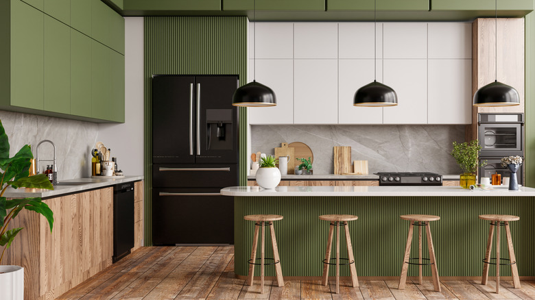
Thanks to its intrinsic earthiness, olive green acts like a brown shade in the neutral sense, but it still makes quite an elegant impact. It's lush, warm, and mimics the feeling of being in a forest or orchard. Olive green shades like thyme, rosemary, and moss appear rustic when paired with wood or gold and rich with creams, browns, and accent colors like navy or burgundy. Bring the color even more to life with lots of plants.
Hunter green
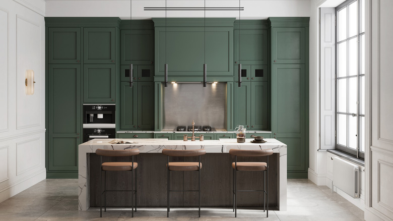
If you're really looking to make a statement and embrace a richer, more artful and saturated aesthetic, turn to hunter green. It envelops you with natural, woody warmth and teams so well with farmhouse kitchen staples like wooden surfaces and furniture. Hunter green looks great on an accent wall or trims and especially pops with tonal tile backsplashes or solid wood counters and gold hardware.
Navy blue
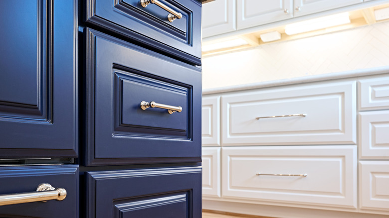
Sophisticated, timeless navy blue is one of those paint colors that instantly make your kitchen look more expensive. Use it for an accent wall, cabinets, or your island. Paired with warm white, gold, or brass, and textures like wood or stone, this color scheme is about as classic as it gets. It's Americana farmhouse-chic with an invigorating nautical twist.
Deeper brown
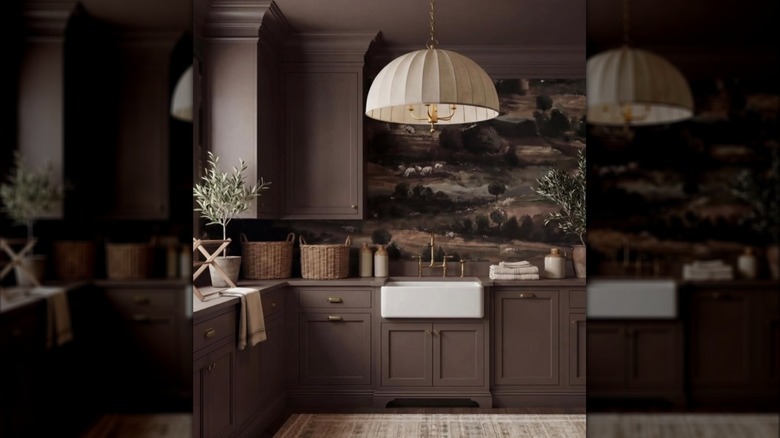
Darker, chocolatey brown provides more drama while remaining in the farmhouse-chic wheelhouse of warm, woody, and rustic yet elegant. It's great for an accent wall or island, but if you have a larger, airier kitchen with good natural light, it can work for higher coverage like walls or cabinets. This is especially true when teamed with lighter, brighter shades like cream and beige. Seek out pigments like coffee, mocha, pecan, hickory, cedar, or cinnamon for warm reddish tones.
Charcoal
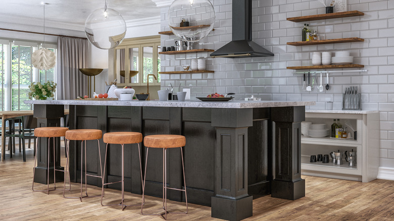
Don't be intimidated by the dark side of paint. Charcoal doesn't have to give your kitchen a goth vibe. Instead of inky jet black, it's light with gray and brown undertones, which is a warmer blackish color that feels earthy and stone-like. Thus, it pairs gorgeously with wood or marble. From cabinets to an accent wall, depending on your space, charcoal gives kitchens a back-in-time country elegance, especially with candlelight, copper, and even artwork.