10 Kitchen Design Horror Stories From Reddit
If you've been fervently following the kitchen trends that will dominate in 2026, you might be tempted to opt for a remodel. However, a kitchen upgrade is an expensive and high-stakes project — and mistakes are often difficult to undo. This is where online forums, like Reddit, can help. In fact, a closer look at the nightmarish kitchen designs abounding online reveal what happens once the contractors have left: poorly planned layouts, inconvenient appliance placements, and disjointed traffic flow.
The biggest takeaway from watching these real world case studies is ensuring you design a kitchen that actually supports your everyday routines and rituals. If access to necessary amenities is consistently obstructed, even the smallest oversight can balloon into a major annoyance. Many errors can't be fixed quickly, either, leading to costly do-overs and repair jobs. You could also be sabotaging the perceived resale value of your home; potential buyers often have an eagle eye that's unlikely to miss major design flaws.
To prevent future regret, you'll want to use these cautionary tales to sharpen your own design logic and thinking. Once you move beyond trends and start focusing on longevity, you'll be able to plan your kitchen with the methodical mindset of a structural engineer. Here are 10 kitchen design horror stories from Reddit that will help you carefully consider your next remodel.
A bathroom inside the kitchen
We get it: When you gotta go, you gotta go. However, walking a few extra steps to reach the bathroom is a small price to pay when nature calls — especially if the alternative is having a toilet seat placed at a stone's throw from your frying pans. Such was the case with the kitchen nightmare shared by user _ZoeyDaveChapelle_ on Reddit – which featured a bathroom built inside the kitchen.
Now, no building inspector is ever going to sign off on this layout for several reasons. For starters, there are the sanitary concerns. The simple act of flushing the toilet releases airborne pathogens, including E. coli. These can easily float towards surfaces used for food prep. When you manage to think beyond the odor transfer, there are the acoustics — the last thing you want to hear when brewing coffee for breakfast is someone flushing down last night's dinner.
You may not have a bathroom located seconds away from your stovetop, but most kitchens suffer from odors you'd rather live without. The best course of action is to invest in proper ventilation. Range hoods are non-negotiable for trapping smoke, pollutants, and grease particles emitted during cooking. A wall-mounted exhaust fan can further transfer fumes and unwanted odors outside. Finally, air purifying solutions — whether in the form of a device or strategically positioned plants — can neutralize lingering odors.
Most of the workspace is unusable
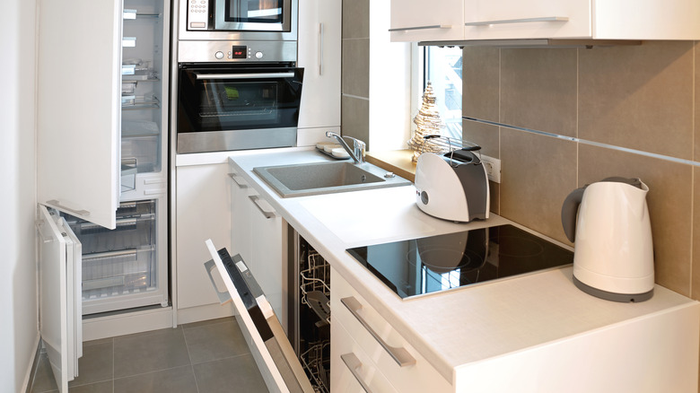
No matter how many work surfaces you have in the kitchen, it is never quite enough (all the more reason to brush up on these organizational hacks to create more countertop space). It's easy to see why the awkward kitchen layout shared to the r/kitchenremodel Reddit thread. Showing a U-shaped layout tucked into the far corner of the room, leaving an excessive amount of floor space unutilized. Oddly sized cabinets impede access to the existing countertops. Matters are further complicated by a tall boiler cabinet that eats into the limited storage space available.
A vast expanse of empty floor can create the illusion of space, but this layout comes at the cost of everyday functionality. The ideal kitchen should offer ample work surfaces for prep and landing zones for storage — all of which are conspicuously absent here. Mealtimes can quickly devolve into endless back-and-forth across the room, increasing the risk of accidents and spills while carrying heavy or hot items.
If your kitchen doesn't have as much countertop space as you'd like, some quick fixes can help. Rolling in a kitchen trolley or butcher block cart can instantly create a handy surface for meal prep. Leveraging vertical storage can further optimize the space you have available. Wall-mounted racks can be added for storing cooking essentials, such as spices and oils, at hand.
Retro green countertops against tiled walls
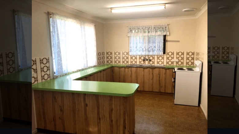
Retro kitchen design ideas may be roaring their way back to trend charts, but certain hues simply look outdated rather than a clever throwback. Case in point: The lime green countertops resting atop wooden cabinetry in this Reddit post shared to the r/femalelivingspace thread.
The visual overwhelm is further compounded by the tiled backsplash. With the countertops and backsplash both competing for attention at the same eye level, it creates a greater sense of visual chaos. This is why, design experts often recommend that bold elements in the kitchen should be flanked by neutral design choices that give the eye some space to rest. Of course, being saddled with an unfortunate hue is a common woe, but redoing countertops is an elaborate task.
Although there are several ways to save money on countertops, not everyone has the time and energy to spare. The only way out then is to bring other visual anchors into the room. Decorative flourishes, such as vases, lively artwork, and floating shelves, can draw attention away from the countertop. Artfully displayed cutting boards, decorative trays for corralling salt and other essentials, and cozy linens can further camouflage unflattering countertops. Partial fixes also exist in the form of peel-and-stick backsplash. When chosen thoughtfully, it can temper a bold countertop hue and bring a greater sense of visual harmony to the space.
Windows obstructed by a faucet and lighting fixtures
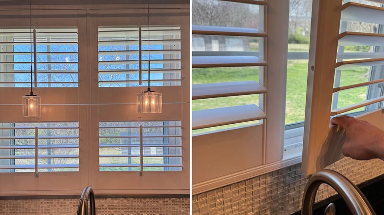
Adequate ventilation, sufficient air circulation, and maximizing natural light: kitchen windows have an important role to play. However, all of these goals can be undone by poor interior design choices. Further proof of the same can be found in this Reddit post. Shared by user Downtown_Artichoke61 on the r/kitchenremodel thread, the simple addition of a tall faucet and twin light fixtures manages to obstruct the basic function of the windows.
Accounting for the clearance area for a window is kitchen design 101. However, design fixtures getting in the way leaves the window functionally useless. After all, you're unable to ventilate the room, reduce moisture, or allow natural light in. Even if you don't have a faucet playing spoilsport, like in this example, inadequate window clearance is a common woe. Strategic design choices can help, though; instead of having doors that swing out, it helps to opt for blinds or shades that swing up.
If you're living in a rental or working on a tight budget, though, the only option is to get creative. These 14 plants can survive in low-light kitchens and will easily improve indoor air quality. Adding a dehumidifier can also aid in reducing moisture buildup from cooking. Brightening hues, such as white and lavender, can further liven up a dark space.
A range hood located opposite the stovetop
The only thing worse than a kitchen without a range hood? One located opposite the stovetop. In this Reddit post shared by user YouCanCallMeQueenB to the r/CrappyDesign thread, a freestanding stove is positioned on one end of the kitchen. On the opposite end, a range hood is proudly perched atop a blank expanse of tiled countertops — meaning the basic purpose of capturing grease and smoke right at the source is defeated.
It's a known fact that the range hood plays a bigger role than simply whisking away odors and pollutants. It prevents grease and airborne particles from settling on your walls and cabinets. Of course, if it isn't located directly above the stove, it merely becomes a decorative fixture with no functional value to offer.
If your rental happens to be missing a range hood, you can address this issue in other ways. Simply opening the windows while cooking or placing a table fan on the countertop can improve air circulation. Portable air purifiers can also further safeguard indoor air quality and keep unwanted odors at bay. If you're worried about grease accumulating on the areas around the stove, consider using a splatter guard while cooking.
An oven placed on the floor
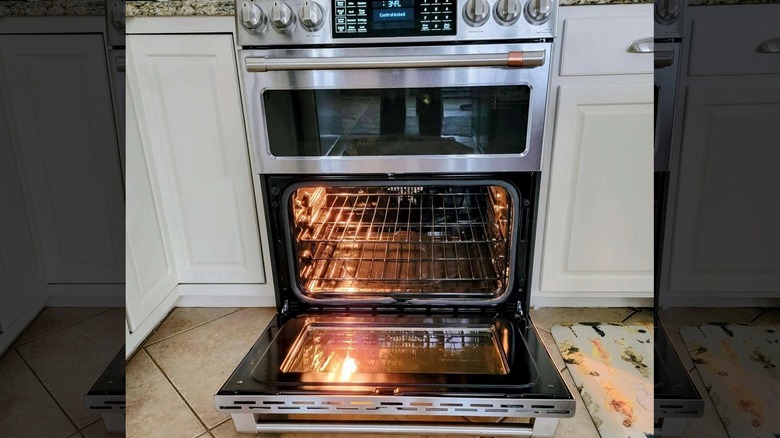
If you've been falling behind on your squat count for the day, the oven placement in this Reddit post shared to the r/kitchenremodel thread can help. Instead of the standard position on the countertop, this oven made heads turn with its placement directly on the floor.
The drawbacks of this design nightmare are obvious. After all, you'll have to precariously crouch when loading and removing hot items, which can easily become a safety hazard. Even the simple act of checking whether your soufflé has risen might strain your back and knees. The everyday workflow in the kitchen also becomes fragmented since the oven controls aren't at eye level.
For those wondering, the standard rule is to place the oven on a bare stretch of countertop. Having ample landing space around the oven can help you land heavy pans quickly. The oven should also be away from other sources of heat, such as the stove or the refrigerator. Integrated ovens positioned just below the counter are increasingly becoming popular, but they should remain no lower than waist level. This eases the process of loading and unloading the oven, while also helping you maintain an eye on temperature levels.
A kitchen island with load-bearing pillars
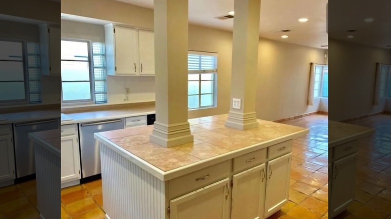
One of the primary functions of a kitchen island is to generate additional workspace. However, bad planning can undo this purpose. For proof, look no further than the kitchen design nightmare discussed on the r/homedecoratingCJ thread on Reddit. "Will this hold my TV?" quipped Redditor Ok_Knee1216, while sharing a photo of his kitchen island situated under two load-bearing pillars.
Now, a load-bearing pillar likely doesn't feature on anyone's wish list for their dream kitchen. It doesn't provide much by way of usable workspace, and the island placement becomes an unnecessary obstacle blocking the organic flow of movement around the kitchen. Food preparation becomes fragmented by the lack of uninterrupted counterspace, while the visual cohesion of the kitchen also takes a beating.
But when removal isn't a possibility, the only solution is to lean into it as an intentional element of your kitchen design. By dousing it in the same colors as the rest of the kitchen, it can become a harmonious member of the family rather than a distant cousin no one gets along with. Attaching a vertical bookcase to one end of the pillar can further add functionality by keeping your go-to cookbooks at hand. Columns can also be used as a visual divider to segregate between different zones in the kitchen, such as cooking versus entertaining.
A staircase in the middle of the kitchen
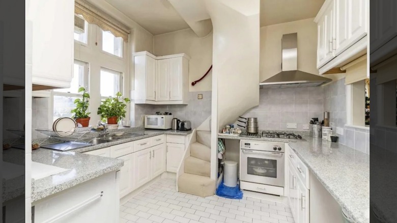
The "Harry Potter" books helped popularize the notion of a bedroom under the stairs. But those would have drawn a line at this kitchen under the stairs design seen in the r/CrappyDesign thread on Reddit. Curving awkwardly into the center of the room, the stairs break the continuous stretch of counterspace that every home cook yearns for. And since the stove hugs the side of the stairs, those walking down are likely to barge in on the most accident-prone area of the kitchen.
Greasy floors and spills around the base of the staircase can further dial up the risk of injury, so if you have one (or a similar immovable architectural feature) in your kitchen? Make the best of a bad situation by optimizing your everyday workflow as much as possible.
Positioning the stove and the sink on the same side of the kitchen can allow seamless movement between tasks. Adding rugs and runners can create a safe path that guides the traffic flow away from the busy zones in the kitchen. Finally, opting for floating shelves instead of overhead cabinets can help reduce the visual bulk from the upper section of the room.
Awkward cabinet and appliance placement
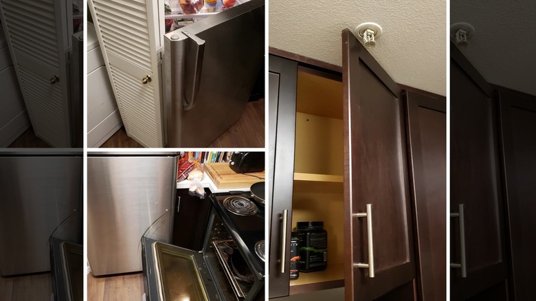
A cabinet door that's obstructed midway by a protruding fire sprinkler. A refrigerator that collides with a neighboring door. An oven door that gouges the aforementioned fridge each time it's opened. Even with a cursory glance, the cabinet and appliance placement in this kitchen, shared by chefmacari on the r/CrappyDesign thread on Reddit, serves as a laundry list of what not to do.
When appliances are placed without careful consideration, they can block access to everyday utilities and disrupt the workflow in the kitchen. Cabinets that don't open fully lead to wasted storage and become an everyday nuisance. So if you'd rather not have your appliance placement end up as a cautionary tale on an online forum, some simple principles can help. For instance, it's generally agreed that the golden triangle doesn't work for all kitchens, so it helps to optimize your space for your daily routine instead.
Additionally, refrigerators are best positioned in a corner so that the open door doesn't create congestion while you unload groceries. The sink and dishwasher are meant to be placed together, but the oven should be relegated to a separate wall in a lower traffic area. A minimum clearance of 48 inches is usually required within the aisle, so appliance and cabinet doors can swing open freely.
Flooring that clashes with the cabinets
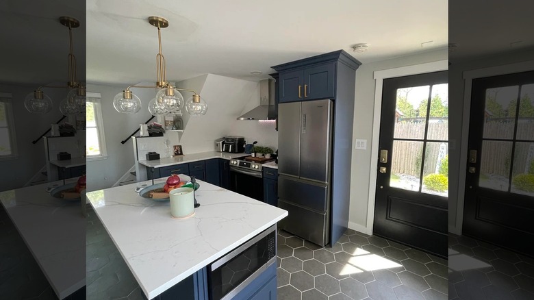
Navy blue cabinets? An on-trend choice for 2026. Neutral walls? Great supporting cast. However, it was the hexagon tile flooring that played the spoiler in the redesign shared in the r/kitchenremodel thread on Reddit. The stark floor tiles are further paired with lighter grout — a jarring contrast that simply amplifies the tension in the space.
Now, bold design choices can serve as an instant conversation starter. But the standard rule is that one element should lead the dance while others follow, which isn't the case here. Consequently, there are some key principles to be followed when choosing flooring for your kitchen. If your cabinets are dark, it helps to go lighter with the flooring. This keeps the focus squarely on the former, rather than having both elements compete for attention. If your kitchen layout is cramped, neutral hues can create a greater illusion of space.
Patterns, meanwhile, should be wielded with careful consideration. Before making this bold design choice, glance around and ensure that there are no other strong patterns in the space that might create visual overwhelm. And if you ever find yourself in the unfortunate situation where you regret your flooring choice, a thoughtfully chosen rug or runner in high-traffic zones can bring a sense of cohesion back to the space.