8 Restaurants That Went Retro For A Logo Rebrand And Proved Old-School Design Still Wins
Anyone who grew up going to the same restaurant weekly knows how much it stings when your favorite nostalgic spot undergoes a modern rebrand. A new logo is usually the first thing to come, and it's uncommon for companies to switch back — but not impossible. Some chains have brought back old-school logos to much positive reception, proving that vintage aesthetics are going through a renaissance.
There are several reasons why restaurant chains have bet on nostalgia to lure in customers. Even the most serious grown-ups could use a flashback to the joy and simplicity of childhood, and being transported to the favorite restaurant of your youth can put a smile on anyone's face (and open up your wallet). Some companies give discontinued fast food items a comeback or revive ad campaigns, but a logo can be even more powerful since it represents the whole brand. Colorful, friendly, vintage logos are an antidote to edgier, sleeker designs that some people find too cold and corporate — a bias that may transfer to their opinion of the restaurant. Retro designs bring back a sense of trust and comfort that makes any eatery feel warm and inviting again.
The internet also plays a role in the retro restaurant revolution. Millions of fans can discuss memories of dining out on social media and directly contact companies with their thoughts. When businesses bring back a logo fans have been missing, customers feel heard and appreciated — just ask these eight restaurants that tried it out.
Pizza Hut
When it comes to taking advantage of nostalgia, no one out-pizzas the Hut. Pizza Hut's red roof logo with wavy font first said "goodbye" in 1999, making way for a sharper design. In 2019, the company brought back the original logo and renovated some locations into old-school Pizza Huts that feel like you've stepped into the '90s. Millennials and Gen Xers could hardly believe their eyes and gave Pizza Hut plenty of free advertising via social media.
Cracker Barrel
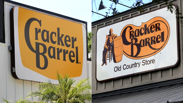
In August of 2025, Cracker Barrel changed its rustic logo — featuring an iconic figure known as the "Old Timer" – to a simple gold sign. Customers who felt the chain had disrespected its country roots erupted in anger on social media, causing the brand's shares to go down. A Cracker Barrel co-founder even called the disaster "pitiful." The old logo was brought back the next week, but this still counts as one of the biggest restaurant logo changes ever.
Burger King
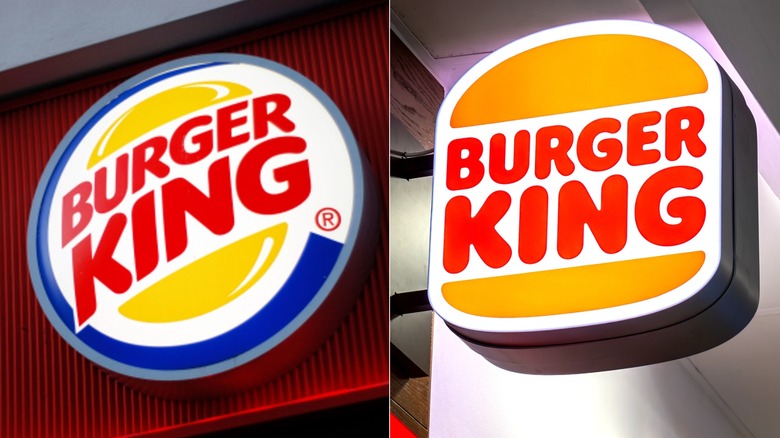
Gen Zers know Burger King by its 1999-born red, yellow, and blue logo, but older generations fondly remember the cheery burger-shaped icon that debuted in 1969. In 2021, the fast food giant brought back its retro logo with slight updates, a surprise that garnered much fanfare among customers. The redesign was accompanied by Burger King initiatives to remove artificial ingredients and emphasize sustainability in its menu items, a clever move to draw in even more sales.
Subway
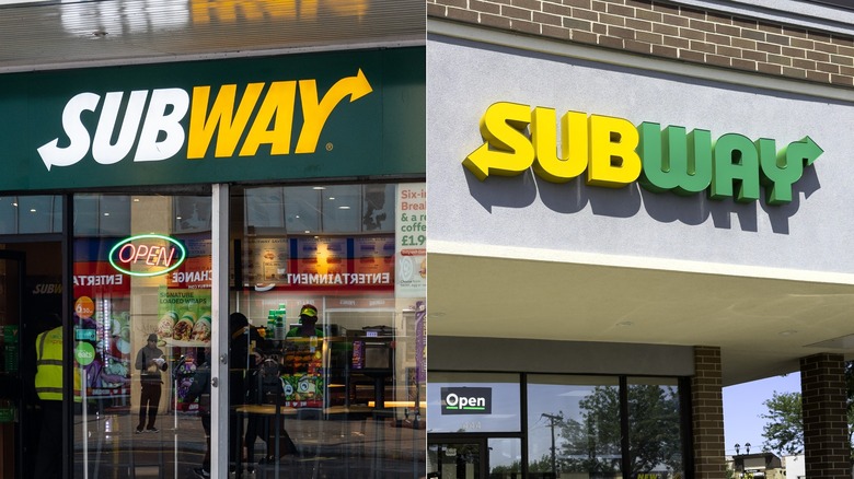
Subway is arguably defined more by the distinctive smell of its stores than its logo, but that yellow, white, and green sign is just as alluring to loyal fans. In its 2016 logo update, Subway decided to please customers old and new, borrowing the font from its black-and-yellow logo from 1969 to 2002, then updating the color scheme to be similar to its more recent "slanted" logos. The result is a vintage throwback with a fresh, simple, yet modern appeal.
Arby's
The Arby's cowboy hat is one of the most recognizable fast food designs, which is probably why its logos mainly play around with the text — but that doesn't guarantee safety. In 2012, Arby's changed its simple red logo to use a sharp lowercase font, 3D rendering style, and darker shade of red. Scores of fans complained that the rebrand looked terrible and didn't suit the famous hat, leading to a 2013 redesign that brought back the serif font and 2D style.
Hard Rock Cafe
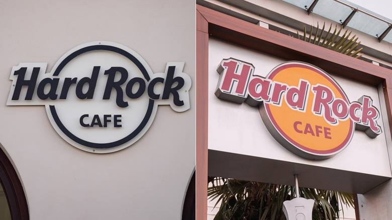
Given its theme, it only makes sense that the Hard Rock Cafe would revive its oldest logo. Its 1972 red and tan icon was designed by legendary artist Alan Aldridge, who worked with bands like The Beatles and The Who. In 1981, the restaurant debuted a new black and white logo that was, frankly, a bit boring. Three years later, the Hard Rock Cafe released its current logo that pays tribute to the original, much like an exciting (yet respectful) cover of a classic song.
McDonald's
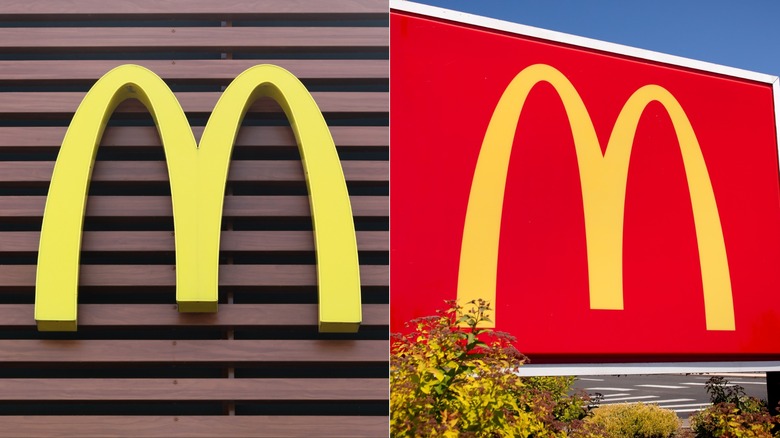
Refer to "the Golden Arches" around any fast food fan, and they'll know you're talking about the McDonald's golden "M." This icon debuted in 1961 and hasn't changed much, though one element that keeps coming and going is the red background. The logo first gained a red rectangle behind it in 1975, but that was completely gone by 2003. In 2018, after a few years of leaving the "M" on its own, McDonald's put it back over a bright red square to create its latest logo.
Little Caesars
The mascot for Little Caesars is right there in the name, so the logo should put the pizza-loving Roman fellow front and center. From 1971 to 2000, the logo featured a larger, full-body illustration of Little Caesar. In the early aughts, he was shrunk down into a tiny portrait next to the chain's name. Luckily, he earned the spotlight back in 2017, when the pizza joint released an updated version of its 20th-century logo.
