We Ranked 16 Chain Restaurants' Decor From Worst To Best
A lot goes into creating an enjoyable experience for diners. It's not just about the food, the service, and the drinks. It's about the overall ambiance, which decor can heavily influence. National chain restaurants carefully consider their aesthetic, including furniture, paint schemes, glassware, and cutlery.
Indeed, ambiance is so important that many chains have embraced psychological research that shows that visual and sensory cues in a dining space can influence how food is perceived in terms of taste, quality, and value. For example, soft, warm lighting can enhance the appearance of dishes and create a sense of intimacy, while harsh, bright lights may make a meal feel rushed or impersonal. Likewise, colors can affect mood: Earthy tones often evoke relaxation, while bold shades may stimulate appetite and energy.
Let's see how chains with at least five locations across multiple cities — including fast-food chains, casual dining establishments, and upscale chains — have chosen to decorate their restaurants and how it affects the dining experience.
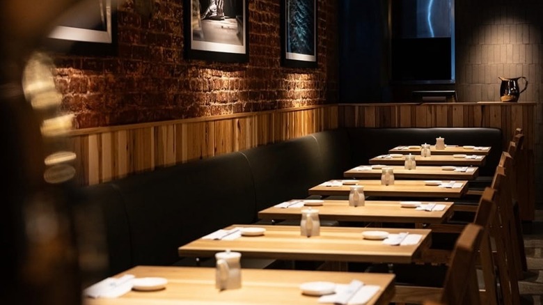
Emmy Squared
This chain of Detroit-style pizza restaurants has locations in major cities down the East Coast and a few on the West Coast. While not every restaurant looks the same, the general aesthetic is part industrial chic, part bistro, and generally with low lighting. Chairs tend to be made of simple wood and metal, tables are either wood or a simple white material, and the rest of the room is typically white or painted in a very "safe" color, complemented with a few interesting light fixtures.
The aesthetic is clean and a real people-pleaser. That said, the decor also resembled "Anywhere U.S.A., restaurant edition." Walking into Emmy Squared feels like you could be walking into any contemporary restaurant serving modern American cuisine. In other words, while not offensive to the eyes, there is not much about the decor at Emmy Squared that stands out as memorable or particularly inventive.
Uno Pizzeria and Grill
Uno may not have the best food on the planet, but they seem to have done something right with the decor, because their signature checkerboard floor tile and black, green, and red color scheme with Art Deco leanings inspires a warm and fuzzy feeling in the tummy.
Uno claims to have invented the deep-dish pizza in Chicago back in 1943, and the retro decor communicates that. The large chandeliers emitting a dim light and the many cozy booths evoke a bygone charm that is worthy of a city so well known for towering Art Deco architecture. That said, Uno Pizzeria may have seen better days, with many locations having gone a little to the wayside. Perhaps some modern updates are needed to make the decor as appealing as it was in the good old 1990s.
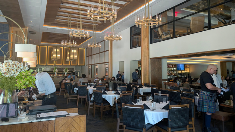
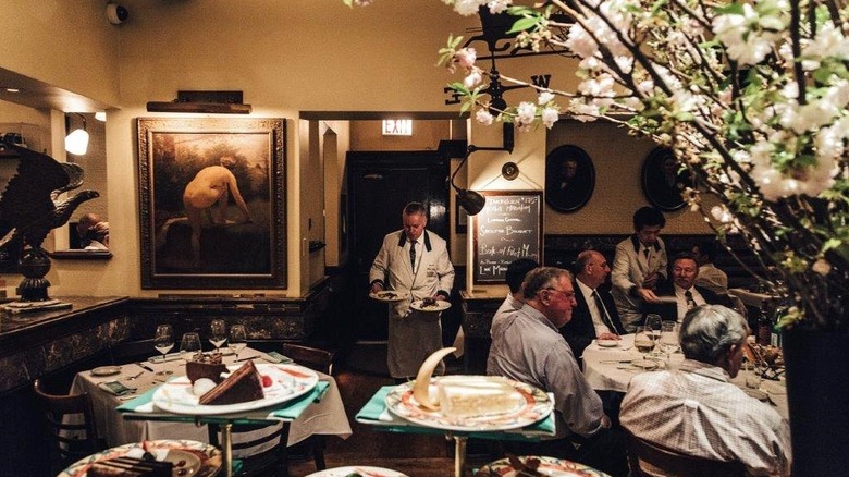
The Capital Grille
If you're looking for plain, traditional, and reliable restaurant decor, the Capital Grille is your place. Fashioning itself as an upscale steakhouse, there are mahogany panels, white tablecloths, crisp napkins, and a fancy lamp on each table. The decor is decidedly grown-up, though in a 1980s sort of way, where a dining room decked out in the finest linens and accessories tended to look a bit stuffy rather than sophisticated.
A saving grace might be the Art Deco chandeliers, which give each Capital Grille dining room a sense of grandeur befitting a dry-aged steak and the full-bodied wine accompanying it. Even so, the heavy use of mahogany might suit older tastes, but it leaves some feeling that this steakhouse may need some renovations to bring it firmly into the modern era.
Legal Sea Foods
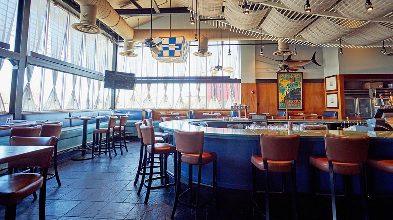
Legal Sea Foods is a small chain with restaurants around the Northeast. It stands somewhere between casual and sophisticated, and its decor represents that space perfectly. Although details may vary from location to location, the seafood restaurant typically features a tasteful nautical-themed decor, with dark blues dominating the color scheme, and images of seafaring items like nautical knots displayed on the wall.
Those restaurants located on the waterfront also make use of their views in their decor, using window walls to maximize views of the water, as in Legal Sea Foods' Harborside location in Boston. The lighting is also carefully thought out: There is plenty of it to see your way around, but it's not so harsh as to make you lose your appetite. Even so, there is something bland about many locations, as if the decor were trying to please so many people that it ended up foregoing interesting details and ultimately pleasing no one.
Shake Shack
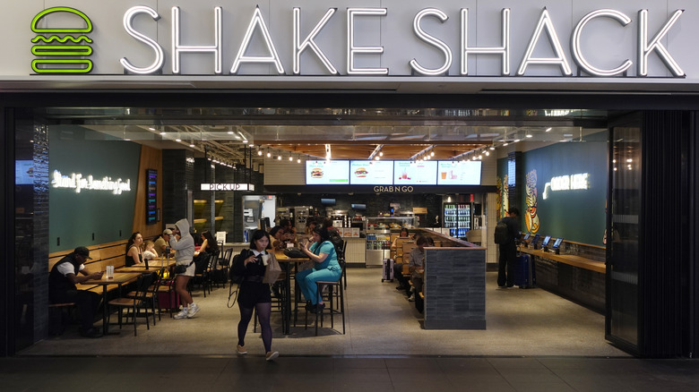
It may be hard to think of fast food joints as having an intentional decor, especially when it's as understated as Shake Shack. Those plain gray menu boards, surrounded by elegant wood paneling or patterned tile, wooden tables, metallic trimmings, and cement flooring, evoke sophistication rather than the typical fast-food aesthetics. It's enough to turn a regular cheeseburger into a gourmet experience.
The gentle lighting, sophisticated building materials, and thoughtful design –- Shake Shack collaborates with local builders to adhere to local architectural character -– do a lot to contribute to a pleasant dining atmosphere. The decor reflects the quality of Shake Shack's burgers, which are somewhat expensive for fast food. The meat is supplied by pre-eminent Pat LaFrieda, who also supplies some of New York City's top restaurants. Saying that, the decor often remains very simple and doesn't take many risks.
The Cheesecake Factory
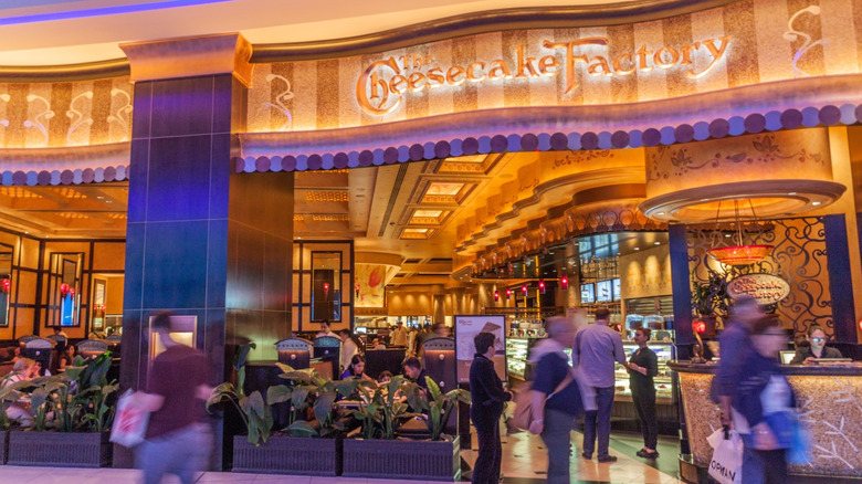
There is something beautiful and grand about Cheesecake Factory locations, even though the dim lighting probably helps to hide some cost-cutting and blemishes that would be all too glaring in the clear light of day. Regardless, this grandiose atmosphere is no accident. It's the work of restaurant and hospital designer Rick McCormack, who was hired to design the sixth location of the chain.
The decor is hard to overlook when you walk into a Cheesecake Factory. Egyptian columns combine with Victorian touches to create a feeling of opulence, at least on the surface, that matches the seemingly interminable Cheesecake Factory menu. In other words, the decor is too much, the menu is too much, the portions are too much, but taken together, it works. While it is certainly kitsch, the design seems to integrate this idea and lean into it to create a charming restaurant atmosphere.
Jack's Wife Freda
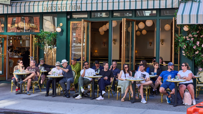
Between the chairs and the hopping atmosphere, one might think Jack's Wife Freda was a typical Parisian bistro. At times, some locations are even decked out in beautiful flowers, like a postcard fantasy of the City of Light. Inside, French bistro tables line the walls while simple yet elegant light fixtures provide a bright -– but not too bright -– atmosphere for family dining and friendly conversations.
Indeed, the outside of this restaurant is so pretty that it is often featured in paintings and prints. That said, the interior, while cozy and welcoming, can seem a bit bland, especially when compared to the charming exterior. Simple, forgettable light fixtures descend from the ceiling, and at night, when the brightness of the colorful dishes dissipates, there is not much color to draw the eye, leaving behind a scene that could be taking place in any restaurant, in any city.
Five Guys
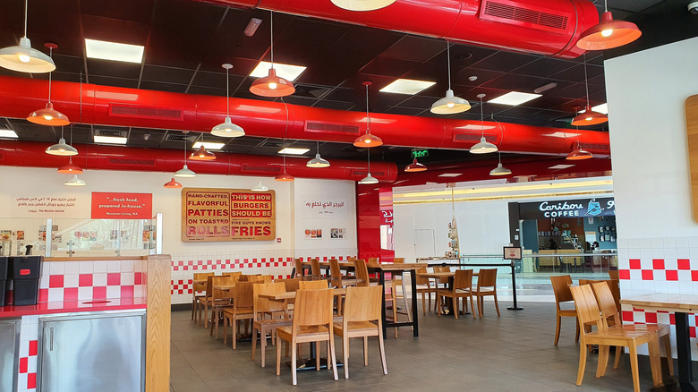
These days, Five Guys is almost as recognizable as McDonald's once was, thanks to its bold and unique red and white checkered color scheme that remains consistent throughout the chain, both nationally and internationally. The look has an endearing, nostalgic feel evocative of 1950s Americana, and the red coloring is a smart touch since research has shown that the color red tends to make people eat more.
Restaurants are outfitted with retro-style soda machines, peanut bags, and wooden accents, adding a clean, modern look. The lights are practically blinding, so this is no place for an intimate dinner, but not everything has to be elegant and sophisticated.
P.F. Chang's
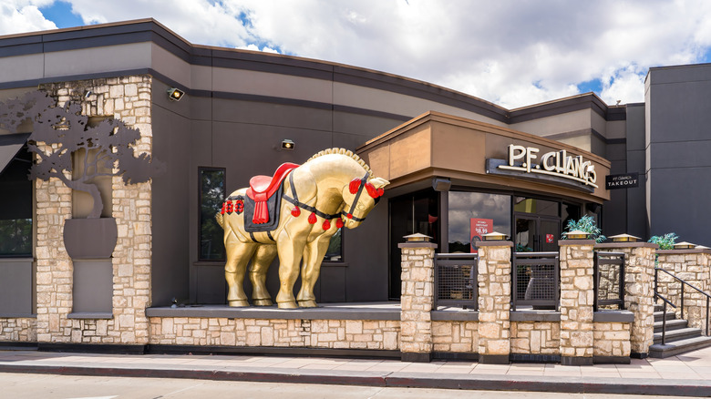
Since opening in 1993, food hasn't been the only reason for P.F. Chang's popularity. Sure, you can probably get a good meal there, but the dining experience is about the visuals as well as the victuals. Each restaurant has a horse statue standing by the entrance, and the kitsch style continues inside with Chang's signature red and gold paint scheme.
The chain has toned down the colors in recent years, adding gray, wood, brass, and other neutral tones that reflect modern tastes. The dark, moody elegance remains intact in most locations, owing to dim lighting and dark and light woods on the walls. Meanwhile, other decorations highlight the restaurant's exoticism, like large murals of women wielding katanas, which may be an American's dream of Asia rather than an authentic expression of its culture.
Wagamama
Before Wagamama took off in the USA, it was big in the UK, where Brits have been enjoying both its food and inviting decor since 1992. Wagamama boasted an open kitchen before it was cool, making it an integral part of its decor. Aside from that, the aesthetic is decidedly industrial chic, and despite being Japanese by way of the UK, its look is very "Brooklyn," with exposed brick walls, high ceilings, wooden tables and chairs with metal legs, simple but elegant light fixtures, and often polished cement floors. This look creates a somewhat upscale ambiance, though the food, while fresh and good, is mid-range.
Fogo de Chao
Steakhouses are supposed to be fancy, elegant affairs, and Fogo de Chao's decor reflects that. Although details vary from location to location, the restaurant has invested in an award-winning design and architecture firm, which has decked out Fogo de Chao locations with various iterations of natural wood finishes, open dining plans, showstopping chandeliers, vaulted ceilings, and key touches meant to recall the Brazilian origins of the restaurant while paying homage to local aesthetic preferences.
Whatever your taste in decor may be, it's clear that the restaurant has not held back on cost when renovating or building its new restaurants. For instance, a recently completed location in Brooklyn features a custom mural of a woman and her horse. The mural itself celebrates Brazilian culture, while all that surrounds it — such as blackened steel — is very much in keeping with Brooklyn's industrial chic style.
Snooze

Snooze is a breakfast and brunch place that started in Denver and now has locations across the western United States. The place is decked out in bright colors, perhaps in a genuine effort to wake people up in the morning. Tables might be orange or yellow, and the same goes for the chandeliers, while the booths could be any range of bright or pastel colors.
If you start to feel overwhelmed, there's really nowhere safe to lay your weary eyes. But if you're up for an energetic breakfast, the bright decor is a feast for the eyes. Implausibly, the bright colors work well together, creating a fun atmosphere brought together by a somewhat retro look with soft angles, rounded countertops, and light fixtures or chairs that might look at home in the Jetsons' kitchen.
Sugarfish
If you like to eat surrounded by natural elements, you can either dine in a forest or head to Sugarfish, a Japanese omakase-style sushi chain with locations in Los Angeles and New York. Restaurants may differ slightly in their decor, but they are typically wrapped in wood paneling on the walls, ceiling, seating, tables, or all of the above.
The rest of the decor tends to be understated, mimicking one of those Japanese restaurants whose prices are unattainable for mere mortals. But Sugarfish is consistently affordable, especially considering it's a big city restaurant with a largely seafood menu. So it's nice to be able to arrive, take in the smoked lighting, polished concrete floor, and wooden paneling — without feeling you have to give up your firstborn son to pay for it all.
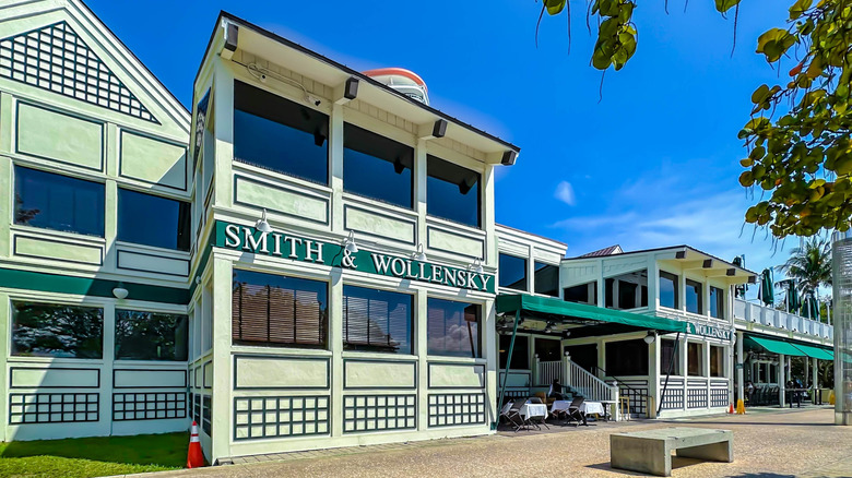
Smith & Wollensky
The signature green, black, and white color scheme is an integral part of Smith & Wollensky's old-school aesthetic, especially in its New York locations in Midtown Manhattan. Other Smith & Wollensky locations, while maintaining the unique color scheme, use other decor elements to their advantage.
In Chicago, floor-to-ceiling windows line the dining room, giving patrons a direct view of the river, while in Miami, the tasteful bistro chairs and tables are lined up outside with a perfect view of the marina and passing cruise ships. While some may find the interiors lacking in some respects — especially the dated beige walls and mahogany accents — Smith & Wollensky restaurants remain inviting, classic spaces.
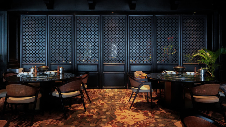
Din Tai Fung
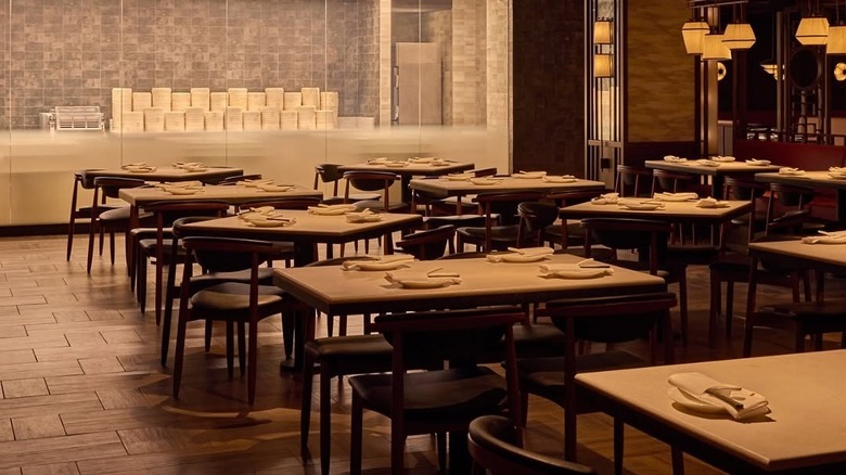
After finding success on the West Coast, Din Tai Fung now has locations at Disney and in New York, the largest and most upscale in its American portfolio. Indeed, the New York venue of this Taiwanese chain was designed by the Rockwell Group, notable for having designed such high-end eateries as Nobu and the Union Square Cafe. It includes a glass cube as an entrance, which leads downstairs to a dimly lit dining room governed by the concept of round garden wall entrances, which is a key element in traditional Chinese gardens.
Reds and golds abound in this space, imparting a sense of opulence to the rooms, while a tapestry-inspired ceiling in the central room was intended to evoke the drama that unfolds in the nearby theaters. Most other Din Tai Fungs are not quite as extraordinary. They typically have clean lines, a modern aesthetic, and idiosyncratic touches like paper lanterns and shoji windows and doors.
Daily Provisions
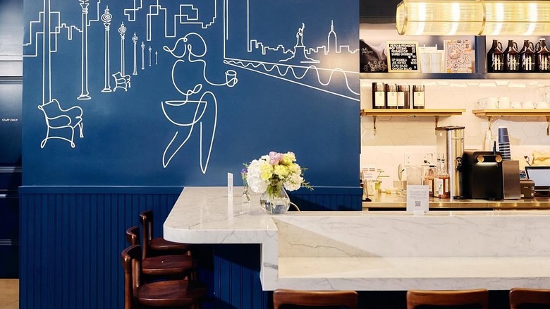
Daily Provisions uses a lot of blue in its decor: It's on the walls, the cupboards, behind the counter, in the bathroom, and pretty much everywhere else you look. It's a lot of blue. But it's a very nice blue. It's a calm, peaceful color and balanced by the white marble countertops and brass and wooden features.
Indeed, Daily Provisions, designed by the prestigious Rockwell Group, won a Notable Built Environment Award in 2018. While we have no idea what that means, it sounds great, and the premises certainly look award-winning. Details are very clearly well thought out, with furniture and fixtures designed to adapt to the changing needs of the restaurant as it moves from breakfast location to casual evening drinking establishment (the bakery becomes a wine display). In other words, the space is both beautiful and multi-functional.
Methodology
Decor trends play a significant role in the restaurant industry, whether they are mom and pop establishments, fast-food joints, or high-end individual restaurants or chains. Indeed, many restaurants these days go all out and hire top-notch architecture and design firms to create appealing spaces that will encourage return customers.
That said, some of these ventures fail miserably and end up looking like grandma's living room, while others skimp on the good stuff and ultimately look cheap or dated. Naturally, such observations are subjective, and our personal taste steered this article.
In our view, the best decor adopts modern aesthetics with a touch of personality, while less attractive interiors may be cheap, kitsch, bland, dated, or an unfortunate combination of these and others.