The Old-School Mountain Dew Can Designs Everyone Seems To Love
What began as the invention of two brothers looking for a whiskey mixer has since exploded into a fan-favorite soda. From Code Red to Voltage to Baja Blast (our favorite, here at Tasting Table), we could only be talking about Mountain Dew. Although over the years, the brand has also debuted and discontinued more than 20 flavors that fans might not even remember (Pitch Black II, anyone?). Meanwhile, the soda cans themselves have changed more than a few times — and diehard customers have taken notice.
Classic Mtn Dew cans have always carried a nature-focused colorway (red, green, and yellow) to evoke the soda's bubbly mouthfeel, citrussy taste, and Appalachian roots. But, aesthetically, in a Reddit thread dedicated to the various Mountain Dew can designs that have been released over the years, commenters seem particularly impassioned about the can designs from 1998 to 2005 and 2005 to 2009. It's worth noting that these two designs, albeit with nuanced differences in font, are remarkably similar. So, why do folks gravitate toward the Mountain Dew cans they recognize from the late-'90s through 2009?
One of the most prevalent motivators behind this specific preference is a personal connection to childhood, as many of whom were born during that particular era. Others echo this nostalgia-centric take, adding, "I like [1998-2005] and the 2005-2009 about the same. The new one is awful." Many soda-lovers seem to agree that their favorite can design is whichever one was in use when they drank their first Mountain Dew as a teenager. Elsewhere online, a viral Instagram meme posted by @dkoldies shares a picture of the 2005 to 2009 Mountain Dew can beside the Cartoon Network television logo with the caption "pov: it's the early 2000's and you just got home from school!"
Mountain Dew cans from the late '90s to early 2000s live in nostalgic soda fans' minds rent-free
The dominant preference for cans from 1998 to 2009 ostensibly indicates a consumer base that is now in its late-20s to early-40s. Indeed, this lines up with the company's own timeline and rise to prominence in the competitive soda market. PepsiCo bought Mountain Dew in 1964, marking a gradual shift away from its Appalachian moonshine design motif toward an adrenaline-soaked, youth-targeted brand concept reminiscent of an energy drink. This shift was buttressed by Mountain Dew's sponsoring of extreme action sporting events from BMX to skateboarding competitions in the mid-'90s. Then, piggybacking on the rise of home gaming systems in the 2010s, the brand launched promotional campaigns with Call of Duty. Consumers who participated in this culture likely engaged with the 1998 to 2009 can designs, if only peripherally.
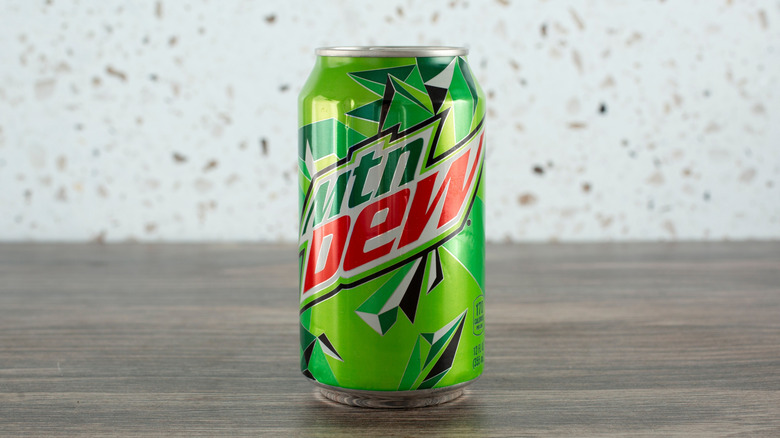
From a stylistic perspective, some folks say they prefer the can designs in which the name "Mountain Dew" is scripted out in its entirety; from 2009 to 2024, the soda switched to an abbreviated "Mtn Dew." Apparently, the folks in the Reddit thread reflect a much larger population of consumers who were jonesing for the nostalgic Mountain Dew cans they recognized from "the good old days." In 2024, PepsiCo made headlines for switching back to its full-script "Mountain Dew" design, with the word "mountain" spelled out again. Also, instead of frenetic typographic angles (reminiscent of SURGE, another '90s kid classic), the 2024 can design also changed to adopt a mountainous landscape as its background image. In an official press release, PepsiCo called the rebrand a way of "going back to its roots" that "celebrates our heritage" with "softer angles" for an "approachable" new look, and fans seem to be digging it. Mountain Dew cans have retained this modernized, Appalachian-inspired design ever since.