Why McDonald's Logo Had A Line Through It In The '60s
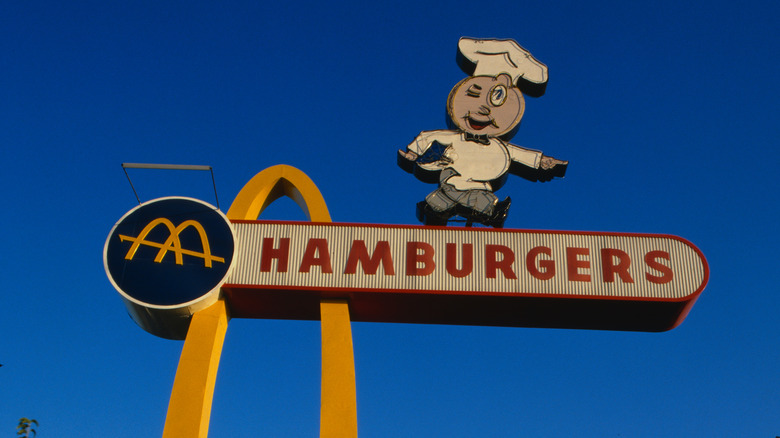
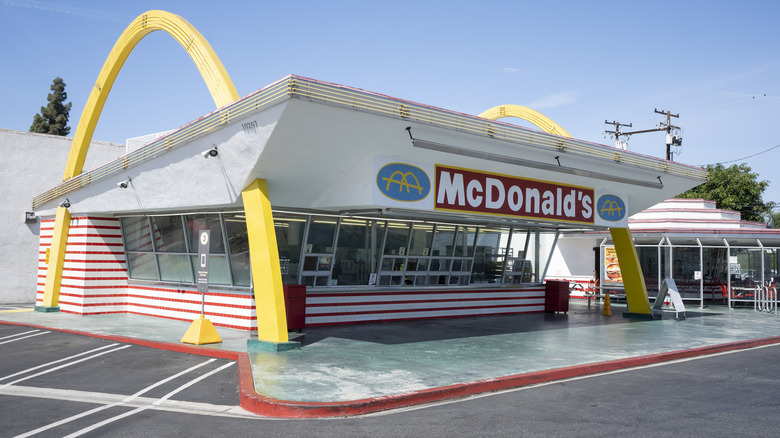
Fans from pole to pole laud Mickey D's for its nuggets. But, today, we're shining the spotlight on McDonald's unique architecture (and we aren't talking about the Playland). In fact, the fast-food chain's architecture is so unique (or at least, it was, back in the '60s) that it inspired the now-iconic logo that has become globally recognizable. The chain's 1960's logo was meant to evoke the roof structure of early McDonald's restaurants.
The Golden Arches logo first debuted in 1961. Prior to the '60s, McDonald's earliest logos simply said the word "McDonald's" in various fonts (weird to imagine nowadays). This world-changing logo was inspired by the physical exterior of the era's McDonald's restaurants, which (in the '60s) sat beneath a pair of eye-catching arched structures — a three-dimensional hieroglyphic of the McDonald's "M." In the logo's artistic rendering, the diagonal line running through those arches indicates the slant of the building's roof. Notably, in reality, those parallel arched structures straddled the restaurant, but did not intersect as depicted in the stylized logo.
Sources somewhat dispute the creditor of the original Golden Arch design. Some say the 1961 logo was designed by Stanley Meston, the architect of the "Red and White" who invented the restaurant's arched roof design. Others posit that the logo was created by McDonald's then-head of construction and engineering Jim Schindler. Either way, Meston's long-legged-arch roof design was replaced by the Mansard Roof in 1969, featuring a slant-skirted vertical roof with a wraparound awning.
The diagonal line represented the rooftop of early McDonald's buildings
Over time, as the logo evolved, the arches remained and the roof-line faded into the past. In 1968, the logo dropped the slanted line and added the word "McDonald's" at the bottom-right corner of the "M." At the time, a Big Mac cost just $0.85. Still, even though the roof design has changed, and the logo has experienced various nuanced alterations over the decades, those iconic arches have stuck around since their 1961 inception — and they're more than just the visual identity of the "M" for "McDonald's."
McDonald's saw its grand debut in San Bernardino, California in 1940, the brainchild of New Hampshire brothers Maurice and Richard (Mac and Dick) McDonald. Milkshake-mixer salesman Ray Kroc purchased a franchise from the brothers in 1955, then bought out the brothers entirely in 1961 for $2.7 million. After acquiring the brand, Kroc consulted psychologist and designer Louis Cheskin about the efficacy of the new 1961 logo. Cheskin postulated that those curved arches subconsciously symbolized maternal comfort to passing customers, indicating safety, warmth, and familiarity. 1960's ad campaigns encouraged fans to "Look for the golden arches at McDonald's — the closest thing to home." Apparently, the branding worked, inviting foodies toward the drive-in and sticking in their memories. By 1968, McDonald's had a U.S. presence of more than 1,000 restaurants, and as of 2024, the chain has over 43,000 locations all around the world.

