

4 Paint Colors That Easily Upgrade Tired Kitchens With A Modern Style
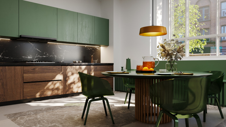
What counted as a modern kitchen 15 years ago can feel like a tired design by today's standards. Kitchen renovations are very expensive, however, and if all of the elements are functioning well but the aesthetic has started to show its age, the easiest (and the cheapest) change usually lies in a can of paint. In fact, you'd be surprised by how much a space transforms when you only introduce a new color into the mix. The big question is, which color should you choose?
With so many options out there, it's easy to get stuck in analysis paralysis, so Tasting Table reached out to a pro — Artem Kropovinsky, owner of Arsight Studio and interior design expert. He highlighted four specific shades that can transform a tired kitchen into a modern oasis: Alabaster by Sherwin-Williams, Elephant's Breath as well as Bancha by Farrow & Ball, and Hale Navy by Benjamin Moore.
Each of these shades has its own strengths, depending on the type of kitchen you're looking to upgrade and the style of the elements you won't be replacing. There are also some limitations, which the expert points out for each color. This way, you can make an informed decision on how to take your kitchen aesthetic from tired to trendy.
Sherwin-Williams Alabaster
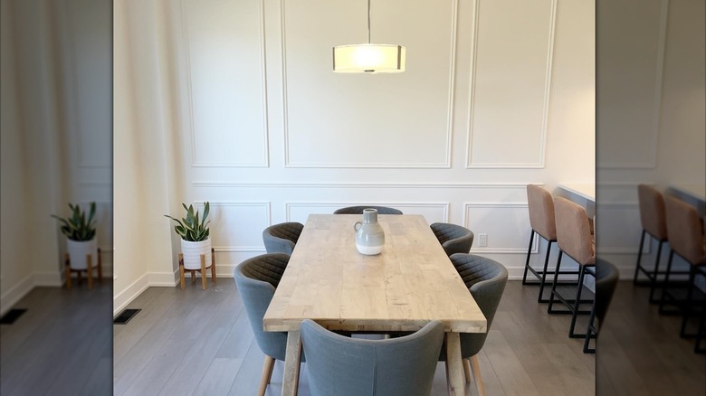
White is one of the most obvious paint shades that turn your kitchen from basic to bougie, but it has to be done just right in order to avoid making your home feel like a museum. Alabaster is a cozy shade of white that aims for a sophisticated-yet-subtle style.
"I use Alabaster for a soft look," Kropovinsky tells us, calling the color "perfect for small galley kitchens." The gentle, off-white Alabaster is bright enough to liven up a space, but muted enough so as not to overwhelm it. "White oak shelves and handmade tile on the backsplash complement this color perfectly for a Scandinavian look," shares Kropovinsky.
Alabaster is considered an incredibly adaptable shade that works with various kitchen styles, but it does have its limits. According to the expert, the color "could look a little yellow with white appliances or white quartz." It's exactly those yellow undertones paired with generic appliances that could make the kitchen look dated — the opposite of what you're hoping for. Creating some contrast is therefore key with this creamy white, and you can achieve that by mixing different finishes within the same space. "I prefer to run it on the trim in semi-gloss, or use Pure White to add a little bit of contrast," Kropovinsky tells us.
Farrow & Ball Elephant's Breath
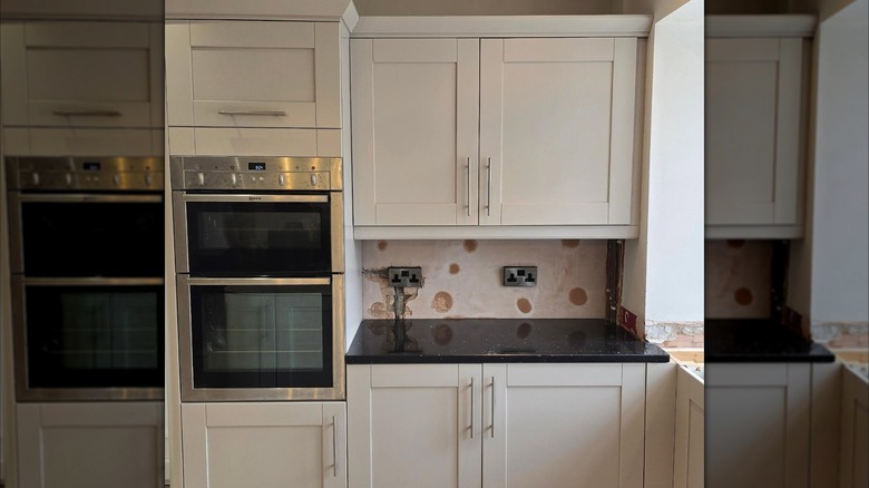
Those who loyally watch home renovation TV shows have surely heard of Elephant's Breath before. Kropovinsky describes it as "a warm gray color with mushroom tones." He adds, "It can perfectly replace the cool gray tint that was popular in the last decade." Unlike Alabaster, this shade is a much better match for bright white tones, but it also works with darker shades. "For trim I would pick Farrow & Ball Strong White or even go a shade darker than the walls to add variety to the color palette and tones," explains Kropovinsky. In other words, Elephant's Breath can absolutely hold its ground, much like its namesake.
An important thing to know about this color is that it's heavily defined by light. "It complements transitional style kitchens and Shakers, but can turn lilac in a cool light," the expert warns. This is not necessarily a deal-breaker but it's something to keep in mind if your kitchen has cool, white overhead lighting. "Sample it first — that's the golden rule," advises Kropovinsky. Paint a smaller section and watch how it changes with the light throughout the day before making a commitment.
Worried that Elephant's Breath is too cold? There are ways to balance it out with warm elements. "I love honed marble and aged brass hardware to complement the color and create additional warmth," notes Kropovinsky. It would also be the perfect companion paint shade for warm wood kitchens.
Farrow & Ball Bancha
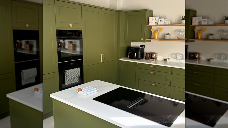
Creating a calm, cozy kitchen that feels modern doesn't mean that you're limited to neutral shades. If you're a staunch opponent of gray and beige, the green Bancha is a lovely, moodier pick. Kropovinsky labels it as the "best color for a mid-century feel with deep olive tones." As he points out, "It looks so current compared with the sage that was a trend several years ago." For the trim, he recommends School House White or Bancha itself in a different sheen, which will create a wrapped look.
In some older kitchens, textured wooden cabinets present a stylistic challenge when choosing fresh wall paint. The wrong choice can make the whole room feel outdated — for example, if your kitchen has oak cabinets, avoid yellow paint like the plague. Bancha, on the other hand, is a bold, space-defining choice. "This color loves wood cabinets," affirms Kropovinsky. "For additional richness, I prefer terracotta and walnut to complete the look," he adds. As for the shade's limitations, Kropovinsky advises exercising caution if you're planning to use it with stainless steel or gray granite because it can turn murky.
Benjamin Moore Hale Navy
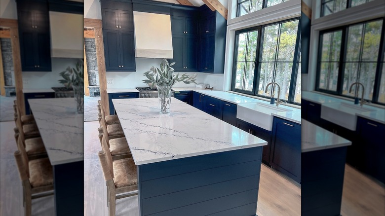
Have you been daydreaming about stunning blue kitchen designs to inspire your next remodel? You're going to love Hale Navy. "This color has gray, but enough to act neutral — it will make a dated kitchen look crisp at once," Kropovinsky tells us. It's a very sophisticated shade with strong character that feels distinctly modern, regardless of other features surrounding it.
"Shaker cabinets and an island love this color," shares the expert. Hale Navy can quite effortlessly transform a large, generic kitchen into a cooking space that actually feels like home. You should be a tad careful about using it in smaller kitchens, though; the expert warns that "it can turn almost black in a dark galley."
Because this is a cooler tone, you might worry about the lack of warmth. Once again that's easy to balance out with appropriate colors. "For the trim, consider Chantilly Lace or White Dove for a warmer feel," recommends Kropovinsky. He also adds, "Brass hardware complements it perfectly." Hale Navy is also versatile enough to work with bolder trim choices, like soft green or a different shade of blue.