How McDonald's Packaging Has Changed Over The Decades
We may receive a commission on purchases made from links.
At McDonald's, the meal doesn't begin (as epicures say) at the eyes — at least, not in the traditional sense. Before patrons behold their yellow-paper-wrapped Big Mac, they're laying eyes on Mickey D's iconic Golden Arches. Graphic design communicates identity, and to that end, McDonald's has emerged as arguably the most recognizable fast-food branding in the world — and it's no contest. Whether Ronald McDonald himself is at the forefront or not, everyone knows McDonald's.
Even though its logo has changed a few times over the years, the burger joint remains well-known across the globe. No matter how many times the packaging has shifted, it's still been McDonald's. Of course, that doesn't mean that there haven't been any interesting deviations along the way. So, join us, fellow "Fry Kids" (a dated reference if we ever heard one), for a retrospective glance at the food and beverage packaging designs of yesteryear as we explore the visual history of such an iconic and recognizable fast food brand.
1950s: Pre-golden-arches, there was a cartoon burger chef mascot
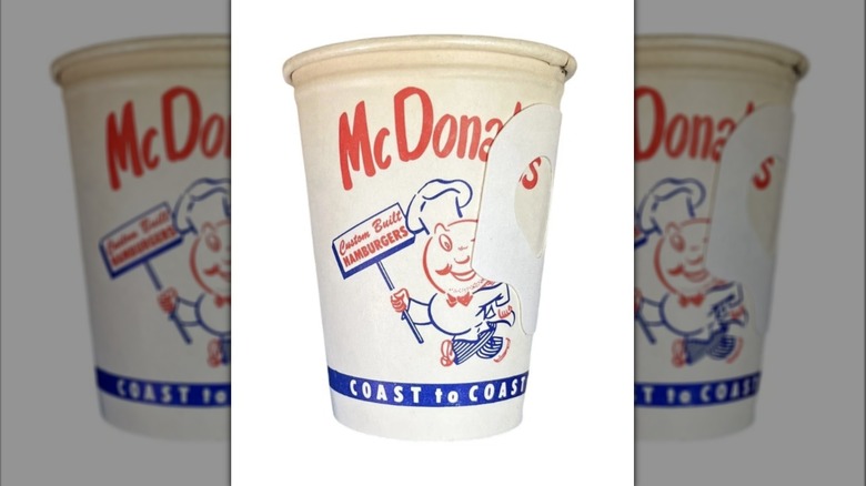
During the 1950s, Mickey D's packaging didn't feature the Golden Arches. Instead, the chain name was printed in red text over a cartoon burger chef mascot sometimes called Speedee, who appeared on white paper bags and drink cups with a blue and red (rather than red and gold) color scheme. The Golden Arches wouldn't emerge until a little later.
1960s: Enter the Golden Arches
In the 1960s, the McDonald's logo had a diagonal line running through it — a nod to the chain's unique architecture of the time. Mickey D's restaurants of the '60s were topped by a signature slanted roof, and this slanted-line-arch was emblazoned on the food bags and cups of the era.
1970s: Groovy graphics for a psychedelic era
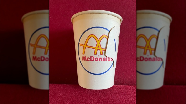
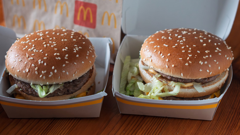
By the 1970s, McDonald's packaging shifted to more closely resemble the presentation it has today. The yellow Golden Arches were emblazoned against red fry cups, brown cardboard burger boxes, and white bags. Also, those arches could be found imprinted into disposable tableside aluminum ashtrays.
1970s: Fry innovation hits the fast-food scene
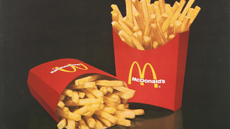
From a utilitarian rather than brand-centric motivation, also in 1970, McDonald's released its innovative red cardboard fry cup. Its wide-open structure enabled employees to scoop fries more quickly than the previously used paper bags. Plus, the cups' unique sloped design prevented those vertically oriented fries from falling out.
1980s: Novelty plastic dominance
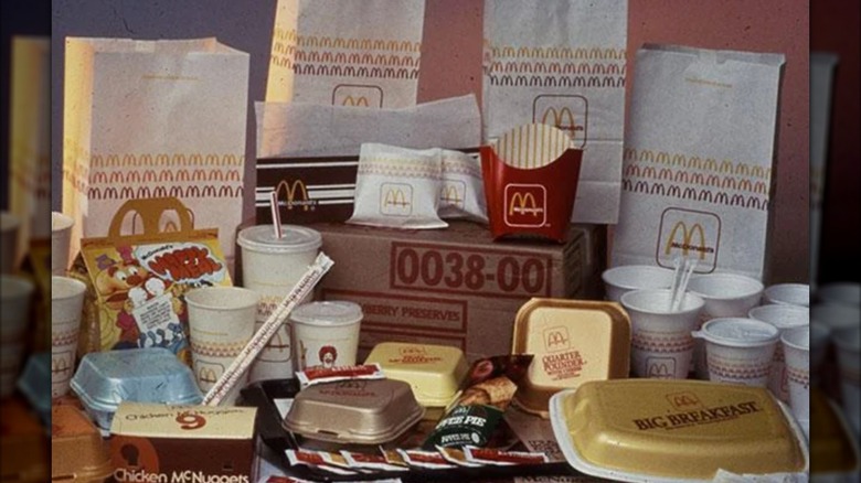
In the '80s, burgers came in their own Styrofoam boxes. Several of the 14 vintage McDonald's Happy Meal boxes that we still remember decades later featured large, hard-plastic food boxes shaped like boats and train cars. While the packaging for 1982's McDonaldland Express and 1983's Ship Shape promotions might have been "collectible," many of those plastic meal containers likely ended up in landfills. Enter: Mickey D's shift toward sustainability.
1990s: Shift toward eco-materials, but perhaps away from creativity
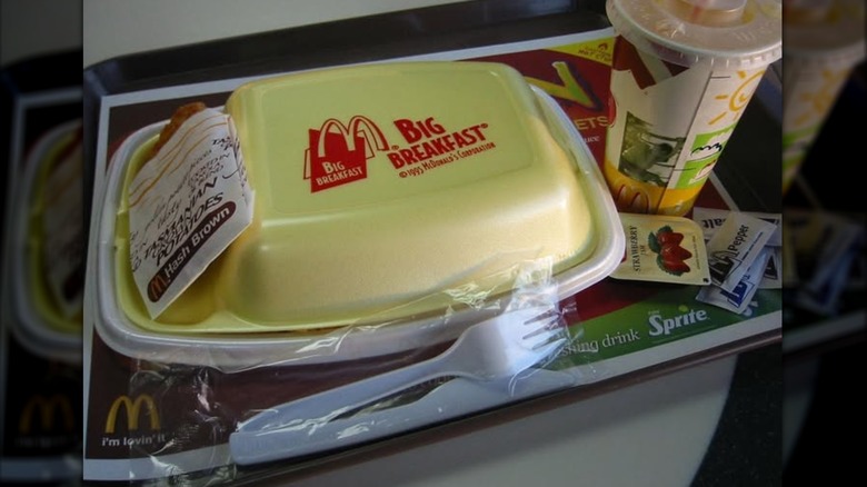
In the '90s, McDonald's hopped on the environmental-awareness train sweeping the nation during the era. Suddenly, Styrofoam boxes and drink cups gave way to more eco-friendly materials. "So long" to the iconic yellow styrofoam "Big Breakfast" boxes of the '90s. One Reddit user posits that, after this, fast food marketing was "less creative and colder and less relatable. Just another reminder that the '90s was the peak of civilization..."
1990s: Shift toward permanent at-home product branding
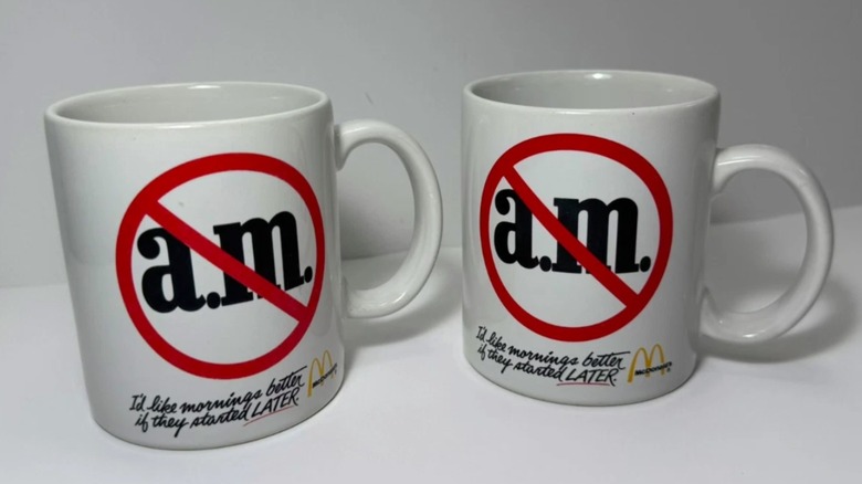
The 1990s also saw McDonald's launch at-home products, ostensibly replacing the advertisement hole left by its now-retired, single-use plastic bobbles. This appeal to permanent fixtures (thus entering the household for perpetual brand signage) manifested in the release of milk glass and ceramic McDonald's mugs (and a series of VHS tapes), further bringing the McDonaldland crew into the home sphere for adult and child audiences alike.
2000s: Sustainability sticks
The shift away from gimmicky packaging was immediately impactful. According to McDonald's website, "The first initiative eliminated more than 300 million pounds of packaging," and also "reduced waste by 30 percent." Nowadays, many of these epochal packaging designs exist only in the nostalgic memories of longtime fans — and possibly landfills, too. Even if you don't remember your last, yellow-boxed Big Breakfast, there's a sporting chance it still remembers you.
2026 and beyond: What do longtime fans think of the changes?
Many fans look back on now-retired McDonald's branding as an out-of-reach symbol of simpler times, representing a warm memory, juxtaposed coldly by the grayscale Brutalism of McDonald's modern design scheme. Another Reddit post highlights an old-school McDonald's drive-thru menu board with white text on a brown background. As one commented noted, "We can never go back to a time where this exists."