What Is The Tri-Color Kitchen Method, And Should You Try It?
The pros know a well-designed kitchen is all about composition. One way to make your small space look and feel bigger is the tri-color kitchen method. It relies on this palette: a dominant hue, a contrasting secondary tone, and refined accent colors. To understand how it all works we turn to Brandy Rinehart, interior designer at Rinehart Design Group Inc. Rinehart's furniture designs have been featured in Architectural Digest, LUXE Home, and Departures. She leans on this warm, yet sleek, minimalist kitchen design approach because it's a deceptively simple — and genius — move.
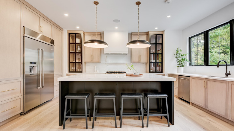
"For example, pairing soft, neutral cabinetry (like warm white or greige) with a richer island tone (charcoal, navy, walnut) and finishing with metallic or natural stone accents allows the eye to travel through the space rather than stop abruptly," Rinehart told Tasting Table. "This creates an illusion of volume and flow — particularly valuable in smaller or enclosed kitchens." Together, this trio forms a clean conversation between surfaces and visually keeps things organized, another key to maximizing a small kitchen space. The key is knowing exactly where to place each different tone.
"Generally, lighter tones should dominate upper cabinetry and walls to draw the eye upward, while mid to darker hues are ideal for lower cabinets or islands, grounding the space and providing contrast. This balance keeps the room feeling both grounded and expansive," said Rinehart. But there are other ways to nail the tri-color method, too — even if you don't have a kitchen island to match (or mis-match) your counter tops.
With the tri-color method, it's all about placing the right colors in the right places
The tri-color method works because it harmonizes neutral tones while leaving plenty of room to blend traditional and modern aesthetics — the hallmark of a transitional design style that splits the difference between modern and traditional. "A well-executed tri-color scheme allows for a more dynamic and layered kitchen by layering contrast and cohesion," said Brandy Rinehart. "Combinations to avoid include overly saturated hues that compete (such as red, blue, and yellow together) or mixing too many cool and warm undertones in the same visual plane. Consistency of temperature and finish is key." And if you don't have a kitchen island — no problem.
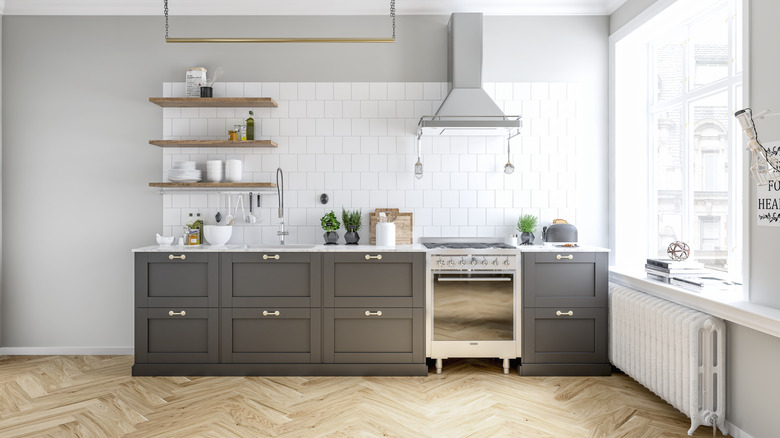
The tri-color method works seamlessly with a dark or textured floor pairing like herringbone, the trendy patterned floor that's replacing hardwoods in many kitchens. Or try painting the lower portion of your kitchen cabinets a darker, earthier color and replacing the accents with just a bit of sparkle. Rinehart suggested a pairing with metallic accents — like deep mushroom and oak tones with brushed brass — or going earthy. Try a soft white shade and pair it with natural stone accents, and then contrast that pairing with a bold splash of navy. Another smart color tip: Rinehart said warm taupes make an elegant but warm pairing with black and marble accents. It's another neat way to use neutral colors to design a kitchen that won't look dated down the line.