How Pizza Hut's Logo Changed Forever In The '70s
Food may be essential to creating an iconic fast-food brand, but you can't discount how important the logo is. The golden arches are recognized the world over, after all — and everyone knows Colonel Sanders' face, even if it's only the cartoon version. Arguably just as iconic is the Pizza Hut logo, which is simple and memorable, but which Pizza Hut logo are we talking about? It has changed a few times over the years. The red roof and the name of the restaurant are the most important parts. The design has evolved, but before the 1970s, that red roof logo didn't even exist.
Pizza Hut dates back to 1958. That makes it older than Domino's, Little Caesars, and Papa John's. The original stores featured the signature red roof on the buildings and on the signs out front, along with a cartoon pizza chef named Pizza Pete. They chose the name because they had limited space on the signage, and Pizza Hut fit neatly.
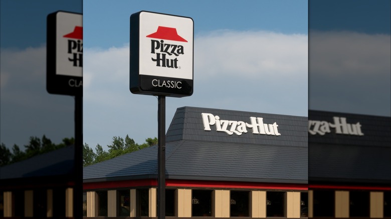
By 1971, Pizza Pete was gone and the chain was focusing on its iconic red roof. In 1974, Pizza Hut marketing executive Sam Moyers, alongside Lippincott, helped design the red roof logo, reducing emphasis on the words to focus on the image associated with the restaurant. They patented the design and focused on making it symbolic of the chain. Associating the roof of the building with the brand meant it wasn't just the sign out front that identified a Pizza Hut, but also the building itself. The locations became the logo, which is not something you see very often.
The Pizza Hut evolution
Pizza Hut's logo has changed at least a dozen times since the company's inception. The font style of the words "Pizza Hut" also changed, but always conveyed an organic and bold feel. For many years, the typeface only included the letters needed to spell Pizza Hut, but later a full, bespoke set of 237 characters was developed for more extensive signage and advertising.
Even the simplest Pizza Hut logos use a font with a retro vibe, featuring long tails and swashes that extend from the P, the Zs, and especially the H. In modern times, the font has become more of a casual, handwritten style, but those elements remain, always centered below the red roof.
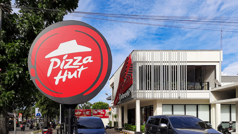
In 1999, Pizza Hut's logo got an overhaul meant to appear more youthful and fun. The company didn't change the core elements, only redesigned how they looked. The clean lines of the previous red roof and font became more organic, and this approach was tweaked for several years with different versions. However, in 2019, the company went back to its 1974 logo with the sharp-edged red roof and the retro-style typeface for the chain's name. You can never go wrong when you play on nostalgia with an iconic brand, and since Pizza Hut remains one of the top pizza chains in America, the strategy is clearly working.

