The Chicken In The Chick-Fil-A Logo Looked A Lot Different In The Early '60s
It would be nearly impossible to talk about chicken sandwiches at any length without mentioning the name "Chick-fil-A." Today, the chain's presence encompasses more than 3,000 restaurants across the U.S., Canada, and Puerto Rico. But, before it was a global fast-casual giant, Chick-fil-A was a standalone chicken joint in Georgia in 1946, and it didn't even have a logo yet. A logo wouldn't emerge until 1960 — and although it bore the same minimal red and black color palette fans recognize today, the "chicken" character wasn't part of the "C" shape in the restaurant's title.
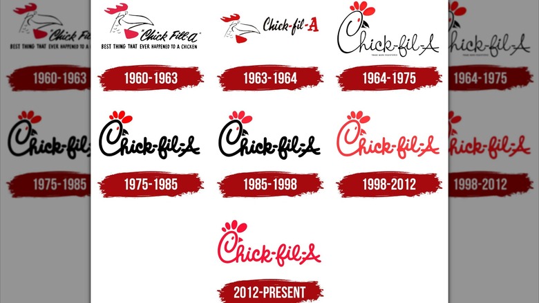
Today's fans know Chick-fil-A's "chicken logo" as a stylized letter "C" adorned with a small beak, plume, and eye dot. However, prior to 1960, the Chick-fil-A chicken wore a different, cruder design: A cartoon poultry head with a long, pointed beak. This original mascot wasn't an apparent chicken at all, but a rooster named "Doodles." Per the lore, Doodles was the creative brainchild of American designers Louie Giglio and Evan Armstrong, reportedly commissioned by Chick-fil-A founder and peanut-oil-chicken-sandwich-creator S. Truett Cathy.
Unlike the swooping, rounded silhouette of the modern logo, the '60s chicken head of yore had a much more pronounced beak (think Foghorn Leghorn) and a smarmy side smile. The complete 1960s restaurant logo featured the name "Chick-fill-A" in italicized typeface beside Doodles' head. For three years (1960-1963), the words "Best Thing That Ever Happened To A Chicken" appeared as a subheading. The second "L" was dropped from the chain's spelling in 1964.
Doodles the rooster had a long, pointed beak
Alas, the playfully sneaky-eyed Doodles was retired in 1964. But, Doodles' invention was a crucial element of Chick-fil-A's early emergence onto the fast-casual scene. In the early 1960s, the industry was largely dominated by burgers. Peddling chicken sandwiches, Cathy knew, set his chain apart into a league of its own. To indicate red-meat-grade-quality, Cathy chose the name "Chick-fil-A" as an aural linguistic mondegreen of "Grade A chicken fillet sandwich." Originally, Cathy had been referring to his fare as the "chicken steak sandwich," which is markedly less catchy.
Ostensibly further cementing Doodles' memorability in customers' minds is the mascot's long-beaked likeness to Foghorn Leghorn – the bombastic, Southern-accented rooster of the "Looney Tunes" universe. Foghorn Leghorn debuted on-screen in 1946 (the same year as the first Chick-fil-A restaurant opened in Georgia), and throughout the 1950s, Warner Bros. cemented itself as a pillar of Saturday morning cartoon-dom in households across America. Any likeness (intended or incidental) to the recognizable "I say, I say" swaggering rooster character would have likely helped Chick-fil-A cement its brand recognition during its early emergence.
Nowadays, Chick-fil-A's signature curving, free-flowing script subconsciously signifies a laid-back, casual atmosphere to customers. Doodles arguably set the tone for this enduring playfulness and familiarity — and was replaced by another playful, perhaps more memorable mascot in 1995: the anarchist spotted cows of the chain's iconic "Eat Mor Chikin" ad campaign.

