The Hidden Meanings Behind The Images On Budweiser's Label
When a brand has been around for over a century, the label has a lot of story to tell, and the many variations of Budweiser labels have attempted to deliver. Filed in 1886, the label is one of the oldest active American design mark registrations. The first Bud label of 1876 was an intricate one meant to symbolize European inspiration and a quality that would attract American drinkers, helping cement it as one of the most popular beers.
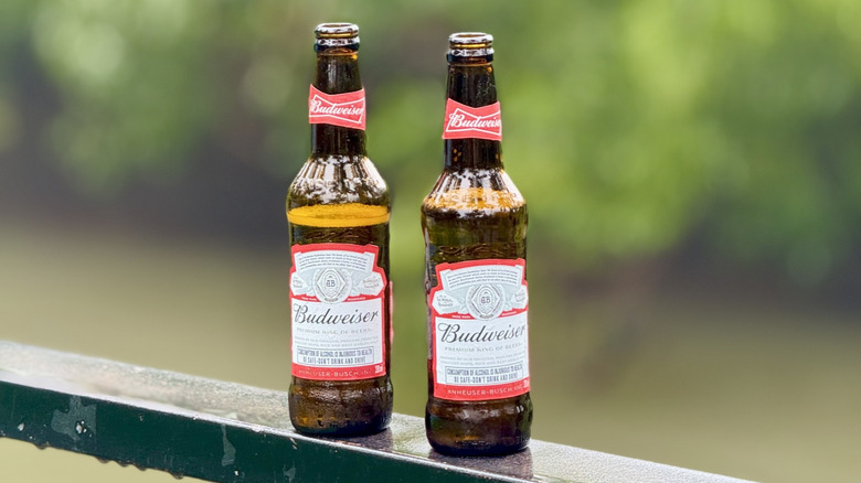
In terms of what the most prominent images on today's label mean, firstly, the recognizable AB at the center is the seal of Anheuser-Busch. The letters are nested inside a depiction of wheat and barley to represent beer-making ingredients, and golden eagles flank the design as a nod to American heritage. One of the eagles was initially designed after the German double-headed eagle but was redesigned after World War I to avoid any association with German symbolism. The shape and color of both bottles and cans are trademarked, as is the use of live Clydesdale horses in connection to beer sales.
The Budweiser label has evolved
The name of the beer is derived from a German word meaning "of Budweis," a city that's now in the Czech Republic but back then was part of the Austro-Hungarian Empire. Budweiser was created by Adolphus Busch who was inspired by pilsners he tasted in Europe. This name of his choosing ended up in a trademark battle with a Czech brewery from the town named Budweiser Budvar, which is why in some parts of Europe, ordering a Bud is the only way to get an Anheuser-Busch Budweiser in your hands. Text appearing below the name was written in German until 1908. "King of Beers," printed beneath the letters, was Busch's inversion of "The Beer of Kings," a descriptor used for beer that was brewed in Budweis for the imperial brewery. Bold design and red backgrounds capture attention, leaving no doubt about the name of the brand.
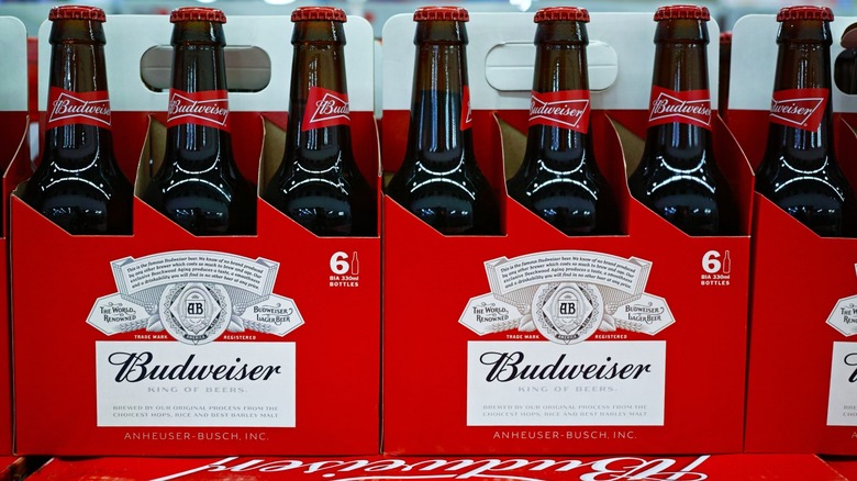
The label has gone through many redesigns. Early versions were detailed and ornate, with seals and coats of arms meant to represent the brand's European influence. In 1952, more minimalist, bold designs were launched to appeal to modern consumers. The original label and many more modern versions feature a banner that states, albeit in tiny writing, the product's promise: "This is the famous Budweiser beer. We know of no brand produced by any other brewer which costs so much to brew and age." The red, white, and blue colors of the cans emphasize the American origins and St. Louis roots. To help celebrate the company's 150th anniversary, Budweiser has released packaging labels inspired by these 19th-century design origins.