How A Bakery Renovation Inspired Raising Cane's Well-Known Logo
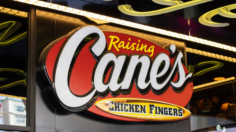
Creating a successful company logo is a multifaceted magic trick, combining marketplace wisdom with personal intuition and a splash of creativity. Most restaurants start from scratch, hoping the design resonates with customers — but that's not always the case. The founder of one beloved fast-food chicken chain got an unusual gift of logo inspiration when remodeling a building. While uncovering traces of history and mystery, entrepreneur Todd Graves discovered a fascinating mural from which the logo of Raising Cane's arose.
It was the first-ever Raising Cane's location, far from a sleek, trendy building funded by deep-pocket investors. Graves raised money for his dream venture by working in oil refineries, then commercial fishing for 20-hour days in Alaska's Bristol Bay. Though projected to fail, Graves meticulously saved his earnings, landed an SBA loan, and took the chicken plunge. A deserted Baton Rouge bakery shop near the gates of Louisiana State University held his destiny.
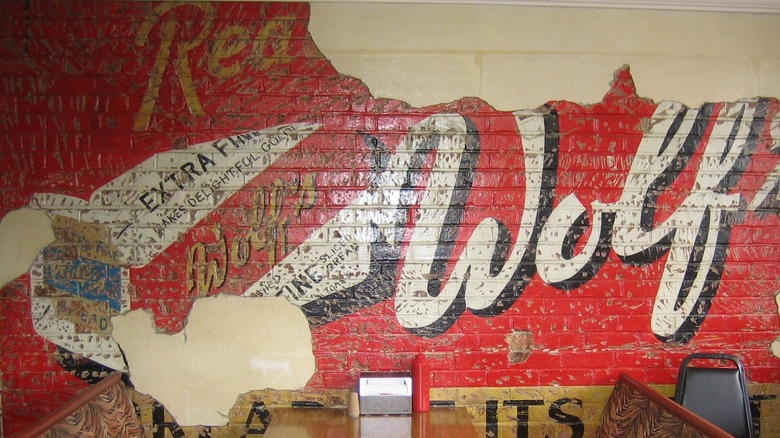
To say the old bakery needed design intervention seemed an understatement on many levels — but Graves soon discovered the building already harbored a wealth of components for aesthetic success. While demolishing a stucco wall, they suddenly uncovered a well-worn Wolf's Bakery mural holding the perfect faded red-brick color palette with flowing white letters, and a tattered yellow tagline declaring "bread at its best." The perfect dream now had the perfect visual inspiration, resulting in today's still-thriving Raising Cane's logo. In a further nod to the value of expression, every Cane's location showcases an artsy mural.
What's in a name?
There's a valid reason why so many fried chicken enterprises have deep roots in the American South: It's the unofficial yet uncontested favorite meal connecting anyone born-and-bred in the region. It criss-crosses state lines, family trees, neighborhood fences, schoolyards, church socials, and most anywhere folks gather. There's even a saying that "fried chicken feeds the soul."
Anyone choosing to profit from deep-fried chicken glory better know their stuff, including not only the recipe but what it represents. The founder of Raising Cane's didn't have to research that; he was born into it and recognized his future logo hidden amidst construction dust and the ravages of time. It was a nod to hard work, culinary enterprise, and a dream of feeding and fueling community. The restaurant name is itself a love note to Graves' canine companion, a yellow Lab by the same name, who watched over the original store's construction when the old bakery revealed the future logo's core components. His photo adorns most Cane's restaurants, and a dog named Cane III continues the namesake mascot tradition.
Fried chicken chains such as Chick-fil-A have changed their logo over the years, but not Raising Cane's. The group has grown to over 870 locations in more than 600 cities as of late summer 2025. It still focuses on chicken fingers, foregoing the full pieces that naysayers claimed was crucial from the very beginning. For more stories, check out some facts about Raising Cane's that fried chicken enthusiasts should know.

