This Texas Burger Chain's Logo Hasn't Changed Since 1972
Even if you're not the kind of whizz with a photographic memory who can name a restaurant based on its symbol alone, sometimes there are certain logos that are so deeply associated with a brand that it's impossible to think of anything else. A little purple bell? Taco Bell, obviously. A green mermaid with two tails and a crown on her head? Starbucks, of course. Or, even more ambiguous: a singular, yellow "M" — yet, even then, you know the restaurant it's associated with is McDonald's. But, how about a striped, orange and white "W"?
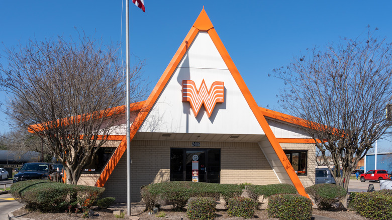
Unlike Cracker Barrel that just underwent a major logo change and sent fans into a tizzy, Whataburger's logo has remained exactly the same since 1972. However, that doesn't mean that the burger chain hasn't experienced a few modifications during its history. The first Whataburger opened in 1950 in Corpus Christi, Texas, with a blue and white sign featuring its namesake. The chain kept variations of that logo for about 20 years, until the early 1970s, which was a decade after founder Harmon Dobson changed the architectural design of the restaurants and proposed the now-beloved orange and white color scheme that hasn't been altered a lick in over 50 years.
The legacy of the Whataburger logo
The emblazoned "W" created out of four white, winged lines on an orange background was the result of Whataburger changing its style to increase visibility and match the automobile age with unmistakable A-frame structures. Already with a unique shape, Dobson also installed two steel poles on either side of select restaurants' triangular peaks to form a giant "W" shape. The orange and white color scheme was instead the product of Dobson's former experience as a pilot. Flying taught him that stripes of alternating colors attract attention, which is exactly what every business person wants when designing a burgeoning fast food empire in the South. Evidently, Whataburger swiftly gained a cult following that holds true to this day — even if its lack of hot sauce is an insult to Texas.
Naturally, Whataburger is very protective of its logo. This was notoriously evidenced by the brand's short (and very public) tiff with DC Comics in 2017, where the fast food chain claimed DC's latest movie, "Wonder Woman," had stolen its logo design. In the years after, Whataburger has remained proud of its striped "W" logo, even collaborating with huge brands such as Wrangler, Sendero, and Academy Sports to develop brand-related merchandise. Given Whataburger's long and loyal dedication to not only its logo, but its food, the eatery easily earned a spot on our list of the best regional fast food chains across the country.

