Dunkin' Logo Evolution: Every Version In The Company's 75-Year History
We may receive a commission on purchases made from links.
Over the last 75 years, Dunkin' has evolved from a modest donut shop into a global juggernaut. The brand offers everything from canned and bottled coffees to breakfast sandwiches to stuffed bagel minis filled with cream cheese (as well as its viral secret menu items). Along the way, its logo has seen just as much transformation as its menu, shifting from a charming handwritten script to the bold, minimalist Dunkin' wordmark.
Each version reflected a design trend while mirroring cultural shifts, brand priorities, and consumer tastes of the time. With over 14,000 locations around the world across almost 40 countries as July 2025, Dunkin' remains one of the world's leading coffee and fast food donut chains — a far cry from its humble beginnings in Quincy, Massachusetts. The brand's visual identity has been key to that growth, blending familiarity with modern flair.
Simply put, Dunkin's logo evolution reflects a balance of fun and function. Ranging from playful choices to bold moves, every iteration marked a deliberate shift in how the brand wanted to be perceived. Here's a look at every major logo Dunkin' has rolled out since 1950 and what each version signaled about the brand at the time.
The original Dunkin' Donuts logo debuts (1950)
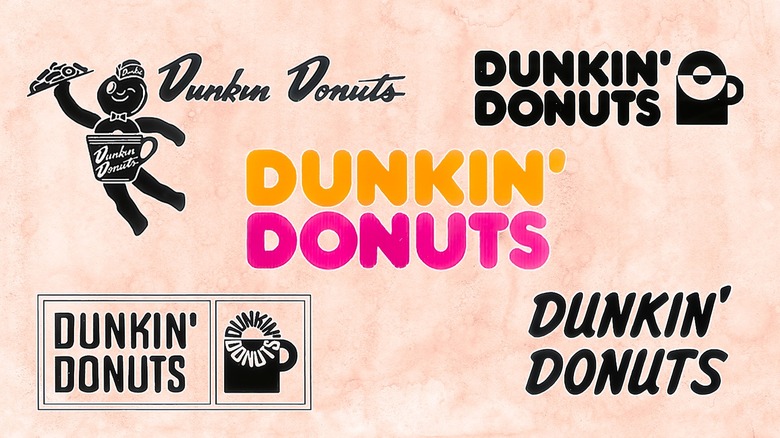
Before it was Dunkin', the brand operated as Open Kettle, a small shop in Quincy, Massachusetts opened by Bill Rosenberg in 1948. After brainstorming with executives for a catchier name, he rebranded it as Dunkin' Donuts in 1950. When that first shop opened, the logo looked very different from the bright, modern identity we know in the 21st century. The original design featured the outlet's name in a cursive, handwritten style, rendered in a reddish-brown hue.
The font choice gave the impression of a friendly neighborhood bakery — one that's personal and unpretentious. There were no coffee cups or donut illustrations yet; instead, the focus was entirely on the text, likely to reflect the no-frills experience of the original location. The warm, dark tone of the script resembled rich coffee or cocoa, further tying it visually to the products sold, even without literal imagery.
This first logo lasted for several years, when Dunkin' began experimenting with character-based branding. During its brief run, the original wordmark helped establish the company's local identity as intimate, dependable, and comfort-driven. Interestingly, the choice of color and script also mirrored postwar American trends: a time when local diners, loud signage, earth tones, dark-stained wood, and stylistic windows were the norm.
Dunkie the coffee mug mascot joins the logo (1955)
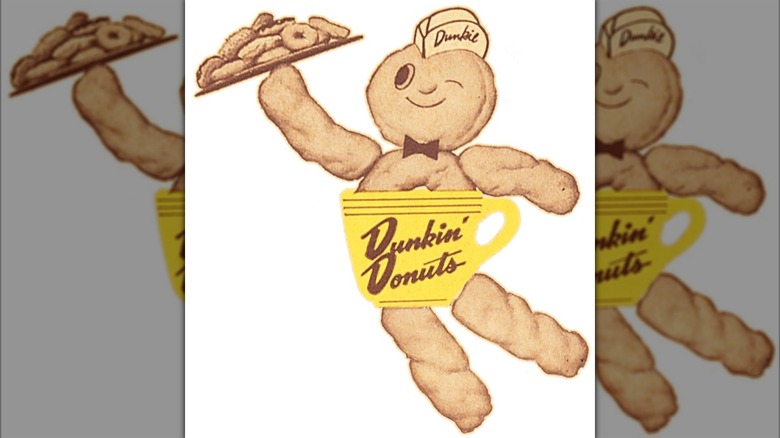
In 1955, Dunkin' Donuts introduced a charming new visual identity: A whimsical mascot named Dunkie, who brought personality and a bit of humor to the brand. This logo featured a mug-bodied character with a donut for a head, donut-shaped hands and feet, and a yellow coffee cup for a torso. Dunkie wore a chef's hat, carried a plate full of doughnuts, and winked playfully. Additionally, the original handwritten script logo appeared across the cup, tying the new mascot to Dunkin's existing identity.
During that time period, many brands were turning to mascots and characters to build emotional connections, especially in fast food and beverage marketing. In that sense, Dunkie wasn't just a fun visual — he gave the brand a friendly face to stand out at storefronts, on product packaging, and in newspaper ads.
This logo stayed in circulation until 1960, when Dunkin' shifted toward a more structured and color-driven approach. While Dunkie eventually disappeared from marketing materials, his legacy remains as one of the brand's first steps toward playful, character-based marketing (a strategy many food and beverage brands continue to rely on).
Dunkin' introduces its iconic pink cup and circular wordmark (1960)
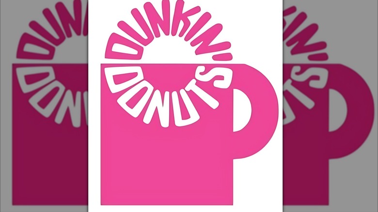
In 1960, Dunkin' Donuts rolled out a logo that would help define its visual identity for over a decade. This redesign debuted the now-familiar bright pink color, which was applied to a coffee cup illustration framed inside a bold circular wordmark. The circle was split horizontally, with the top portion shaded in bold pink, and the bottom left white. Inside this ring sat a pink coffee cup: A simple, flat illustration that visually conveyed the brand's focus on coffee.
While the layout was simple, the use of circular framing also subtly nodded to a donut shape. This, of course, reinforced the brand's overall identity through form and color rather than literal imagery. More polished than its predecessors, this redesign was fun, modern, and unmistakably vibrant. It remained in use until 1976, giving Dunkin' a vibrant and recognizable face while laying the foundation for its iconic color-forward designs to follow.
The famous pink and orange color palette is unveiled (1976)
By 1976, Dunkin' Donuts was ready for a bold visual refresh. Consequently, the company decided to introduce the now-iconic color pairing that still defines the brand in the 21st century. More than that, its 1976 logo marked a major evolution while still carrying visual DNA from the 1967 design.
The familiar pink coffee cup (first introduced in the circular badge logo) was retained but simplified. Rather than featuring the restaurant's name inside, the cup stood alone as a bold icon with smooth, rounded lines and a curved handle. Perched right on top of the cup sat a two-toned, pink and white circle — an unmistakable reference to the brand's most famous pastry offering.
To the left of the cup, the new logo featured the words "Dunkin' Donuts" in a stacked, two-line layout. It displayed "Dunkin'" in orange on top, with "Donuts" in pink beneath it, using a plump, rounded typeface. This version of the logo didn't appear to last very long before being streamlined further. Still, it set the foundation for what would become the brand's signature visual style — one that continues to be instantly recognizable.
Dunkin' simplifies the 1976 logo (1977)
In 1977, Dunkin' made a decisive shift in its branding strategy: It removed the coffee cup and donut imagery from its logo, opting for a sleeker, more typography-driven logo. The result was a simplified version of the previous design that still featured the stacked "Dunkin' Donuts" wordmark. However, there were now no illustrations competing for attention alongside the name.
The color palette remained the same, with orange for Dunkin' and pink for Donuts (both in the rounded, friendly font). Visually, this simplified version embraced bold minimalism, a seemingly deliberate strategy to keep Dunkin' recognizable. After all, as Dunkin' shifted from a regional chain to a national (and eventually international) presence in the mid-1970s — fueled by the fast-food industry's rapid growth — the brand needed a logo that was simple, scalable, and adaptable across storefronts, signage, uniforms, and packaging.
The new logo delivered exactly that, and the decision to strip away mascots and detailed imagery proved effective. This iteration of the logo provided instant recognition and personality in just two words and two colors. It remained in use until 2002, becoming one of the longest-running designs in the brand's history.
A steaming styrofoam coffee cup joins the logo (2002)
After more than two decades years of relying solely on its text-based logo, Dunkin' brought imagery back into the fold in 2002. Testing for the new look began in May 2001 in select markets (like Boston, Chicago, Florida, and parts of New York), backed by five rounds of consumer research. The update did more than tweak aesthetics, though, and it had a clear message: Coffee was now front and center, too.
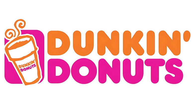
The change was announced through the company's official blog., with a steaming Styrofoam coffee cup added to the left of the iconic orange-and-pink wordmark. The cup featured a clean white body with an orange outline, two stylized steam curls, and was typically set against a vibrant pink backdrop. More than just a design update, it was a branding declaration. As Ken Kimmel, then Vice President of Dunkin' Donuts Concepts, put it, "the addition of a steaming coffee cup to the logo supports our belief that coffee and donuts go hand-in-hand."
The redesign was part of Dunkin's broader effort to modernize while still honoring its heritage. As a result, this refreshed logo was familiar, but more in tune with the modern, coffee-fueled lifestyles of its growing customer base. The logo lasted until 2007, when it received further refinement.
A more polished coffee cup and DD monogram appear on the logo (2007)
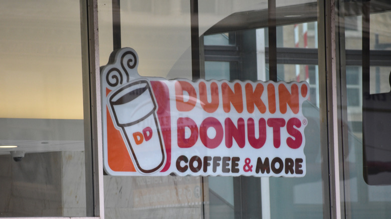
In 2007, Dunkin' elevated its branding once again by refining its 2002 design to enhance the coffee cup, and introduce a monogram. While the playful orange-and-pink wordmark remained untouched, the new logo featured a detailed coffee cup illustration with a brown outline and shading, giving it a more sleek and polished look.
The most striking addition was the "DD" monogram printed directly on the cup in Dunkin's signature orange and pink colors. This monogram served a dual purpose: It made the logo more compact for digital and mobile use, and opened the door for secondary branding. Customers soon saw the "DD" symbol appear on packaging, signages, advertisements, and even app icons — a move that mirrored what other fast-food giants had done with similar imagery (like McDonald's with its golden arches).
The logo also included a rectangle bar behind the cup (a combination of orange and pink), adding structure and balance. This subtle shape worked well across drive-thru signs, menus, and to-go bags, all while tying back to the vibrant dual-tone identity Dunkin' had owned for decades. This version of the logo remained in use until 2019, marking the final iteration before the company made its boldest branding move yet.
Dunkin' drops Donuts for a streamlined wordmark (2019)
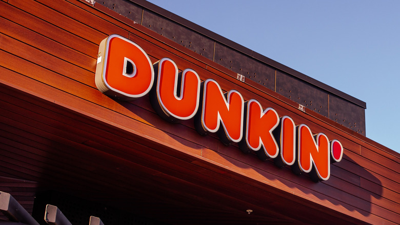
On September 25, 2018 — with a full rollout planned in January 2019 — Dunkin' announced a major rebrand in a letter from its Chief Marketing Officer Tony Weisman. The news quickly made headlines across the food, design, and media world, even trending on Twitter. The big change? Dunkin' officially dropped "Donuts" from its name and logo. The new identity kept the restaurant chain's signature orange and pink color scheme, but simplified the logo to a single word — Dunkin' — with a cleaner, more versatile look.
Now, this wasn't a casual design tweak, or one that came out of nowhere. After all, Dunkin' had spent years expanding its offerings beyond donuts, investing heavily in espresso, cold brews, breakfast sandwiches, and on-the-go ordering. The new logo reflected that shift, while also strengthening brand familiarity and emotional connection. Weisman elaborated on this during the announcement, noting the brand was "moving to a first-name basis with America" with the change.
The typography was also updated. In fact, Dunkin' introduced a custom font — Dunkin Sans — with this change, which was inspired by the rounded curves of the 1970s Souvenir typeface. It preserved the friendly feel of Frankfurter but with cleaner lines for digital use. A small but bold detail: the apostrophe in "Dunkin'" was now bright pink.
Dunkin' updates the logo with a clean, digital-friendly refresh (2022)
Since Dunkin' had fully evolved from a regional donut shop into a global coffee powerhouse by 2022, its branding needed to keep pace with the increasingly digital, fast-moving world. In fact, as more customer interactions shifted to digital platforms, mobile apps, and drive-thru lanes, the logo was adapted once more to ensure clarity and consistency in these modern spaces. That year, the company introduced a refined version of its 2019 logo. It kept the "Dunkin'" wordmark and signature colors but updated the design with cleaner lines, improved spacing, and slightly adjusted hues for better legibility across screens.
The most noticeable change was subtle yet deliberate. The iconic orange and pink hues were slightly adjusted: The orange shifted to a slightly deeper pumpkin hue, while the pink was darkened for better contrast and legibility. The brand's custom Dunkin Sans font remained, but received technical refinements during the change. Another subtle yet meaningful change was the apostrophe. Previously colored bright pink, it was updated to a deeper, richer shade that subtly nods to the brown tones from Dunkin's earliest logos. This version remains the company's current visual identity as of July 2025.
