

15 Erin Napier-Approved Paint Colors To Revive Dull And Basic Kitchens

Erin Napier's eye for color, design, and overall aesthetic is so unique and inviting, it has seemingly pulled the whole world into her small town of Laurel, Mississippi. With a wholesome and creative feel, Napier delivers inspirational ideas for brilliant kitchen upgrades and advice regarding common mistakes made in kitchen renovations. And she's also given support to some wonderful paint colors to bring into your kitchen.
The possibilities are truly endless when it comes to what colors Napier will use in her decorating to please her clients. While Sherwin-Williams Dover White is a top pick from her, she invites others to be adventurous and unafraid when decorating their own space. "When it comes to using bolder colors in a room, you just have to not care about other people's opinions," she told Homes & Gardens. "Let's stop worrying about what other people think about our red kitchen or our green cabinets and just enjoy our spaces."
If you do indeed choose to go with a bold hue, anchor it with neutrals to create a balance. Your big color can be the star of the show, but remember to include neutral-hued co-stars. For instance, if you paint your cabinets red, balance it with a cream or light gray backsplash. Additionally, Napier suggests whites and greens in your neutral palette that contain a bit of yellow. That undertone creates what Napier calls "dinge," an aspect that can bring an entire room together.
Sherwin-Williams Netsuke
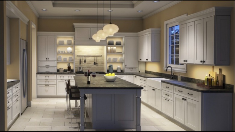
Sherwin-Williams Netsuke provides a beautiful neutral yellow with khaki undertones, and it's the color Napier painted her dream home kitchen with. Built in 1930, the home required a total kitchen renovation, which could easily detract from the historic aesthetic. Napier explained to Southern Living she envisioned a kitchen that was "like the downstairs from Downton Abbey" — comfortable yet functional, elegant yet utilitarian. And to create that style kitchen Napier desired, she chose Sherwin-Williams Netsuke as the primary paint color. It makes for a great example of the "dinge" Napier embraces.
Valspar Cream Delight
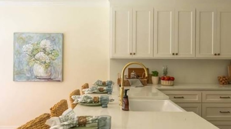
Valspar's Cream Delight is a popular shade of white with warm undertones that give this neutral an inviting feel. And that is exactly why Napier chose it for a client kitchen renovation. Looking to provide a coastal-style facelift to an old kitchen, Napier chose this as the color for the walls, ceilings, doors, and the trim. Pairing it with a painted cabinet seating area in now-discontinued Sea Mist, a greenish-gray color with yellow undertones, proved to be just what she needed to complete the look.
Sherwin-Williams Morning at Sea
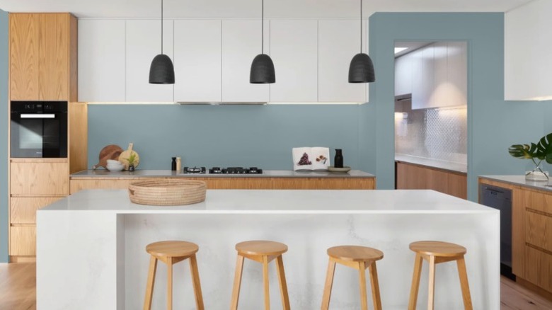
In one of her favorite kitchen renovations on her and her husband Ben's HGTV show, "Home Town," Napier was motivated to use a blue hue from the existing ceramic tile backsplash. To match and enhance the look of the tile, the kitchen cabinets were painted in the gorgeous gray-blue hue of Morning at Sea by Sherwin-Williams. Although it could appear a bit moody on its own, when paired with bright white upper cabinetry and a herringbone-patterned brick floor, it was right at home.
Sherwin-Williams Quietude
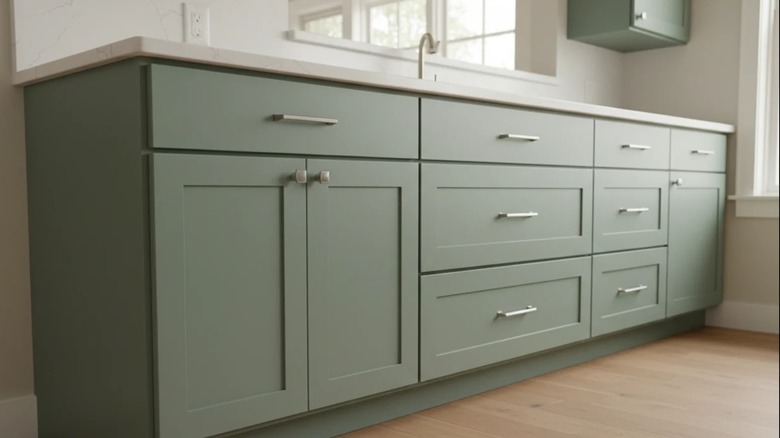
One of Napier's kitchen remodels, The Cochran House, was remodeled into transitional housing for women. Wanting to bring the old home back to its former glory while also creating a place of refuge, Napier knew the atmosphere needed to be as inviting as possible. To bring that feeling to the Cochran kitchen, Napier painted all the cabinets and the door in Sherwin-Williams Quietude, a neutral green with blue and gray undertones. Green is a color considered by Napier to be neutral because it is the color of nature.
Valspar Noir
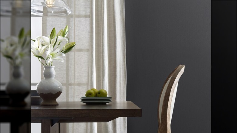
Showing you really can choose any color for your kitchen, Napier sent a huge goodbye message to boring kitchens by bringing in the darkest of dark colors, Valspar Noir. This paint is black, but it also has a cool undertone which allowed Napier to transform the cabinets of one high-ceiling kitchen into elegant, eye-catching showpieces. Pairing the dark color of the cabinets with light, neutral brown walls and a muted black on the ceiling created a sophisticated space.
Sherwin-Williams Tranquil Aqua
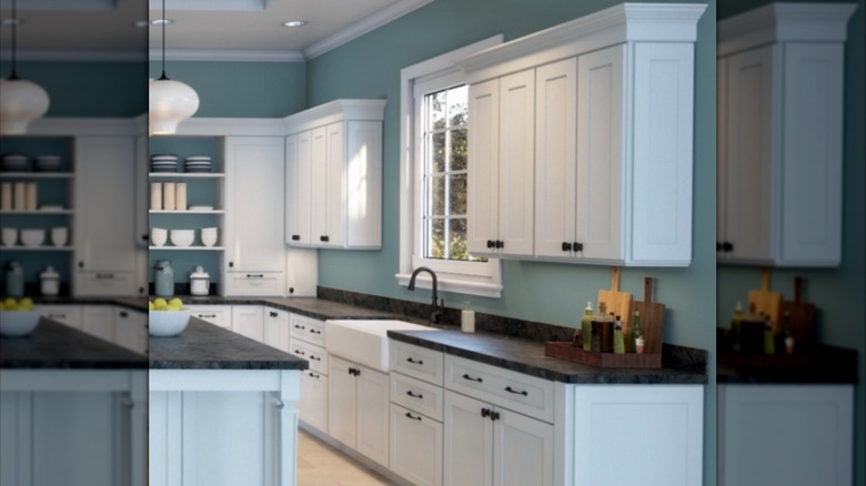
When a client inherited a family home, they were very excited but found the space felt a bit small. Working with natural elements in the kitchen, like a tiled wall and one of exposed brick, Napier knew she had to make intentional choices to create a larger, more inviting space. So, she used Sherwin-Williams Tranquil Aqua – a calming blue shade that can be paired well with white or yellow — on the floor-to-ceiling cabinets.
Benjamin Moore Jojoba
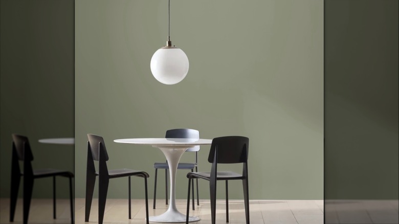
As already mentioned, Napier is a fan of green as a neutral. That's why she chose Benjamin Moore's Jojoba, a softer side to forest green that produces a shade of muted olive, to liven up one of her redesigned kitchens. Using the green paint to showcase the cabinets, she covered the walls in soft ivory as a supporting color and instantly was able to give the room the warm, embracing aesthetic it needed.
Sherwin-Williams Conservative Grey
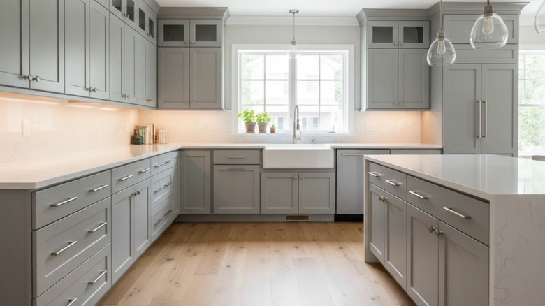
Napier has previously brought in Sherwin-Williams Conservative Grey to a client's kitchen. A green-gray color with blue-green undertones, it adds a cozy feel to a kitchen while subtly showcasing the doors, cabinets, windows, and backsplash. With a bright white ceiling and neutral-colored walls, the combo creates a comfortable space from day to night.
Sherwin-Williams Deep Sea Dive
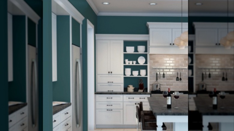
Sherwin-Williams Deep Sea Dive is a rich color that is both mysterious and tranquil. This go-to blue for Napier is a brilliant blue-green that she used on her clients' kitchen cabinets. Paired with bright white walls, the kitchen seemed to pop wide open with both color and space.
Benjamin Moore Kendall Charcoal
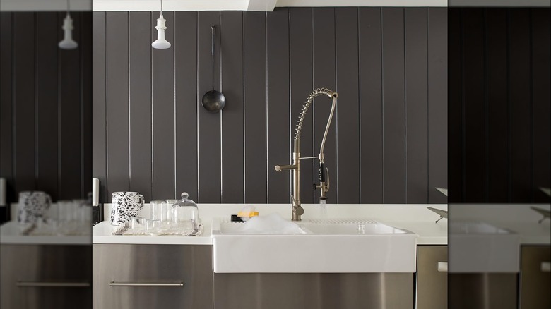
Benjamin Moore's dark and stormy Kendall Charcoal is a striking accent color Napier has previously used. Doubling down on the neutral green color palette, she went with a muted gray-green on the walls and chose the pantry door to carry the heavy weight of the dark charcoal gray. Creating a focal point with the pantry allowed for the kitchen to go from stuffy to superb.
Sherwin-Williams Cajun Red
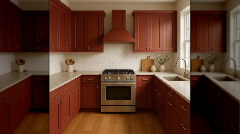
A bright, rich color Napier chose for a client's kitchen, Sherwin-Williams Cajun Red is in the company's line of historic colors. A spicy brick red with orange undertones is a perfect choice for kitchen cabinets. When the color is paired with a bright Dover White, the room remains both bright and warm.
Sherwin-Williams Cascades
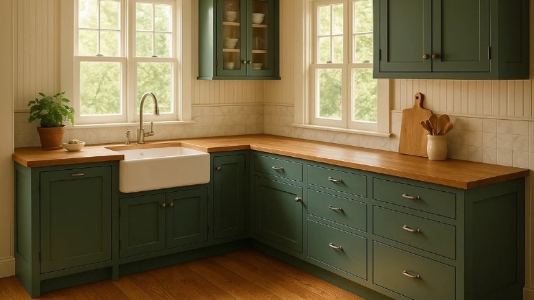
Don't shy away from a dark color for fear of what it might do to a space. Napier chose to paint the majority of a kitchen — floor to ceiling cabinets, trims, door, and bead board — in the dark bluish-green of Sherwin-Williams Cascades. Gorgeous and bold, this dramatic color transformed the kitchen from plain to powerful.
Sherwin-Williams Regatta
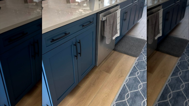
Regatta by Sherwin-Williams is a deep violet blue with hues of cerulean. Dark yet vibrant, the company suggests using it for an office or bedroom, but it's perfect for a kitchen, too. When working with one client who adored Mexican-inspired designs, Napier chose to use the terracotta floor as a grounding point that allowed her to go bold with this color on the cabinetry.
Benjamin Moore Beau Green
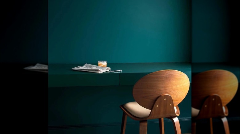
Beau Green is another bold choice from Benjamin Moore in the green category, which leaves us curious as to just how neutral Napier considers the color of nature. Described as a mixture of emerald and sapphire, this color brings a wow factor to a kitchen. Napier previously painted the cabinets and island of a kitchen with this remarkable hue, and the pairing of a slight off-white shade for the walls brought sophisticated excitement to the newly-rehabbed room.
Sherwin-Williams Rosemary
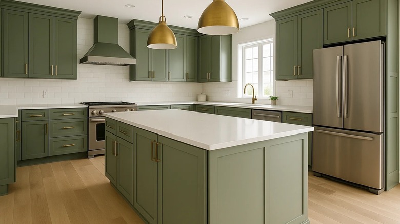
Rosemary by Sherwin-Williams is a soft, muted olive with gray undertones that offers color and comfort to reside simultaneously. Napier chose to make it the highlight of a client's dining area while choosing a lighter tone from the same family for the kitchen cabinets. With soft complementary shades established, what was once two rooms became a central space with a simple splash of color.