

Why Is The Nestlé Logo A Bird's Nest?
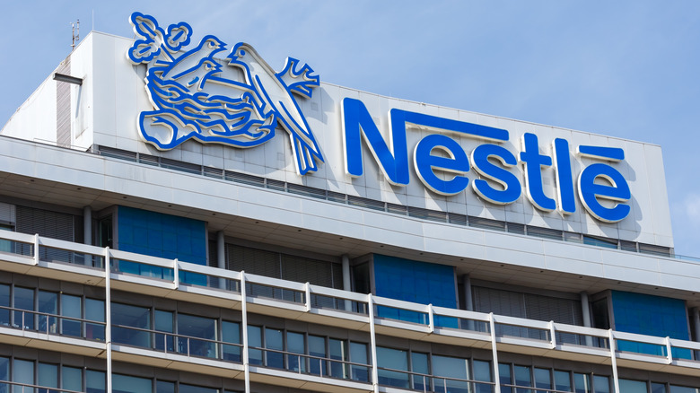
Many of the world's most iconic logos contain hidden meanings if you know where to look. FedEx has its hidden arrow suggesting speedy delivery, Amazon's smile indicates the company sells everything from A to Z, and Toblerone's camouflaged bear hints at the chocolate's Swiss roots in Bern. The origins of the famous bird's nest logo is one of the more interesting facts about Nestlé, and while the image does have a deeper meaning, it's far less subtle than you might think.
The Nestlé we know today is the result of more than 150 years of various mergers and brand buyouts, but it takes its name from German-born founder Henri Nestlé. In German, the surname "Nestlé" roughly translates to "little nest," and the Nestlé family crest depicted a small bird sitting in one. When Nestlé founded his company in the 1860s, he adapted the coat of arms into a logo featuring a bird feeding three chicks inside a nest. However, this wasn't simply an homage to his ancestry. Nowadays, Nestlé owns countless popular brands, but its very first product was milk-based infant formula. The nurturing image of a mother feeding her offspring was the perfect match for the company, and Nestlé officially trademarked the symbol in 1868, helping customers differentiate its products from competitors at a time when recognizable branding was starting to gain importance.
The evolution of the Nestlé logo
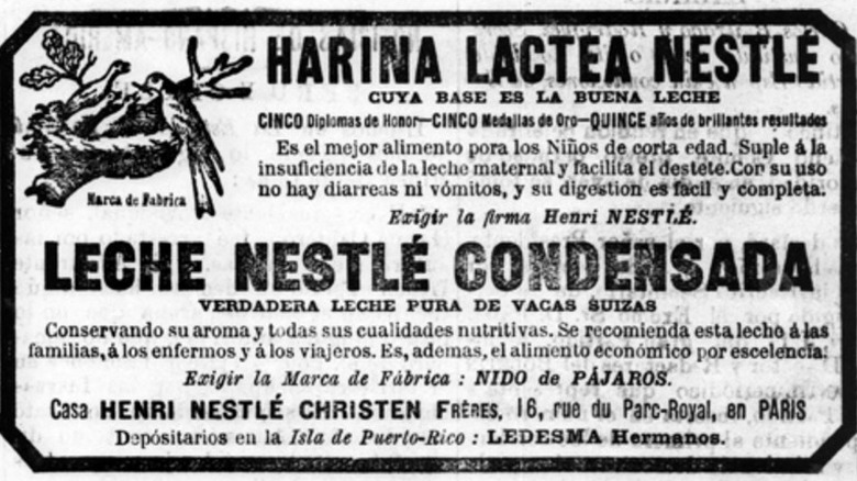
Although the bird's nest has remained central to Nestlé's branding since the company's inception, the logo itself has gone through several redesigns over the years. The earliest versions were far more decorative and detailed than the modern design, but the updates have been so gradual that most customers probably didn't notice the change. At least, there doesn't seem to be any record of Cracker Barrel-style outrage over the logo redesigns.
The first notable change to the logo came in 1938, when Nestlé added its wordmark to the nest illustration for the first time. By this point, the company had significantly expanded its product portfolio, and the logo was used as an umbrella icon for its various global brands. In 1966, the font was modernized and the image made slightly cleaner, but the most significant update was made in 1988. The number of chicks in the nest was reduced from three to two, and while this may have been a way of simplifying the logo, some believe it was intended to reflect the smaller size of modern families. This was also when Nestlé introduced the instantly recognizable lettering style that's still used to this day.
While the Nestlé logo has been further refined since, the current version is remarkably similar to the one introduced in 1988. Minor changes were made in 2015 to improve readability on product packaging and digital screens, and an oak brown hue was adopted in 2018 to give the logo a warmer, more natural aesthetic. Whether Nestlé will change its logo again remains to be seen, but based on its history, it's a safe bet that the iconic nest is here to stay.