This Mall-Based Snack Chain's Logo Used To Include A Halo
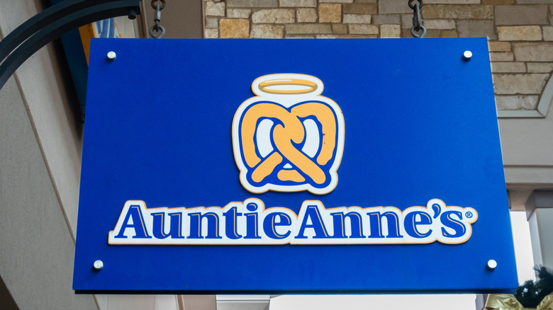
Based on recent consumer input over restaurant logos, they're often a touchpoint with loyal (and very vocal) fans. Timid restaurateurs may press pause before making noticeable changes — but apparently not a highly recognizable mall-based snack chain, one that long featured a glowing gold halo in its logo and signage. That beloved chain is Auntie Anne's, maker of the well-loved pretzels perched in shopping and airport food courts for decades.
The halo-graced logo held a divine presence for about 17 years, from 2006 to 2023, perhaps an inference to the heavenly taste of the warm types of soft pretzels. Fans would surely agree, but the significance potentially goes much deeper, given founder Anne Beiler's remarkably religious upbringing. As a member of Pennsylvania's Amish-Mennonite community in Lancaster County, Beiler was raised with faith-based principles, a strong farm-based work ethic, and close family ties with seven siblings. However, interestingly enough, the halo appeared in the logo only after Beiler and her husband sold Auntie Anne's to a cousin, Sam Beiler — who was also part of the Amish community.
By the time the tell-tale halo was replaced in 2023, along with its homespun, artsy pretzel illustration, Auntie Anne's was under its current umbrella of GoTo Foods, home to other recognizable chain restaurants, including fellow mall-mates like the cinnamon-scented Cinnabon, Carvel, and Jamba. The Auntie Anne's logo got a modern, simplified spruce-up, sans the halo, with a cleaner, sleeker pretzel-only symbol. As more modernization moves forward in 2025, the logo is being incorporated across a broader spectrum of at least 150 Auntie Anne's remodels.
Auntie Anne's sans the glowing halo
As GoTo Foods takes Auntie Ann's through a contemporary transformation, the logo inevitably centers the new look — but it's not the only focus. A company statement reveals the goal of attracting younger demographics, inviting them to "twist up your day" in the updated ambiance, which includes the modern logo that "aligns with the brand's fresh personality and evolving tone." It's accompanied by a total décor uplift with modular layouts, fresh textures, and artistic design elements evoking pretzel imagery such as twisted murals and "naturally knotty" wall graphics. There are also open kitchens and a "now rolling" sign inviting customers to watch the pretzels come to life.
As summarized by Michael Freeman, President of Brands, "Our bold new look, featuring vibrant blues, playful twists, and a sleek logo, signifies a major evolution in our visual identity, ensuring we remain culturally relevant and enticing to our target Gen Z and Millennial demographics." It's a bold gamble in a social-media environment that penalizes nostalgia brands like Cracker Barrel for eliminating iconic logos and décor.
To date, there's less outrage over changes at Auntie Anne's, with mixed reactions from pretzel fans. One Reddit user feels the rebrand, which includes mobile ordering plus the refreshed ambiance and logo, "is cute I guess but I don't think this solves the fundamental business problem — there are less malls and less people going to them, therefore less people to buy mall pretzels." Some gripe about pricing or quality, though others mention they'll continue to buy the pretzels regardless.

