The Mall-Based Restaurant Chain Whose Logo Went From Decorative To Dull
In August 2025, Cracker Barrel revealed (and subsequently reversed) a highly-controversial rebranding strategy, considered one of the biggest restaurant logo changes of all time. The new design, embracing the corporate minimalism trend, was bashed for being out of touch. But the restaurant-plus-country-store is far from the first victim of public scrutiny for an updated logo. Nearly two decades earlier, Ruby Tuesday — the mall-based chain restaurant best known for its all-you-can-eat salad bar — made a similar gamble with its public-facing appearance, taking a once lively and distinctive logo and stripping it down to its simplest parts.
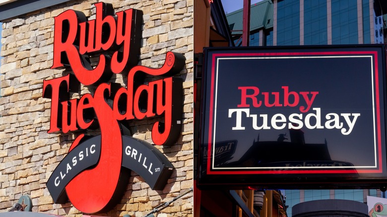
When it first opened in 1972, Ruby Tuesday was a hoppin' burger joint made for college students by college students. Naturally, its logo was adorned with ruby red script lettering, with quirky little curlicues throughout, giving the icon a sense of motion and whimsy. The first "S" in "Tuesdays" was especially prominent, with a larger-than-life lower hook that became instantly recognizable for the restaurant's regulars. And for newcomers, Ruby Tuesday's logo signaled it wasn't a fancy, upscale eatery, nor was it fast food. Instead, customers knew it was a casual neighborhood hangout spot even before walking in.
As the chain expanded across the country, its logo underwent some minor changes, but the symbol's bones remained in tact. That was until the mid-2000s, when the company faced pressure amidst a changing market, undergoing a massive rebrand that removed its logo's unique lettering, opting instead for Clarendon, a readily-available type of serif font, instead.
A Ruby that lost its shine
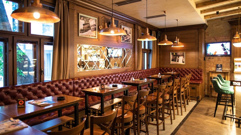
Around 2006, Ruby Tuesday shifted away from the kitschy vibes it had curated over 30 years in business. Spending over $100 million in the process, the chain's image became more upscale, with waiters donned in black, an expanded wine selection, and redecorated interiors. The company's new logo was at the helm of this rebrand, with the text split into two colors. "Ruby" remained, well, ruby, and "Tuesday" became written in black or white font, depending on its background. For a restaurant known for inexpensive meals, its new logo felt like it could belong anywhere, lacking the signature soul the company originated with.
Unfortunately, the upscale rebranding came at the worst possible time, too. In 2008, the United States plunged into deep financial crisis, and while some companies like Starbucks elevated efficiency during the Great Recession by listening to customer feedback, Ruby Tuesday didn't fully understand its core audience's needs. Its bread and butter entree sales — think ribs, burgers, and the aforementioned all-you-can-eat salad bar — all slumped, and overall attendance dropped.
Though the company did see some gains in the early 2010s, Ruby Tuesday remained rocky, changing its owners and corporate leadership several times. And, even worse for Ruby Tuesday, another 21st century crisis exposed the chain's pre-existing cracks. The nationwide shutdowns caused by the COVID-19 pandemic forced the company to shutter hundreds of its locations. Ultimately, Ruby Tuesday filed for bankruptcy in October 2020, but locations remain open to this day.

