Cracker Barrel Is Finally Speaking Out After Its Disastrous Logo Change. Here's What Happened To Uncle Herschel
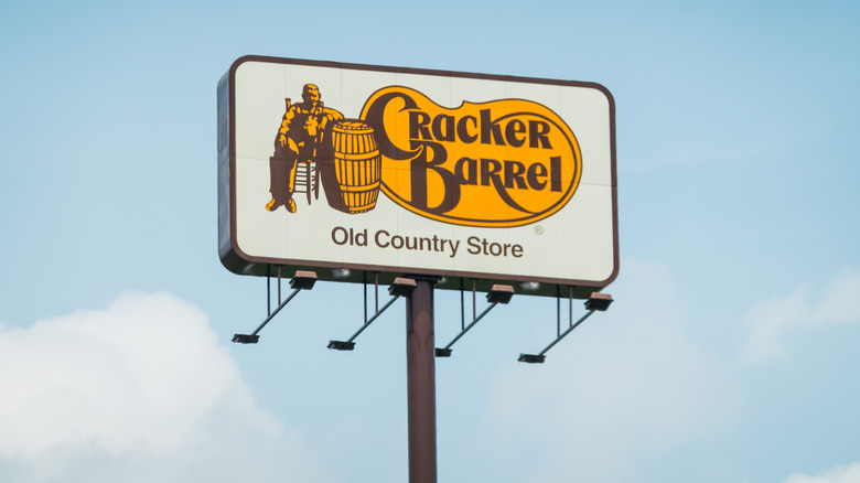
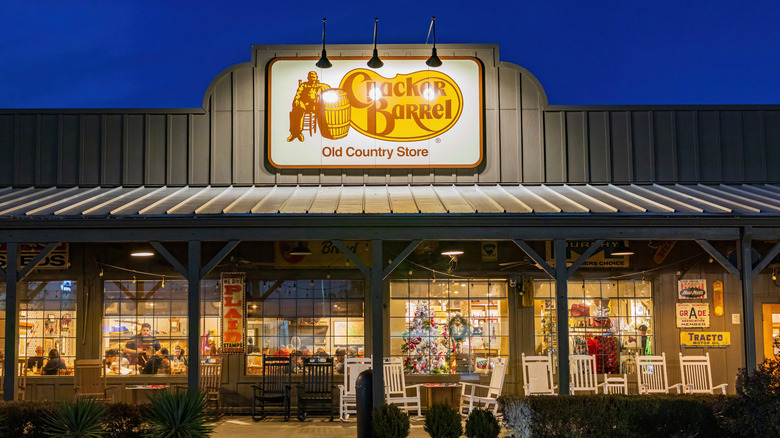
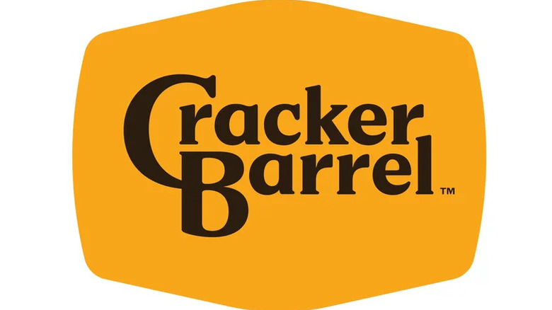
Cracker Barrel unveiled a simplified wordmark in late August, dropping the familiar, illustrated white man leaning on a barrel, as part of a wider refresh of stores and branding. The rollout drew sharp backlash from conservative media and related social platforms, and the company's stock fell after the reveal. In a public statement, the company said the communication fell short, reiterated the brand's focus on food and hospitality, and clarified that Uncle Herschel hasn't been replaced. "He's not going anywhere, he's family," the statement read.
Cracker Barrel has been around since the late-1960s when the highway-adjacent concept was created by Dan Evins to capture the imaginations of travelers and sell food and gasoline. The first unit went up by Interstate 40 in Lebanon, Tennessee, and the look was curated to resemble an old country store, by then already a symbol of a bygone era. The illustrated old-timer wasn't even part of the original logo, but was added as the brand scaled in the late 1970s.
If a private trademark feels like heritage, it says as much about how corporations package memory, and sell cultural identity, as it does about the actual past itself. The new signage shows a minimalist wordmark, common for national chains hoping to reach new generations of Hashbrown Casserole eaters, while reassuring, and keeping, loyal regulars. The company's statement, entitled "Our Promise to You" attempts to mollify everyone seated at the table, and promises vestiges of the old signs will remain.
A sign of the times
Rebrands are routine maintenance for national chains, especially ones struggling to stay both culturally relevant and financially solvent. The new logo allowed critics to focus on a single target: Uncle Herschel's erasure. The company's response shows that the rebrand's focus is on making the visitor experience more consistent, while giving official reassurance that the emblematic uncle will live on in the menu, road signs and gift shop.
The buttery heart of the biscuit is that people don't read logos as just design, but as symbols that gather meaning over time. That meaning is reassigned as culture, demographics and values evolve, which is how a sign advertising hush puppies and hot cakes along the interstate can become representation of identity, and why an update at a private company can be argued as if it were public heritage.
But it's important to remember, corporate marketing is a system with one aim — to sell more of what the company makes. When a logo is treated like a family member, the strategy has succeeded, because the uproar is also advertising. It keeps the name in circulation and nudges people back for chicken n' dumplins.
Heritage vs. Minimalism
If critics feel that the new logo is missing some soul, it may be because it's part of a long run of simplifications across industries. Designers have labeled this aesthetic "blanding," a move toward stripped-down marks that are easy to reproduce but risk sameness. See McDonald's continuous revamping of its McCafé concept throughout the last 10 years, or or Village Inn's early-2010s update, which swapped a tavern-style wordmark for a flats sans serif logo. Research and trade coverage have noted minimal marks travel well on screens, while more descriptive or pictorial marks can feel warmer and read as more authentic.
Chains also simplify because the mark has to be versatile. It needs to be legible on a freeway sign at 70 miles per hour and in a one-centimeter app icon. Fewer strokes cut fabrication costs and reduce failure points when hundreds of stores roll out at once. It's all production choices inside a system that has to function at national scale.
Cracker Barrel says Uncle Hershel will remain where guests encounter the brand, and if breakfast hits the table hot and the dining room feels comfy, the reaction will likely settle into acceptance. If the biscuits are dry, or the sweet tea watery, no logo can fix it.


