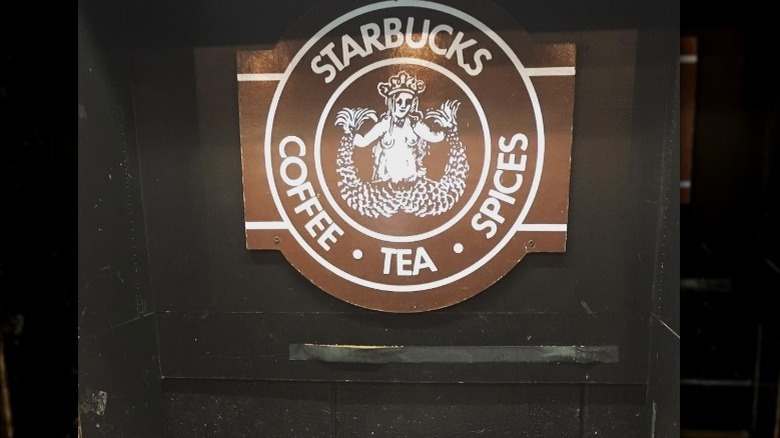
The Original Starbucks Logo Was NSFW
It's important for logos to be unmistakably recognizable, so as to succinctly and prominently represent their brand to the fullest. Consumers should know instantly which brand a logo belongs to and in the states, few logos are as instantaneously identifiable as the Starbucks siren.
A mythical and mysterious mermaid heralding newer and more tasty methods of ingesting caffeine, this image of the fair sea was one that the founders of Starbucks intentionally designed to convey to consumers, per Forbes. Even the name Starbucks is taken from a combination of an old town by the sea and Captain Ahab's first mate.
According to Starbucks, when deciding on a logo or mascot that could capture the same saltwater settings as the namesake, designer Terry Heckler found himself flipping through old illustrations of mythical sea beasts, examining ancient illustrations of water nymphs and sea sprites. Eventually he settled on the siren or mermaid, simultaneous symbols for both alluring beauty and powerful danger.
Why Starbucks updated its logo
This siren was not always the child-friendly, universally recognized, safe for work logo you know it to be today. The original logo was a bit more elemental. It was more detailed in a rugged way as if it had itself been beaten by tide after tide. The siren was a brown color, had a forked mermaid tail, and most problematic of all, was topless (via Insider).
At the time of Starbucks' inception the image was not as controversial and the brand had not spread far enough to garner any criticism, but as time went on the coffee giant saw fit to modify the logo. In 1987 Starbucks came under new ownership and Heckler was asked to merge the Starbucks logo with that of Il Giornale, and in 1992 the siren was branded onto all Starbucks merchandise, per Starbucks. Eventually, in 2011, the logo was slightly altered again to be the siren people know today, adorning cups everywhere and calling back to wilder times.

