This Beloved Ice Cream Brand's Logo Went Minimalist Back In 1979
Ice cream transcends age (we all scream for ice cream, kiddos and grown-ups alike). In the case of Ben & Jerry's, really good ice cream can transcend time itself, too. According to data analytics firm Statista, the confectionery giant's brand awareness is fairly equal across generational divides, with an enthusiastic fan base spanning all age groups. The ice cream has been wildly popular since its conception in the '70s – and in addition to a knockout product, memorable branding also helps get the message across.
From 1979 through the '80s, Ben & Jerry's sported its plainest logo in company history. Different logo iterations throughout the decades have always included the names of co-founders Ben Cohen and Jerry Greenfield (and there's a sweet reason why Ben's name comes before Jerry's, by the way). But, the company's 1979-1980s logo delivered the simple, unforgettable message needed to help the then-new brand break onto the national food scene and stay there.
The business officially began in 1978 as a scoop shop inside a renovated Burlington, Vermont gas station. To expand their product to grocery retailers in the area, Ben and Jerry started renting a former spool-and-bobbin mill, which they transformed into an ice-cream-packing facility. The now-iconic, globally recognized pints fans know today were personally delivered to stores by Ben himself in his VW Squareback station wagon. Enter: A fresh, updated logo designed to suit the growing business.
Ben & Jerry's broke onto the '80s foodie main stage with a minimal, memorable logo
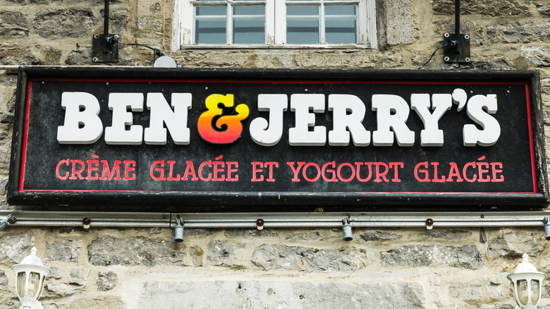
In 1979, the burgeoning ice cream chain's simplified logo read just "Ben & Jerry's" with a multicolored ampersand. This stripped-down design might have been an effort to increase memorability as the company spread beyond its local Vermont community. Also notably, Ben & Jerry's ice cream pints didn't exist at all until 1980. It was cups and cones only at the O.G. gas station scoop shop. So, the company's logo wouldn't have been printed on every single product before then, ostensibly creating the need for a simplified logo. In fact, the original pints of 1980 only listed their specific ice cream flavor on the lid, not on the side of the pint.
Before the simplified logo of 1979 debuted, during its first year of operation only, Ben & Jerry's was represented by a more ornate, high-detail logo. The 1978 logo featured a bold black oval, surrounding an illustrated piano covered in three large, cartoonish ice cream scoops. Text inside the thick oval border read "Ben & Jerry's Homemade" in lowercase letters. The piano icon makes sense, considering the co-founders' (and subsequently the brand's) emphasis on arts and counterculture. On the company's 10-year anniversary in 1988, when Ben and Jerry received the "U.S. Small Business Persons of the Year" award by then-President Ronald Reagan, Jerry arrived at the White House wearing the only suit in his closet, and Ben was clad in a waiter's jacket.
The 1979-80s logo simplified an artsier design from 1978
Even though the company's 1979 logo dropped its Creem-magazine-esque piano design, "Cherry Garcia" flavor debuted shortly thereafter in 1987. Over the years since, Ben & Jerry's wide-ranging flavor oeuvre has oft-included pop culture references, like "Bernie's Yearning" in support of Senator Sanders' 2016 presidential campaign. Indeed, commitment to high-quality ingredients (which itself is a revolutionary act in the modern industrial American foodscape) and sociopolitical activism have always been the center of the Ben & Jerry's brand. Philanthropic group The Ben & Jerry's Foundation was established in 1985, and the company publicly rebuked the use of artificial growth hormones in 1989.
In many ways, the company's activist endeavors have become synonymous with its name (and, by extension, recognition of its logo). A dedicated Issues We Care About page on the company's website lists LGBTQ+ rights, climate justice, racial justice, rights and dignities of refugees, campaign finance reform, intentional product sourcing, regenerative agriculture, and more — an accessibility- and community-forward message arguably highlighted by the cofounders' use of their first names only in the company's branding. (No comment on Ben Cohen's recent retirement due to activism-squashing tactics by now-parent-company Unilever, or his sobering Instagram statement about the move.)
The minimal "Ben & Jerry's" typeface logo of the '80s remained until the 1990s. Funnily enough, it was replaced by a reprisal of the original round-shape-encircling-a-drawing motif of 1979. This time, the words "Ben & Jerry's Ice Cream" circled a black-and-white photo of the co-founders.


