Pepsi Is Updating Its Logo, So Let's Look At The Bizarre Proposal For The Last Time It Changed
Writer and philosopher Susan Sontag once famously observed that "Obsessive people make great art." If you're ever feeling a little "married to your craft" or like you might be overdoing it (i.e. every bar conversation centers around your band), rest assured: In the art world, an excess of passion can be a good thing. As Pablo Picasso himself put it, "The chief enemy of creativity is 'good' sense."
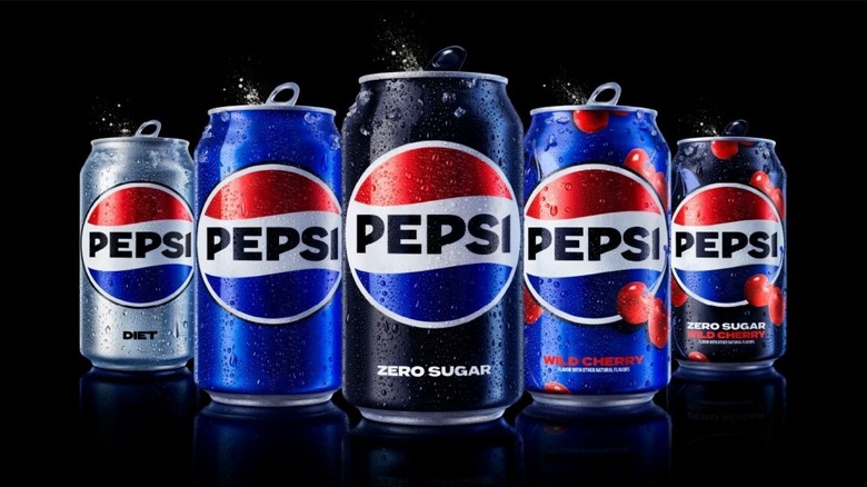
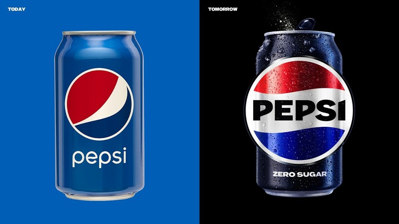
So, why are we walking about this? Pepsi is updating its logo for the first time since 2008. Design-wise, it's not a drastic change. The previous logo was a slightly-diagonal, tri-color swish, contained in a circle above the word "pepsi" in lowercase letters. Now, the new logo rotated the color wheel to a horizontal plane and the "PEPSI," written in the middle of the wheel, is all uppercase. On the surface, it's a pretty ordinary change, but Pepsi is no stranger to the avant-garde. In recent years, the soda giant has released imaginative flavors like s'mores and nutmeg. Or consider the strange 2015 Pepsi Super Bowl Halftime Show, where Katy Perry's "left shark" nearly broke the internet. Still, perhaps Pepsi's greatest exploration into the alternative art world was its newly-retired logo.
As Newsweek revealed, Pepsi's former logo was created by industry giant Peter Arnell, who worked on branding for Tropicana, McDonald's, Samsung, DKNY, Ray-Ban, and countless others. But, his Pepsi logo was more than just a graphic design — and Arnell's bizarre proposal explains it all.
Peter Arnell invites fans to enter the Pepsiverse
It might seem like a basic, tilted color wheel, but Arnell conceptualized the seemingly-simple Pepsi logo with Dali-esque geometric ideations in mind. The logo was designed around an axis in which two rays intersect. The first ray is represents "Convention to Innovation," and the second "DNA to Future," per Golden Number, which shared a copy of the detailed proposal. The intersection of these rays is the center of the Pepsi logo circle — but this is only where Arnell's Pepsi-logo-metaverse-lore begins. The former "swoosh" shape of the tri-color logo might look like a freehanded artistic flourish, but don't be fooled: Its angularity was modeled after light's natural path through an object, the spatial directions of universal expansion, and earth's gravitational field. (Yes, really.) These measurements were interpreted as an acute angle with a curved lower axis, resulting in the slightly tilted, swooshy, oblong "swirl" Pepsi fans recognize and love — or, at least, used to. The logo is different now, and, as far as we can tell, there's no accompanying soft drink metaverse this time.
The old design is, perhaps, an extreme example of obsessive art riding the line between bizarre and impossibly cool. Still, Pepsi's new logo isn't totally dropping its unconventional artistic roots. Per PepsiCo, the new logo "evolves the Pepsi brand to represent its most unapologetic and enjoyable qualities," which is a notably abstract way to describe a slightly roasted circle and some capitalization.

