Tanqueray Debuts New Bottle Design For Its Iconic No. 10 Gin
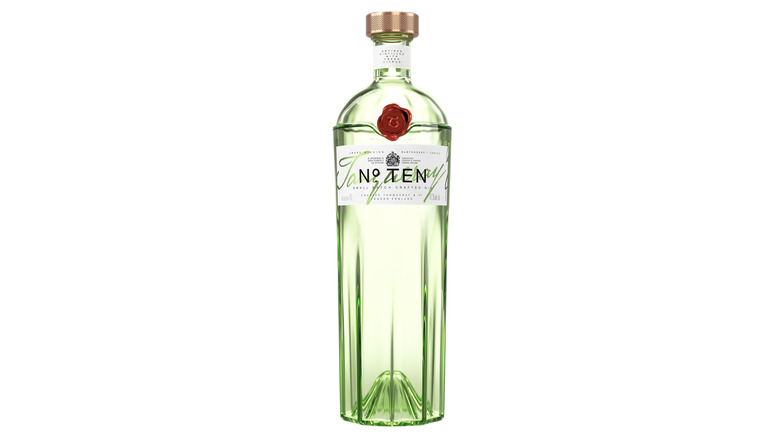
Gin drinkers have something exciting to talk about thanks to the new bottle redesign of the legendary Tanqueray No. 10. According to a press release, the new bottle retains its Art Deco sensibilities, but has swapped out the old silver cap for a lustrous copper complete with a citrus grater texture which offers a nice grip and gives a nod to the Tiny Ten copper pot still that the Tanqueray No. 10 gets its name from.
Another major change is the slightly more translucent green glass which manages to stay within the Tanqueray family's characteristically emerald color scheme while adding a new lighter touch to the entourage. The bottle's shape has also changed slightly, resembling a citrus press on the lower half. The previous design had a similar structure but it reached all the way to the top of the bottle, whereas this one tapers off before cresting over a nice ridgeline that undergirds Tanqueray's signature red wax stamp there on the front.
If you were a fan of the previous bottle's design, you may still have some time before the new bottles push their way through the supply — but you better hurry since the transition is already underway. The redesign comes in tandem with the company's announcement of a bartender residency program that aims to cultivate excellence in the global bartending industry. Feel free to celebrate your own bartending mastery with a Martini, a drink the No. 10 excels at.
A history in glass
This is the second time Tanqueray No. 10's bottle has been redesigned. The original Tanqueray No. 10 debuted in 2000 with a bottle that didn't exactly impress. The citrus press shape hadn't been adopted yet, leaving it with a relatively flat-looking exterior. The label was quite simple and the cap was smooth and lacked character. No. 10's debut at the turn of the millennium coincided with the beginning of the cocktail renaissance that poured out of New York City — an auspicious moment that helped carry it into the limelight where it has since won many, many awards and accolades.
In 2014, the bottle got its first redesign, which better showcased what had become a celebrity among spirits. While the original bottle offered a faint whiff of Art Deco, the new design made it a core feature. It was as if the glassmaker began writing in cursive instead of plain block print and the writing on the label was upgraded in kind. The 2024 redesign is a nice evolution in Tanqueray's bottle aesthetics.
While the previous design was fantastic, in comparison, it feels quite loud. The Art Deco features lambasted the eyes, whereas this one feels more graceful and refined. The previous design had an identical emerald hue to Tanqueray's flagship gin as well, which made it hard to distinguish the two. Tanqueray remains one of the most popular gin brands in the world for good reason and it's nice to see the company paying attention to the little details.