What Panera's Logo Represents
What's in a name? William Shakespeare posed that question in his play, "Romeo and Juliet." While he determined that names are irrelevant and that a rose by any other name would smell as sweet, the case is much stronger for logos. What is in a logo?
Panera's logo was the brainchild of the design firm Heckler Branding. Besides Panera, they have branded culinary giants like Starbucks and Qdoba. Can you imagine life without the mermaid?
Like their culinary competitors, Panera's imaging, font, and colors were specifically designed to represent the company's mission, vision, and core values.
Panera's logo has seen four revisions in the three decades since its inception, according to 1000 Logos. The beloved cinnamon crunch bagel and convenient you-pick-two have become the signature identifiers of the restaurant's warm, easy, and comforting draw. Each version of its logo has served to represent those identifiers — warmth, comfort, and freshness. The newest version is no less significant, incorporating symbolic elements from color, to font, to image placement, to size, and their meanings may just inspire you to reconsider Panera as today's lunch option.
The woman is Mother Bread
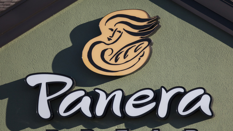
Panera's newest logo is of a woman with long, flowing hair drawn in dark brown lines, set on a beige background. She is holding a loaf of bread and, in one hand, is breaking off the end. She faces outward with a large green arch behind her, "Panera Bread" written in script and boldface beneath her, via Logos World. Each element of this design is steeped in meaning.
The woman is the most enduring feature of Panera's logo and is known as "Mother Bread." The new design places her front and center. The term "mother" is two-fold. CNN writes that this emphasis on the mother is a "nod to Panera Bread's more than 30-year-old sourdough starter." Sourdough begins with a starter or a "mother," which can be kept forever if it's continually fed. The Mother breaking off the end symbolizes Panera's long history of taking a piece of the original 1980s "mother" to any new Panera Bread location so that its bread can continually be baked from the source, explains 1000 Logos. In past logos, Mother Bread cradled a baguette like a baby. Panera still uses the Mother to represent comfort and care, writes Taste of Home.
Colors represent bread and freshness
Panera's colors are significant too. While many describe the golden tones as beige, Logos World explains that it's a custom color of orange-yellow that provides warmth to the sign. The olive represents Panera's fresh ingredients and commitment to the environment and has been used as either the background or the font color over the years. The company has long been committed to fresh ingredients, sustainability, and environmental awareness. Beginning in 2004 with their debut of antibiotic-free chicken, they declared themselves as 100% clean by 2017, per their site. They have always been forerunners in green initiatives and health awareness — the first national restaurant to post calorie and nutritional information on their menu boards and the first restaurant to partner with the World Resource Initiative for "cool carbon food meals."
Shapes have also played a part in Panera's logos over the years. This newest design introduces a brand new feature with its arch-shaped green background. Taste of Home writes that the arch is meant to represent the open mouth of an oven. All in all, Panera's logo represents the warmth, comfort, and familiarity that we all have come to recognize in the brand.


