What It's Like To Create An Event Space, According To A Pro Design Team
A Q&A with designers from FLOAT Studio, the experts behind our new space
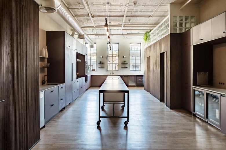
We're proud of our new event space—mobile islands, in-wall taps, impressive pops of color—but it sure didn't build itself. We have FLOAT Studio, a six-year-old, full-service firm, to thank for that. The team handled everything from construction drawings to choosing flatware in order to create a work space that motivates and inspires.
When FLOAT partner Brad Sherman and junior designer Barbara Giacoman got to work designing The Commons by Tasting Table, they had a specific goal in mind: a modern, warm space that's as functional as it is inviting. Here, Sherman and Giacoman talk about exactly what went into this project.
What was your vision for The Commons? How faithful were you to your original plans?
BS: "What was really important for us in your space was to understand the functional component that goes into making a successful test kitchen. We designed a bunch of test kitchens in the past for New York companies—Lucky Peach, Food52—and we've learned in the process that every company has a different set of needs for food prep, styling, video shooting and whatever they're using their kitchen for. Your kitchen served a variety of needs. Understanding what those needs were from the beginning was really important and so was creating functional zones that could be flexible. Filming and general preparation was very important to [Tasting Table], so using all that information, we created a space that we're very happy with but ended up pivoting toward the end to get that beverage bar area. I think the design was a lot more successful because of it."
BG: "Aesthetically, we tried to do something that wasn't too masculine or too feminine—gender neutral. We maintained what you need for events while not losing that Tasting Table touch and having some personality in it."
BS: "Geoff [Tasting Table's CEO], by nature and looking at the way the original space was designed, loves primary colors, like supersaturated, rich tones. And for Barbara, it was important to maintain that integrity but tone it down a little bit so it's not so specific or memorable. I mean, memorable in the design but not the color. When you're working with food, gearing toward neutrals helps highlight what you're doing and highlights the food and the dishware. That's what you want the experience to be about and less about the colors shouting at you. Barbara's done a really good job of continuing to layer tones that have personality, like the burgundy [cabinetry], but are still neutral except for the amount of saturation the color has. That burgundy is very much a red, but it's warm and neutral enough that it's still hunger-invoking and works well with the natural wood tones, and food looks great backed by it."
 Tasting Table
What were your inspirations for The Commons?
BG: "We deviated a little. We wanted an Italian postmodern [design]. And when we presented that to Geoff, he wanted to have more bright, big pops of color, and we'd shown something very toned down, very subtle. So that's why we brought in the royal-blue sofa to contrast with the burgundy on the other end of the space, and that brings the look [back] to the Tasting Table vision."
BS: "I think it was an overall mix of styles. I think, even though we started off Italian postmodern, we went toward something that's a little more just modern and fresh. [All the while] still maintaining Tasting Table's color palette but dumbing down the primaries: What was red is now burgundy, what was blue is now electric blue and what was green is now army green. We took inspiration from that but neutralized it so it's not so 'in your face.'"
How did you pick the countertops?
BS: "Caesarstone agreed to be a partner in this project, which is great, so we had their product line to choose from. And from our experience designing kitchens, something matte was a requirement. Because when you're shooting something, it needs to absorb the light; there can't be any shiny reflective surfaces. And that's how our choice for the material of the cabinets came about, too. So we had three options: One was a light concrete, one was a darker concrete and one was a new material that they just came out with that had some of those black and white flecks in it, and that one created a little more visual interest and a little more of a fresh feeling."
 Tasting Table
BG: "And the creamy color was ideal to contrast the burgundy, the black outlines [between the cabinets] and the black outlets."
Which comes first: design or function?
Both: "Function."
BS: "Always function, because it leads the design process. We have to understand what your needs are and what your aesthetic needs are. We have to consider who's the audience, who's being entertained in this space and also what the personality of the brand is. Function is the number one thing to understand about how clients are going to move through the space."
Describe your process for designing the lounge.
BG: "We will have custom tables made, and the furniture overall has a modern look and lofty feel to it. In terms of colors, we have the electric velvet couch, which will be a long linear couch against the main back wall, and we have black here and there, and the cane chairs."
BS: "Something Barbara did really well was connect the lounge and the kitchen with subtle details. There are all these black lines between the cabinets, and she designed a wall treatment [for the lounge] that is going to carry that black line in molding. I think what was really important was layering, starting from the shell and working inward. We took natural architectural details of the space that give those walls visual interest and layered a textile against the back wall. And we took that and layered it in the carpet and furniture. This is the kind of warm, cozy space that makes you never want to leave, but it's also cohesive, and that was really important."
Tell us about the wooden wall.
BS: "When we look at space a lot of times, it's in volume. There are certain architectural rooms and spaces that just define themselves based on how they are positioned, and there are a couple volumes in The Commons—one is the storage closet, the other is the stairwell entrance and the other is the bathrooms. So you had three areas for which we went, 'How can we treat this in a way that gives it a little warmth and texture?' Barbara came up with the idea of using tambour, which is an amazing wall covering that goes on like a wallpaper. Then it helps give a space warmth and texture."
Why should people want to entertain in The Commons?
BS: "It feels like the space has been evolving over time. The original tin ceiling from when the space was originally built and those large arched windows and skylights are all natural architectural features, but then you layer in things like 90s tambour and glass from the 70s and postmodern colors, and all of these things feel like somebody lived there and collected and added on throughout the years. And I think that once it's really finished, you're really going to get that. I always say, 'When the last thing's in place, it'll all make sense.' The idea is that you're coming into somebody's home and it has a personality, and that personality really is Geoff and Tasting Table. It feels like you are in a warm, comfortable environment that has a unique personality that can transform to meet a variety of needs more than any other kitchen I've seen or designed."
BG: "All the textures, materials and colors are a visual assimilation: the tambour, the different textures and the glass, the bright sofa on the other end of this space."
BS: "There's nothing like this that exists. Really, you look at all these blogs and you see similar themes like millennial pink or boho chic or whatever it is; this space is designed by a variety of things coming together, and it wasn't 'Let's copy that' or '"Let's copy this.' It really is a unique, one-of-a-kind space. You don't see too many burgundy kitchens out there. So if people are looking for an experience that is unique but still warm, big and stimulating, like Barbara said, this is it."