The Sly Way Restaurant Menus Use Fonts To Influence You
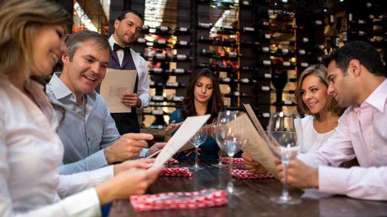
There are plenty of psychological tricks businesses use when it comes to the shopping experience. Think soft music, alluring sale signs, and free mints. As it pertains to eateries, can restaurants make their customers hungry? Not exactly, but they may be able to trick you into ordering like you are. When we scoot into a restaurant booth and reach for the aesthetically pleasing menu, our eyes will be drawn to particular items without even realizing it.
You may habitually skim the menu for your go-to sandwich order, but keep in mind what pulls you in another direction. It may be a different dish that calls to you, or it may just be the typography. Despite the constant reminders not to, society is always judging books by their cover, both literally and figuratively. When we peruse a well-crafted menu welcoming us with sparkling typefaces, we're going to expect the food to be just as elegant. A short, simple restaurant menu, meanwhile, suggests that the ingredients are as fresh as can be.
Not only do certain layouts captivate our eyes (and appetites), but, according to a 2015 study published in the International Journal of Hospitality Management, specific font styles and colors send our brains a message. Experts have been analyzing the psychology of menu design for decades and discovered that we're all tricked by what Dave Pavesic referred to in a 2005 issue of Hospitality Faculty Publications as "eye magnets." Bold lettering and bright borders are especially attractive to our wandering gazes.
Specific font styles pull our palates in new directions
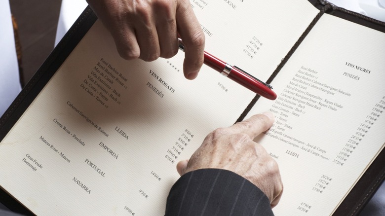
Creating a successful menu isn't just about the food. Contrasting lines and prominent fonts are proven to grab our eyes first, according to a 2014 study published in the International Journal of Hospitality Management. And a 1997 study published in the Journal of Advertising noted that yellow page viewers were 42% more likely to look at an ad listing when it was presented in bold font. All of this explains why a menu's most expensive items are often highlighted front and center. Font styles will vary by size, weight, and color to spotlight certain areas of the menu — all thoughtfully chosen to get customers to drop big money.
Font color also matters. Green and orange are one of the most common color schemes on menus, and not just for aesthetic reasons. Green signifies freshness while orange stimulates the appetite. Sections written in yellow or red are designed to draw our attention, with red specifically provoking urgency and action. Our eyes will always dart to a menu's warm yellow hues, and then the dishes featured in red will be hard to resist. These days, menu design is just as important as the dishes themselves.
New restaurants hire the expected crew; servers, bartenders, managers, sommeliers, and, largely unnoticed, menu engineers. The face of a restaurant used to be its storefront, but now that obtaining a menu is as easy as checking the weather, that's changing. Restaurant menus are evolving and – alongside a strong digital presence — often have to lead the way. As Danny Meyer told The New York Times, "The chefs write the music and the menu becomes the lyrics, and sometimes the music is gorgeous and it's got the wrong lyrics and the lyrics can torpedo the music."